Archive for September, 2008

Bedroom Curtains…

Monday, September 8th, 2008

and I don’t mean the meaty kind.

I hated the curtain rods in the bedroom – above is an old shot. I started thinking about doing a turnbuckle curtain wire system…like these featured on Apartment Therapy – and I used these instructions.

Here are some of my supplies. I used the Apartment Therapy step by step to install the wire on the back wall and wrapped it around the corner using the eyelet thing below to cover the side wall.

Heres my corner eyelet thing.

Here is the turnbuckle with the wire clamped on…exciting!


Here (finally) is a small preview of the whole thing put together. I used those
DIGNITET clips from Ikea and I’m still working out the kinks…more soon…

Curtains

Friday, September 5th, 2008

Ugh.

I have to admit that I am a miserable failure with curtains. I wanted to test out the Ikea KVARTAL track system to use in the living room wall of curtains.

Here is the installed track – mounted to the ceiling – and here is the curtains attached 2 ways (since I like to try things both ways if you know what I mean…). I tried those funny little plastic gliders and curtain clips…both look like crap.

Heres a bit of a cropped view with the two hanging styles – gliders on the left, clips on the right. The whole thing looks rather LAME-O.

Plus the window is in a weird spot, shoved right into the corner, so I’m a little stumped on how to actually hang a curtain there. I’ve been looking for fun fabrics since I think white curtains are ever so boring in the den…but now I can’t decide on a fabric or color. Theres a lot of yellow and orange and warm wood tones in the den, so maybe something cooler or more neutral might be in order. I love the fabric over at Sew, Mama, Sew! and Reprodepot Fabrics and feel like I might want to get some fabric to make my own curtains.

Where do fancy designers go for textiles? I bet its pricey…and I bet its not Joann’s.

So I’m a failure – a FAILURE I say – at curtains and such. Poo.

Exterior Painting! Part DEUX

Wednesday, September 3rd, 2008


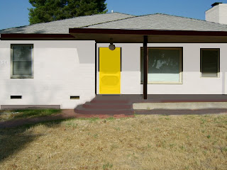
I attempted to use the Martha Stewart inspiration photo and translate it via “amazing” Photoshop skills into a paint color mock-up.

Then I bought more color samples…I’m at about 21 now…

Nothing was right. As I was organizing my shoes after my little vacation in Palm Springs I saw the perfect colors! I knew I liked this color combo.

I went to Lowes and had them color match my old stinky shoes. Poor lady at the counter looked a little weirded out about having to touch them. Apologies ma’am.

Tried them out and liked them but the gray was a tad bit too dark. (In the left photo those three colors on the far left are the color matched samples from the shoes). So I had her lighten the converse gray by 75% and 150%.

I like them both and I really think I like the black trim. I think I might go with the lighter color but it seems a bit pink in the bright sun. The shoe sample of yellow is awesome – I can’t wait to throw it on the front door – GLOSSY style.

What do you guys think – which one – and is the black trim weird? The boy thinks I’m nuts to paint gray cement a lighter gray…