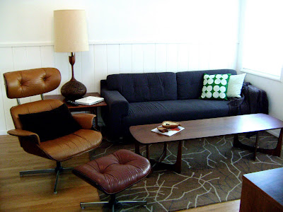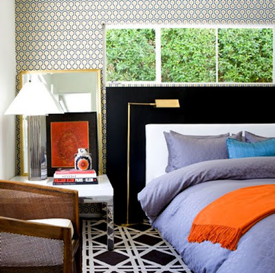
I really have been considering the Eddie Ross school of vignette styling (although I’m very suspicious of it) it seems some of the basic rules are sound. Paying attention to scale, texture, pattern, and white space helps visually order things and show off the best parts of a collection. I’ve been attempting (and failing) to style the entry wall in the living room for the last year.

The top image is my current entry area “vignette”. I think I kind of dig it.
I’ve been considering a coat hanger and was thinking of the Eames Hang it All installed on the empty left side to hang coats, purses, ect. I also want to add a shelving unit behind the sofa to act as a sofa table and bookcase. If only I can find something stylish, long, and cheap…which is how I like my men… if you know what i mean…

This is when vignetting fails.
I love this marble table and was hoping to use it bedside for the Boy. The entry space in the bedroom is tight and his table needs to be small and floating to keep the room feeling as spacious as possible. First thing first – DESTROY that alarm clock. For SEVEN years he has had that ugly sticker covered monstrosity. Its like the size of a toaster.
Probably no table lamp will work. I’m going to have to do pendant lights or something wall mounted to keep the space open and symmetrical on either side of the bed. Right now the tables don’t match, the lamps don’t match, cords are askew and asunder, and we don’t have a headboard. It looks a hot mess. After all that is figured – I guess something simple, clean and with clear accent pieces will make it all come together. I hope.


The den is brown and crowded. Ugh. Eventually this will get some awesome vignetting and color action when the space planning issue works out. This pic solves the mystery of where the old coffee table ended up. The table is way to big and will be sold when I find the right perfectly priced white oval tulip base coffee table…or maybe a naked gold lady holding up a piece of glass.


