Archive for the ‘dining’ Category

Chandelier

Monday, December 14th, 2009

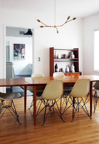
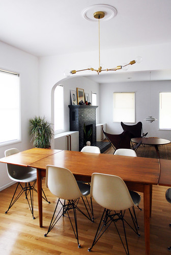
I’ve been hunting for a new chandelier to go in the dining room for about four months now. Throughout constant thrifting and ebay scouring nothing popped up that was affordable or amazing enough to warrant purchase.

But, while I was on the hunt I did fall in love with one lighting designers work. At many MANY thousands of dollars for each handmade chandelier it was a totally unattainable item.

1-1

Except…

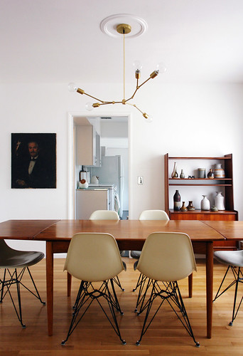
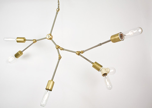
The lovely and talented Lindsey Adelman posted a DIY version of her chandelier design including a parts list and how-to instructions.

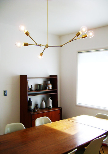
I changed her design (seen above) by switching it to a hardwired installation and shifting / tilting the way the armatures are designed to extend.

OK, apologies but this whole DIY light project was a bit of a test run due to improvising so many changes to the original instructions on the fly. I didn’t document what went down as it exploded over two extremely frustrating days that included a huge learning curve and bigger mess.

All the kinks aren’t worked out with my adjusted design. If you want to try Lindsey’s DIY instructions just follow them closely – it will totally work.

DSC05658 copy DSC08634 copy

F*ck yeah! It totally works.

Surprisingly, it was much easier to make a wire harness than I imagined.

DSC05654 copy DSC05691 copy

DSC05684 copy DSC05687 copy

Now that I have the basics (sort of) down and a little more experience with the many little particulars and issues inherent in lighting design I want to try out a smaller version for the pink bathroom. I’ll totally do a step by step DIY for that nonsense.

The project cost about $120 in lamp parts, one trip to Home Depot, two days of labor and some pretty intense arguing, jimmy-rigging and brainstorming with the Boy. All completely worth it – I love it!
Art

Thursday, September 3rd, 2009

The readers spoke and I listened. The art in the dining and living room got the old switch-a-roo.

The mantel vignette in the living room is one of those things that will probably change shortly. It all depends on when I find awesome things, that perfect piece of art or sculpture can be elusive when your thrifty.

While my vintage art collection can be a bit disconcerting to some folks (or squares as I’d like to call them) the right piece of art gives a room a hella lot of charm and loads of quirk. An art collection can speak volumes about its owner and is one of those things that can be sourced and purchased over time and at any budget. Plus art makes a bland space EXPLODE with style.

You really don’t need a ton of cash to start collecting. I’ve never paid over $40 for a piece of art. Most of my collection was picked up at thrift stores (mainly), flea markets, garage sales and occasionally ebay. I also trade art with friends or sometimes make my own – even if it is a knock-off.

When in doubt buy original paintings, not giclee prints (or the bane of my existence) those crappy ink jet prints on canvas. Silkscreens, lithographs (well any printmaking for that matter) and drawings are all fabulous and have a great texture and that rich handmade quality.

Full disclosure; my background, ie. education, employment, ect. is in visual art. That’s probably why I dig modernism and wanna collect, collect, collect – especially when it comes to paintings, furniture, ceramics, blah blah blah. I like art. I like design. I like pretty pretty things. I am an aesthetic junkie and total art whore.

Art really seals the deal when it comes to taking your decor to that next elusive level. Real art (be it vintage, on etsy, or from a real life fancy gallery – hooray galleries!) is pretty easy to find and buy. So NO ONE has an excuse to buy that goddamn Audrey Hepburn fake painting at Ikea.

Vignette

Friday, July 31st, 2009

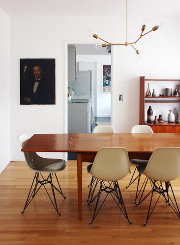
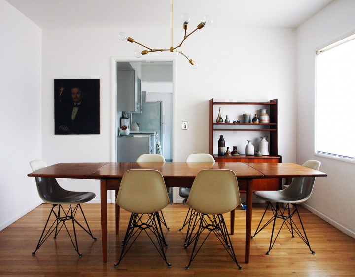
The dining room hutch vignette got some updating in honor of the freshly installed dining room chairs.

I pulled together some of my vintage ceramic collection comprised of muted tones to play off the parchment color of the Eames chairs, the warm teak of the dining table/hutch and amber tones of the vintage Danish ceiling light.

The dining room is now very monochromatic and pulled together in a minimalist style that I’m usually not very comfortable with…like neutral and rustic or something. Those words would have NEVER described my design sensibilities in my head – but I hope that it all turned out looking surprisingly sophisticated.

I’m not a huge fan of taupe, beige or the typically ascribed go-to safe neutral colors, but recently I’ve been digging a more subtle and minimal pallet. I’d still love to find a GIANT Bumling light in red or some bold color to really make a big impact above the table.

I’m dubbing the dining room: AKA Brown Town. For now…till it changes again, as it always does.

Oh god, I just went back in the archives to see what the dining room used to look like when we first moved in. Yuck, what a hot mess.