Archive for the ‘DIY’ Category

Guest Bedroom Wall? Constructed? F*%k Yeah.

Friday, November 6th, 2009


This is the BEFORE before image of the guest bedroom taken during the house inspection. So many, many – many moons ago…

Gotta love the aluminum foil window treatment.

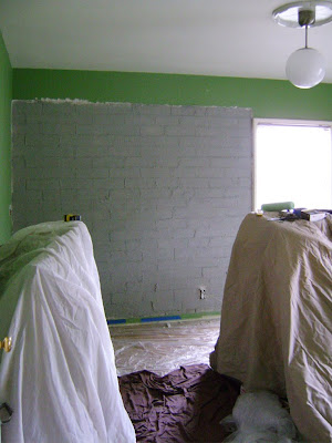
Little did we know that the wall would soon look like this:

And stayed looking that way until last month. Almost two years. We’re lazy.

Long story short, we had to remove a lot of crumbling water destroyed plaster to discover a big crack and no lathe. Poop.

We sealed the crack with mortar repair and then primed and Drylok‘d the interior and exterior masonry. BTW – that stuff smells horrid and is nar-sty to paint with.

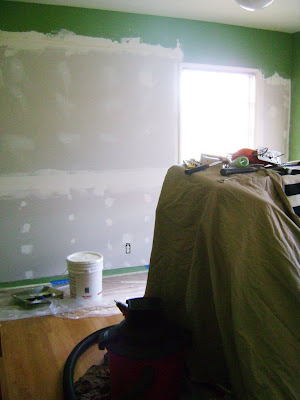
Then we used 1/2″ furring strips at 16″ on center (F*ck you Holmes on Holmes. TV shouldn’t be educational) to frame out the wall to hang new 1/4″ drywall. We only had about 5/8″ to 3/4″ of depth to work with the remaining plaster, window and electrical framing.

It was a tight squeeze, and we weren’t about to make a novice attempt of throwing an inch of plaster on the whole wall. We got a quote of $1500 to have the pros do it.

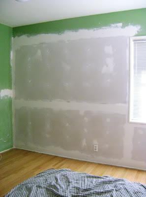
We attached drywall and mudded the holes and seams with joint compound to make the wall flush and paint ready. Smooth and straight (mmmm hmmmm, thats what I like).

Here is the whole wall in it’s “ready to be painted” glory. The Boy was so proud, and remember he did it all.

OK, another tease sneak peek because the room’s not all the way finished and I’m so over showing pictures of that horrible green color. I mean come on – yuck – that green is hideous.

*Previous Owners you are put on notice. Bad, BAD P.O.’s! Did you see that horrible hanging pendant light? (It’s in the top right corner) Again, naughty P.O. bad, bad choice. Those are for kitchens.


Everything is white! Surprise surprise.

But look, it’s a real finished wall in a real guest bedroom – not just a grubby junk room, aka The Boy’s exploded closet. That’s a big deal for The Brick House.

Wall construction Run Down:

Pro:
Quote: $600 – $1500

DIY:
Materials: $150
Labor: $0

Rad.
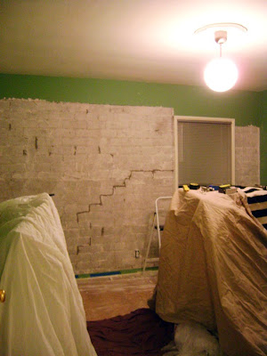
The Horror.

Monday, October 19th, 2009

Some peeps around this house finally got going on the big guest bedroom rehab project this weekend. Yes, after only two years we came up with a plan to fix the plaster that had fallen off that wall.

Back story on this wall: There was a crack (see all the dark marks – you could see daylight through them, which is not a good sign for an exterior wall), water weeped in though those holes and popped most of the plaster off, we removed the rest of the water damaged crumbly plaster and fixed the cracks and sealed the exterior masonry. There is NO lathe on the wall – just an inch of plaster troweled directly onto the cement, which is so annoying. We cannot leave it plain cement, which has been suggested many times…I won’t go into all the reasons why, just trust me.

We had three plaster/drywall guys come and quote to have it fixed. Their quotes ranged from $1500 to $600 to re-plaster or float drywall over the cement brick. NO. No f*ing way. DIY is the way we are choosing to go. Hopefully it all works out.

I’ll let you know.

Apologies to all of the guests who have had to stay in that cesspit of a bedroom. We only have two bedrooms – so the guest bedroom became the default catchall room for overflow. Most of the excess that has been floating in there got moved into the living room for now…yikes. Where are we going to put all this stuff? Ugh.

Maybe its high time to update the etsy store.

Sorry for the ugly pictures and all these words, words, words. With a little luck we can start decorating the guest bedroom soon. Then pretty pics and much decorating turmoil will ensue…

DIY Shelf

Thursday, October 15th, 2009


Check it out!

Another Ace Hotel inspired shelving unit from the blog Ascot Friday. I’m going to take a little credit for inspiring this awesome project, you know, cause I’m just a bit of a narcissist. She did a great job, it looks so very lovely and is super budget friendly. Anyone can really do this pretty simply.

What really peaked my interest is that rad typography poster.

Looks like it’s the new OLUNDA poster from Ikea. I have to admit it’s the first print from Ikea I’ve ever really considered buying. Now I’ve got to see it in person…