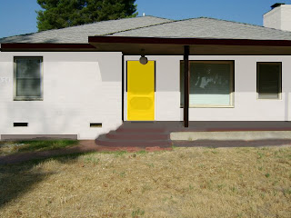
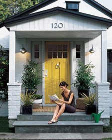
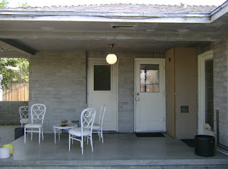
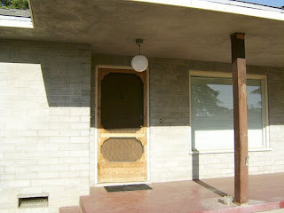
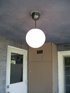
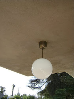
I attempted to use the Martha Stewart inspiration photo and translate it via “amazing” Photoshop skills into a paint color mock-up.
Then I bought more color samples…I’m at about 21 now…
Nothing was right. As I was organizing my shoes after my little vacation in Palm Springs I saw the perfect colors! I knew I liked this color combo.
I went to Lowes and had them color match my old stinky shoes. Poor lady at the counter looked a little weirded out about having to touch them. Apologies ma’am.
Tried them out and liked them but the gray was a tad bit too dark. (In the left photo those three colors on the far left are the color matched samples from the shoes). So I had her lighten the converse gray by 75% and 150%.
I like them both and I really think I like the black trim. I think I might go with the lighter color but it seems a bit pink in the bright sun. The shoe sample of yellow is awesome – I can’t wait to throw it on the front door – GLOSSY style.
What do you guys think – which one – and is the black trim weird? The boy thinks I’m nuts to paint gray cement a lighter gray…

