Archive for the ‘inspiration’ Category

ROPE WALL

Thursday, May 5th, 2011

I’ve been helping out Shelly Leer – aka ModHomeEc – with the design of her brand new upholstery workshop in Indianapolis. Shelly is a fantastic upholster and hosts classes to teach folks the ins and outs of fixing up and reupholstering their old forlorn stuff (a skill I can really appreciate).

With this open warehouse space, one big design issue Shelly needed help with was figuring out how to layout and define areas for various work and private “zones”. She needed areas for tools, areas for storage, an area for a personal office, a waiting area, an area to teach and work with students and so on and so forth. Functionally, this one big room had to be used for many many purposes and still be open, accessible and of course look awesome.

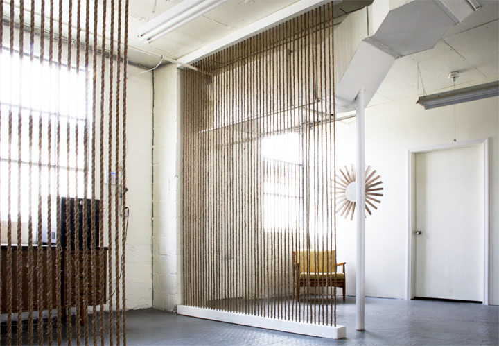
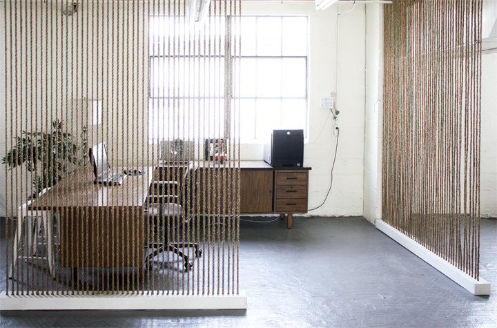
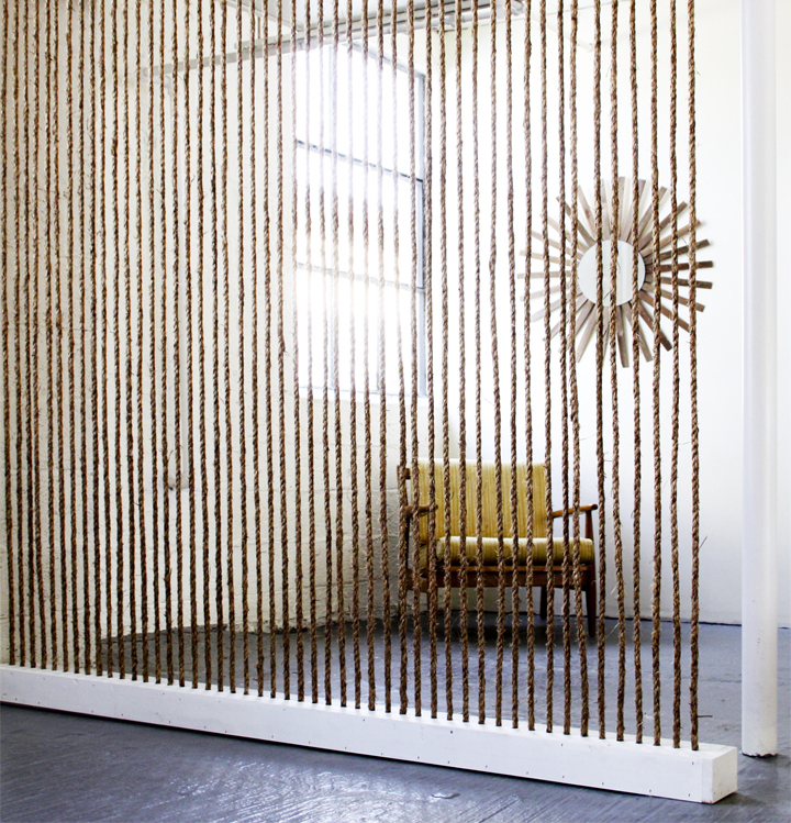
Since cost is always an issue (and this space is a rental), it wasn’t prudent to dump a bunch of cash into building traditional solid walls that would split up the space and make it feel smaller and darker. My solution was to build these vertical jute rope division walls that allowed for defined “zones” but still retained light and visibility throughout the entire space. A plus when using this type of jute rope is the added benefit of bringing in a chunky / graphic / warm texture to an otherwise cold and hard industrial room.

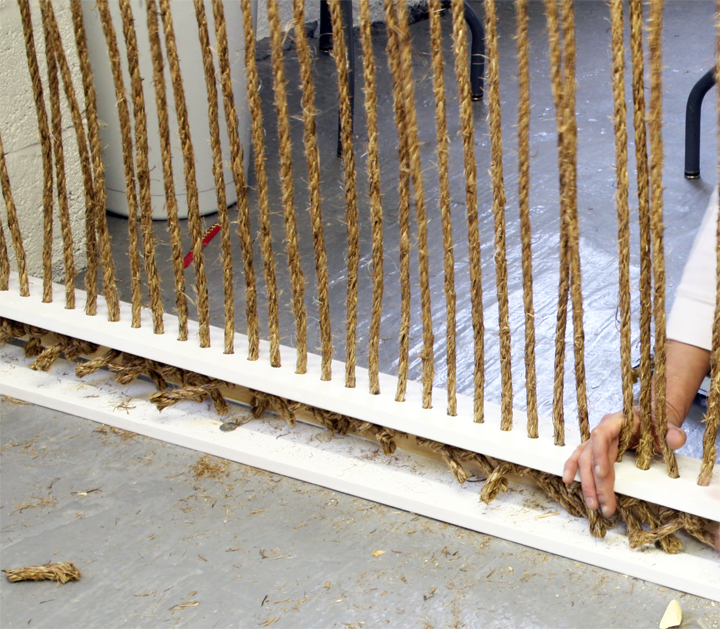
The construction process is pretty simple. Wood boxes were custom built with evenly spaced rope sized holes drilled through the top and bottom. Precut sections of rope were strung through the top and tied off at the bottom, allowing for the interior knot to hold the rope in place and taut. Just screw close the open side of the box and all those ugly knots are hidden away.

With this design the overall costs are kept pretty low for such a big impact. Rope is cheap, especially when bought in bulk, and wood boxes are very low cost to build. The true cost is going to be labor and time – it’s just a tedious and super repetitive process.

Come on. Hotness.

I think the outcome is pretty spectacular. Not that I’m bias or anything.

This roped off area is actually Shelly’s office!

I’m completely thrilled with how these rope walls came together and so happy I didn’t have to lift a finger and do any of the actual labor. There is another wall in the works that I’m pretty excited to see completed as well as other awesome ideas that came from designing Shelly’s new workspace to be affordable, functional and downright ‘effing stylish.
Phoenix

Tuesday, March 15th, 2011

We drove through the desert in our rental car with out of date registration tags all the while crossing our fingers that we wouldn’t be pulled over by the authorities.

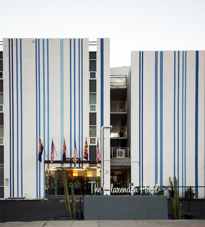
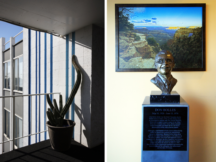
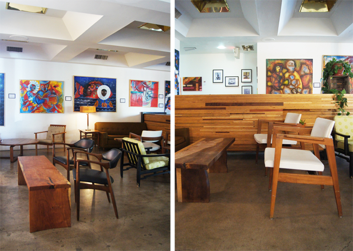
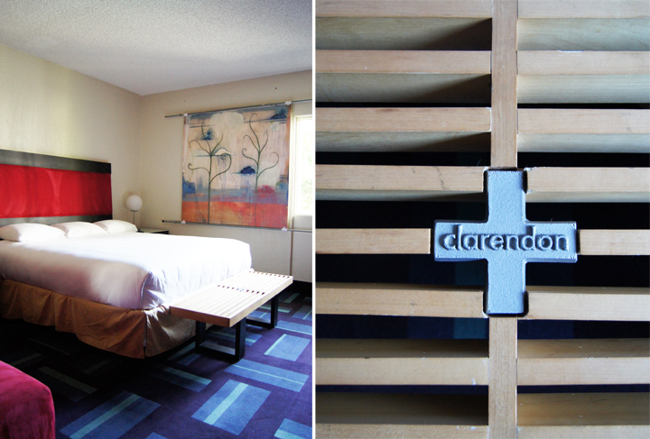
We stayed at The Clarendon Hotel, a small boutique hotel in mid-town, that had a bit of a younger retro slant to its digs.

The rooms and interior had seen better days. Everything needed a bit of an update, some maintenance and a thorough scrub down.

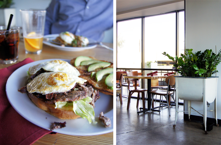
The thing I loved most was the little restaurant at the hotel. Gallo Blanco was delectable! Doug Robson is the chef & owner, and according to their site, “the food is cooked from scratch daily…we strive to utilize local ingredients and partner with local farmers and distributors.” Tasty tasty fair and probably the best part of our trip.

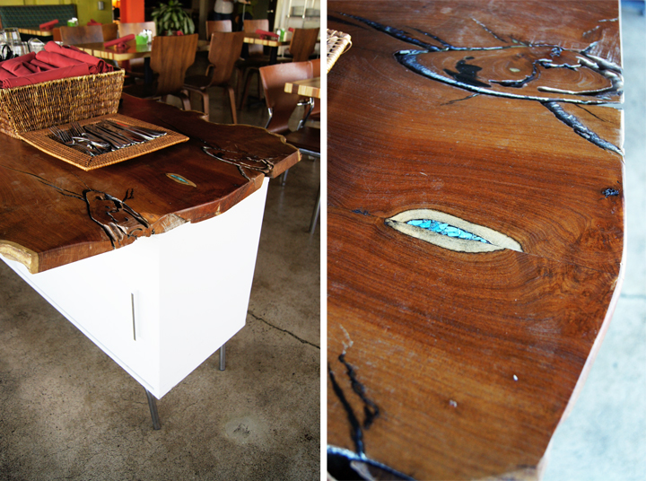
I loves this little service area. It was just two Ikea sideboards with a giant wood slab stretched across the top. The turquoise detail inlaid in the wood killed me – something I’d love to copy some day for sure.

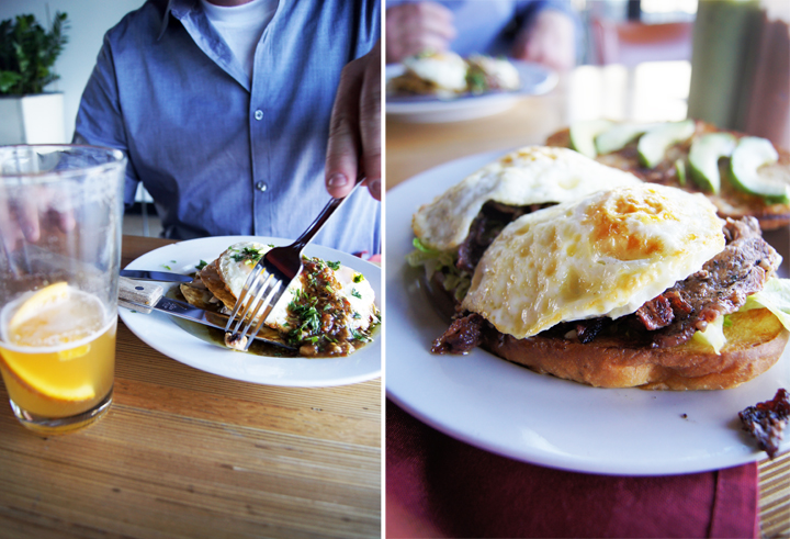
Jeremy got a tasty chicken chilaquile and I scarfed down this incredible torta with over easy eggs, avocado and piles of deliciousness. I will now put over easy eggs on everything I eat.

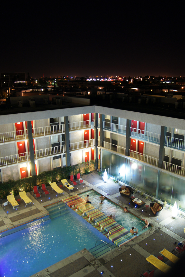
We totally went hot tubing, body shame be dammed!

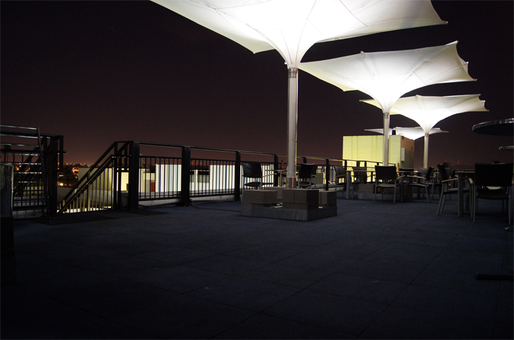
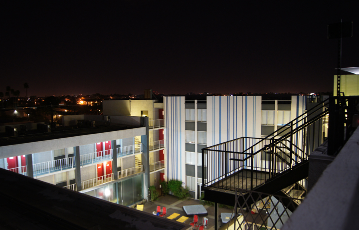
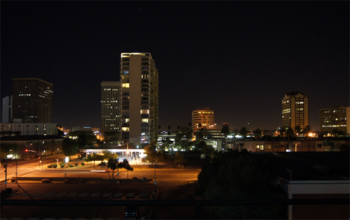
The rooftop deck was the poop. Seriously, I love a high rooftop lounge area with city views and completely devoid of other guests. Voyeurism never felt so good.

We had one night to go out on the town and after a long day of business and shopping and hot tubing (and more than a few cocktails), we headed out to a restaurant around the corner that the staff recommended.

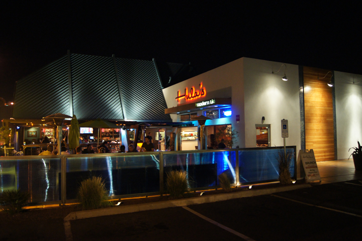
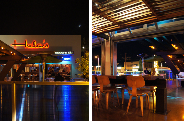
Totally cheese-ball, but kind of perfect after a long hot day was Hula’s Modern Tiki.

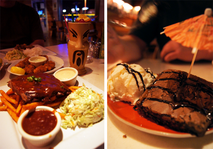
We got frou frou girl drinks with silly names like Dr. Funk and ate our weight in spare ribs, fish bites, sweet potato fries and jerk pork. Macadamia nut ice cream and brownies? Yeah. Yum num num.

We had a good time and left incredibly late and stuffed to the gills.

The thing about Hemet is that we have ZERO even mildly interesting restaurants. It’s all chain stuff like Applebees and Chili’s and Red Robin, so anything even remotely different or unique is pretty mind blowing. The food wasn’t even that spectacular, it was just nice to go somewhere that didn’t have fake ivy plants and “country” themed rooster wall paper for once.

Phoenix actually reminded me a lot of Hemet, well maybe more like Riverside. It had that same sort of desert strip mall atmosphere with a dash of ghetto and retro forlornness that seems to creep in. Phoenix did seem to have an INCREDIBLE amount of strip clubs and all the signs posted at thrift stores about not bringing in guns kind of freaked me out. I guess you can just walk around with guns everywhere? Makes going to IHOP or wherever a little more interesting…

It was a quick trip and we headed back after a full day of shopping and tootling around. Even more to come on that front…

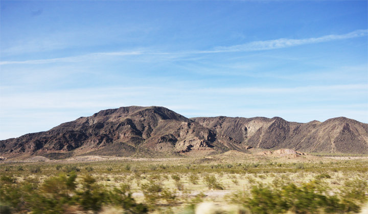
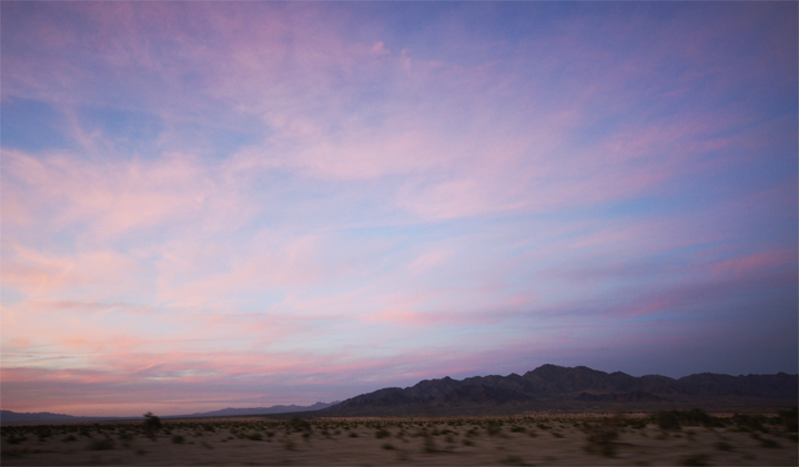
I still love nothing more than the western desert at sunset. It made a beautiful drive home after a densely packed and curious little trip.

Spring Home & Garden Show

Wednesday, March 9th, 2011

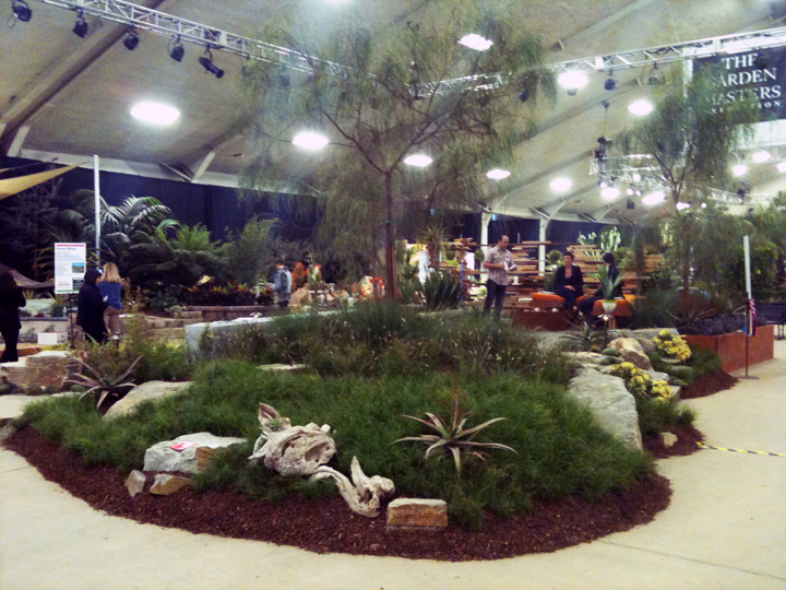
I headed out to San Diego to check out Ryan’s entry in the Garden Masters Exposition at the San Diego Spring Home & Garden Show.

Well..

I got all my fancy camera equipment together to take some killer photos and then…forgot my battery. Because I am dumb. And a loser. And a terrible blogger. Please please please excuse the crappy iPhone pictures. I was in a bit of a pickle and it was the only camera I had that actually worked.

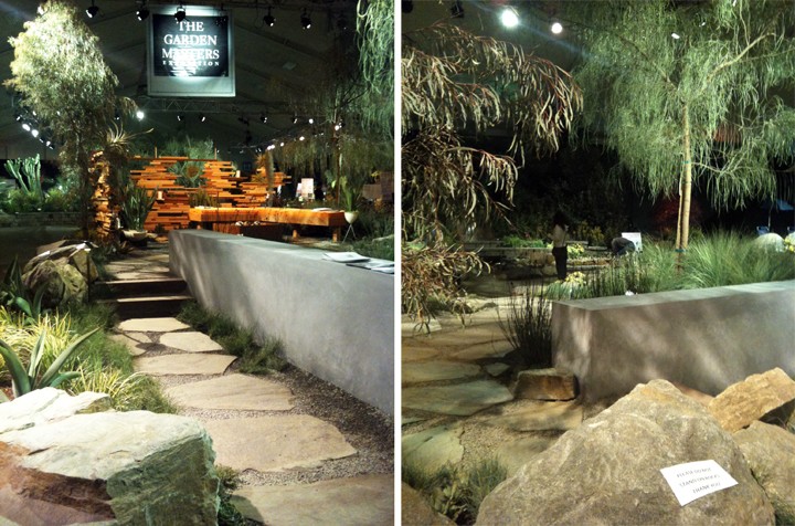
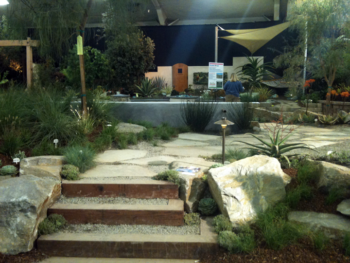
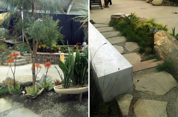
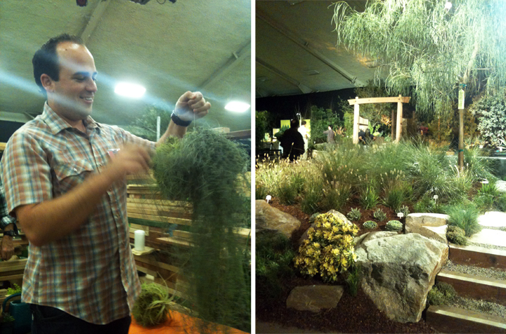
Ryan’s entry was super modern but still very lush. I dug the plant selection and easy breezy walk through set up. I wish I had somewhere to put these gravel and wood steps…so simple!
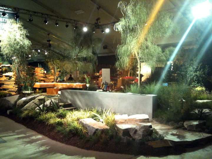
The lighting throughout the event was very “theatrical”. It was like a garden bordello in there.

Gotta love a hard troweled stucco wall that looks like concrete, though. I would also like to find a place for one of those babies somewhere. Maybe a ten foot tall one to block out the crazy cat guys house…
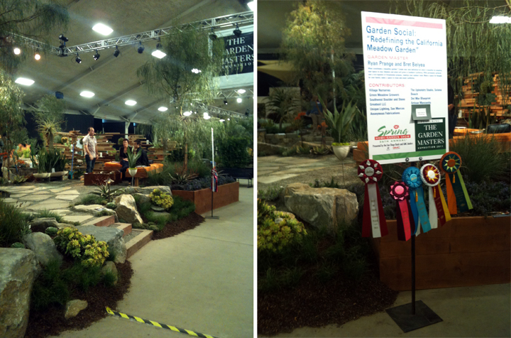
Look who won all the fanciest ribbons! Ryan really took home more prizes than anyone else…and you will see why in just a moment…

We showed up at the very end of the event and they finally turned off the bordello lights and turned on some basic overheads. Thank you regular lights, now I can see the plants.

Ryan loved handling these big bushy balls. Just saying.

Overall, I thought he did a great job. It was a good mixture of organic and geometric planting with an interesting water feature and great little fire pit area. Totally that comfy SoCal modern backyard deal that is so nice to hang out in and totally water friendly. Definately my fav design of the show.

+++++++++

Now folks, onto the other entries that caught my eye (if by caught I mean made them bleed).

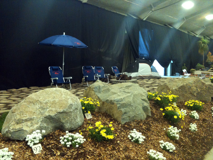
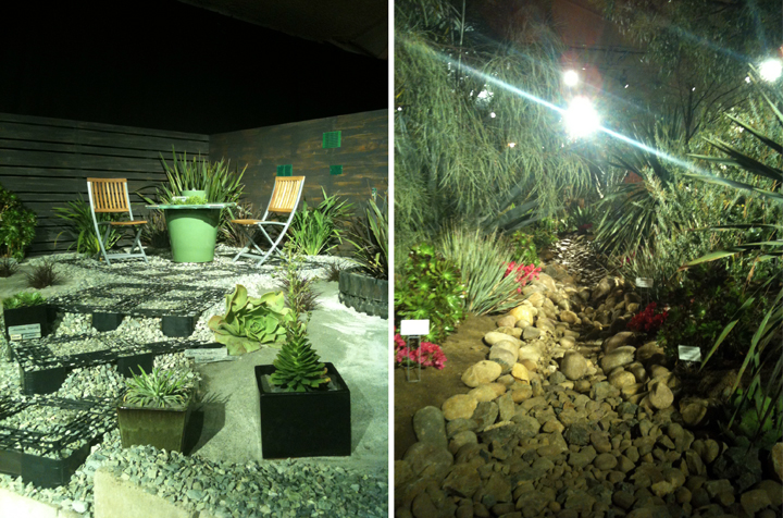
This pissed me off. Little stupid flowers (only two kinds total) and Tommy Bahama folding chairs? It was like a big F.U. to viewers and the other designers. Totally ridiculous.

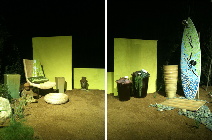
Let me count the ugly.

  • Neon green random panels? Check.
  • Mosaic surfboard shower? Check.
  • Creepy voyeur wicker chair? Check.
  • Random empty planters? Check.
  • Random eastern statues? Check.
  • DRY RIVERBED? Check.

(Dry riverbeds may be one of my bigger pet peeves.)

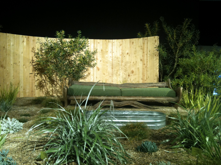
I liked this bench thing and the galvanized tank fountain, but overall it was a little random and strange with the plantings and layout and totally all green all the time.

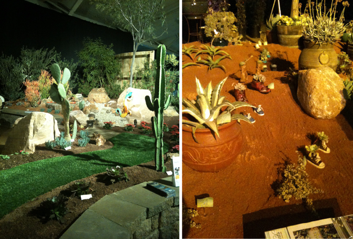
AstroTurf. ‘Nuff said.

Baby sneakers with plants in them walking through the landscape? GAG. GAG. GAG.

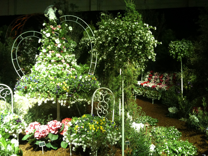
Oh yeah, this was a horror show. Curly white wrought iron with a wedding themed “bush” (check out the “whimsical” bride and groom on top) and a poofy flower bench. Please gouge out my eyes.

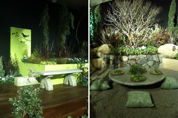
When in doubt, put a bird on it. Or a spitting frog fountain. For fucks sake.

Also, how many people want to sit on a pillow in a bunch of pea gravel? All I can think of is gravel in my pants.

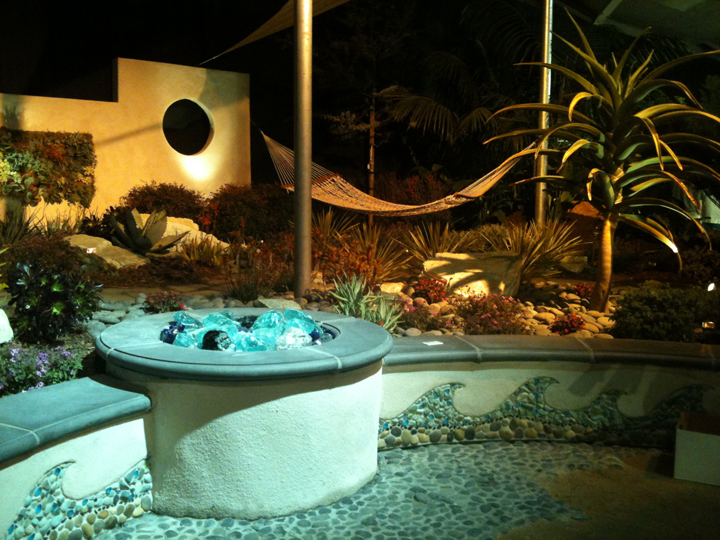
This was almost OK until you saw the wave mosaic masonry work and the creepy balls of glass fire pit.

Ah, sharp and horrible slicing cheese grater squares to step on to get to the most depressing sitting area ever. The fence looked like it was smeared with poo.

Oh awesome, another huge dry riverbed. The most pointless thing in all of landscaping.

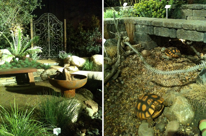
Check out that cool fire pit! Too bad there is a total disconnect with that fanciful wrought iron gate. What happened? Design seizure?

Oh perfect. Plastic fucking turtles on a dry riverbed.

+++++++++

Ok, now I may be a little grumpy (or a lot grumpy) but I drove an hour and a half to check this show out and my camera had no battery and it started raining and I’ve been really sick – so I’m grumpy. Shut up. It happens.

I appreciate all the hard work that goes into an event like this, but honestly, it seemed like a lot of folks were just completely phoning it in. Seeing as these landscapes were intended to be professional examples created in the hopes that they will win awards and entice new clients, some of the choices were just weird. I’m pretty sure someones dream landscape wouldn’t consist of folding Tommy Bahama chairs, or maybe people really do love plastic turtles and wave mosaics. Who knows. I’m being a grumpy snob.