Archive for the ‘inspiration’ Category

CACTI

Thursday, September 15th, 2011

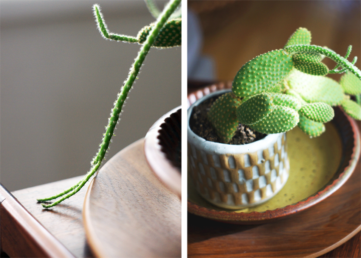
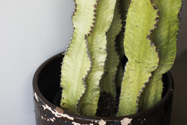
My cacti are all screwed up.

I hate plants.

How is it possible to constantly kill every living thing that comes into this house? Finally got a fiddle leaf fig tree – immediately dead. My terrariums? Mostly dead. My sansevieria? Dead. You see – everything living is dead.

Well, except for these two.

They’re OK.

But seriously, screw you cacti. Please stop suddenly drooping and turning brown and being all temperamental.

What’s wrong with you? Depressed? Thirsty? Bored? You got fungus? I neglected you like the instructions said to. We live in the damn desert – this is your home! YOU COME FROM HERE. You should be loving this.

I give up on cacti and plants and greenery in general (even though I’ve always dreamt that the house would be filled up with sculptural plants). They just keep committing suicide…or I’m murdering them. It’s a 50/50 chance.

DAMMIT.

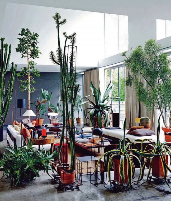
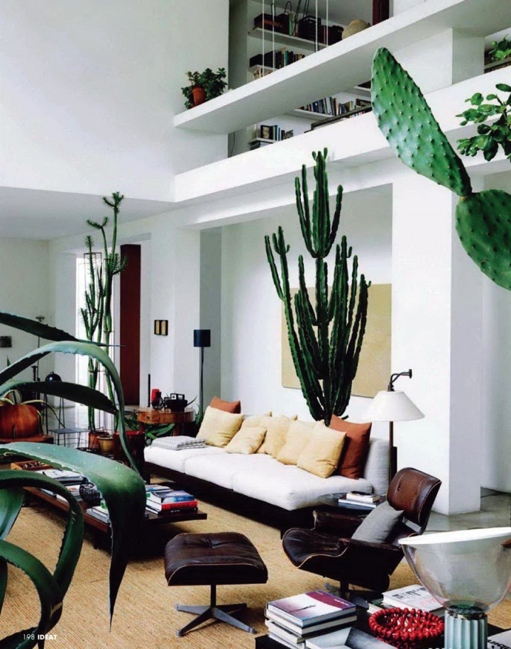
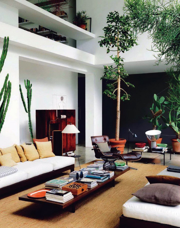
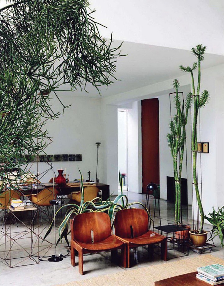
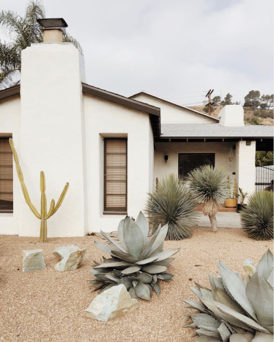
In my plant fantasy, I imagine my cacti reaching the sort of grand heights and mythic health that Maurizio Zucchi’s have. This is ‘effing plant pornography. These pictures are mocking me and my stupid plant failure. Also, that entire interior? You know, pretty much PERFECTION on every single level. Dammit.

(you’ve probably seen these images from Ideat Magazine-June 2011 via iiiinspired).

Mocking me.

Bastards.

FIREPLACE

Tuesday, September 13th, 2011

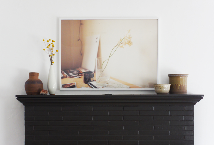
A little while back Laure and I went through her storage and pulled out a few portfolios filled with large scale photos she had taken during art school. We framed one great landscape for her bedroom and it looked so crazy amazing that she graciously let me borrow this softly colored desk shot so I could have a big ‘ol framed photo as well.

I hung it and looked at it and then texted her a picture of everything installed.

While it’s a great piece, we both agreed that it was being completely overpowered by the fireplace. Off to another spot with you!
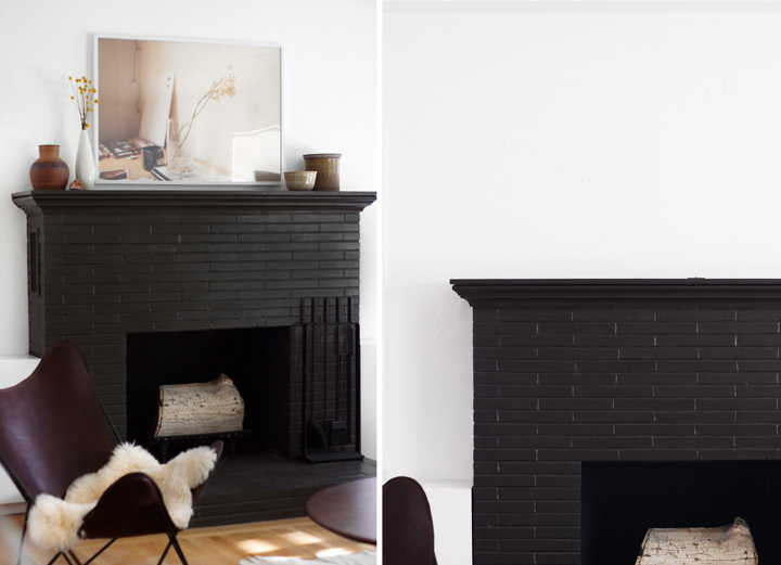
The area above the fireplace has been an ongoing struggle, with many unsatisfactory incarnations including these – HEREHERE HERE.

The problem is scale.

Our ceilings are a standard 8′ tall, but the fireplace rides pretty high on the wall allowing for a mere 37″ of white space above the mantel. Two thin windows flank the fireplace on either side and their top moldings create a weird invisible horizontal line across the wall. When anything hangs near or above this strange visual trickery the ceiling begins to feel really low, while conversely, the art appears to be hung way too high.
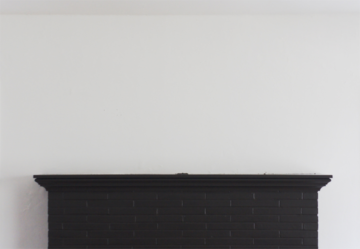
Then there’s that mantel.

Blech.

Overly fussy and completely under-scaled, this has been one of those “I’ll get to it projects” that never seemed to be gotten to. All I’ve ever imagined doing was installing a simple but chunkier wood mantel over the top of this thing. Something boxy, something easy to build, something budget friendly.
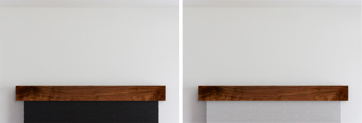
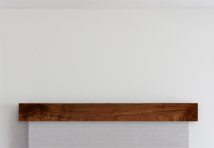
Excuse my terrible photoshopping, but a solution as simple as this uncomplicated wood box would be better scaled and suited for the fireplace mantle, easily constructed and pretty cheap materials-wise.

Screw it. Why not go all change crazy and paint the brick a lighter color like a soft gray/almost white. Or go slightly less nuttier and paint the thing a true black.

(I’m leaning lighter – if for no other reason than to shake things up)

Over the mantle art-wise is still an issue. I’ve hunted for the perfect long and lean piece to snuggle up into that strangely proportioned spot and have come up with ZERO things after almost four years of searching. Time to DIY.
Surprise surprise. I can’t afford a Stella or a Judd or any blue chippy art. I mean, I wish I could – that would be INCREDIBLE – but I can’t even find an affordable no-name modernist abstract painting or mid century fiber art wall hanging, let alone ANYTHING that’s both famous and super long and lean.

Making some fauxart has long been a noodle in my brain (and something I have done before). Why not. Faking it is fun.

I’ve been mocking up a few different (easily made) options – but SHOCKER – this long/thin composition isn’t widely popular with artists whose work I dig. Or really any artists. ‘Cause it’s weird.
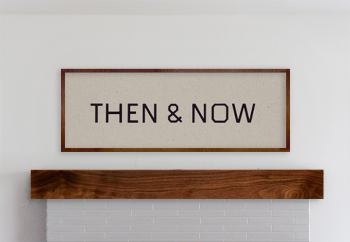
Firstly, a fake Ed Ruscha, well actually it’s from his art book THEN & NOW. I don’t know, it’s not a favorite – I just always liked that project and this typography. Plus this would be so easy to make.
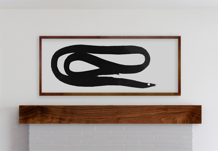
Next idea was a fake Matthew Brannon. I always liked his larger scale installations – like the Whitney limply coiled eel, a reoccurring motif in his work. It’s the right scale and I love an eel.

Otherwise, most of the artist’s work that I love looks awkward as hell squished into a format like this or is too labor intensive for my quick and dirty faker style. I though I could pretty easily pull-off something text based like a Weiner or a Holzer or a Shrigley or a Nauman or even a Baldessari – but nothing felt quite right (even though I love me some Weiner).

I’ll always remember this story a teacher once told me about going to another rather famous artists studio. He was admiring all the Jasper Johns and Warhols (or things equally blue chippy) and asked about the pieces. “Oh those? They’re all fakes – I just made them. Come on, I can’t afford that shit.”

Mantel first, forgery later, methinks.
RESEARCH & ROUGH BEGINNINGS

Tuesday, July 19th, 2011

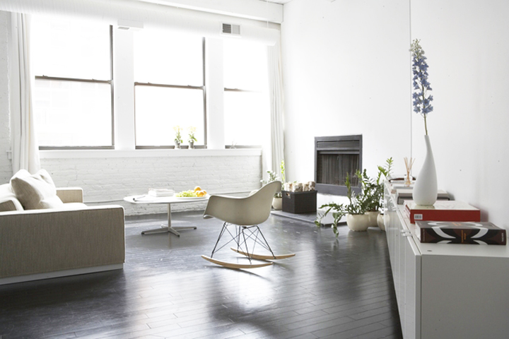
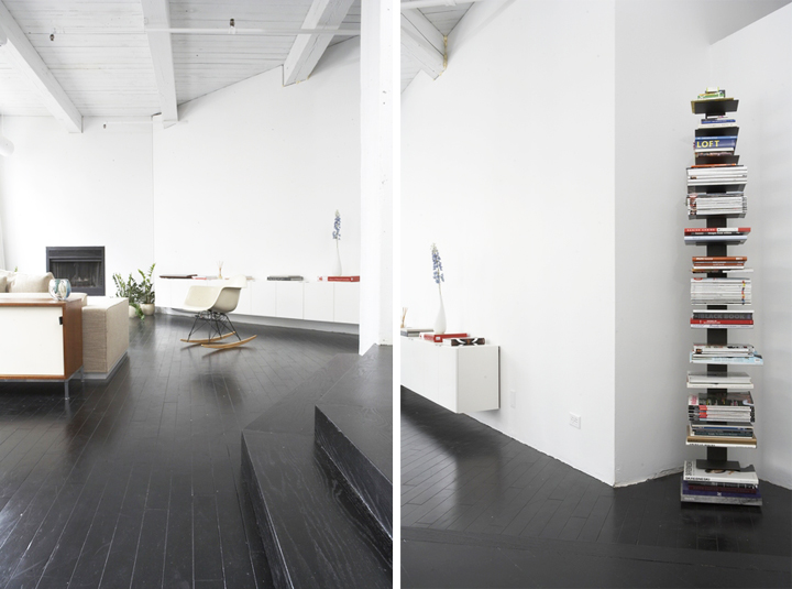
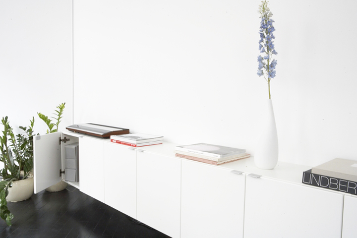
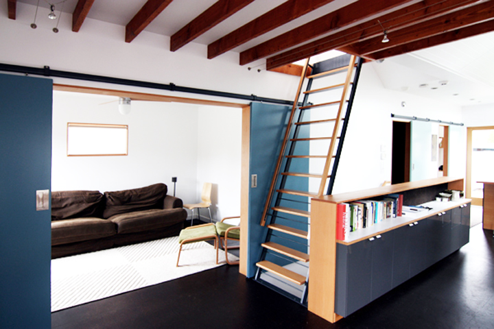
Like many home fans who browse the internets, I fell in love with Andrea’s Greektown loft many years ago and have off and on toyed with the idea of creating a long minimal storage unit using basic Ikea kitchen cabinets like the one installed in the main living space.

This is such a simple and clever idea that is totally DIY-able and has an exhaustive abundance of variations and customizations that can be applied in any space. Which, really, any great DIY sort of should have a kernel of that customizable component built into the initial design.

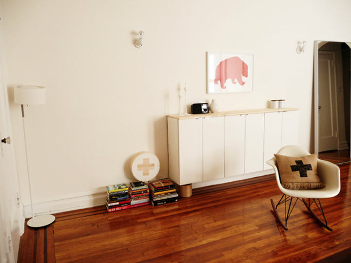
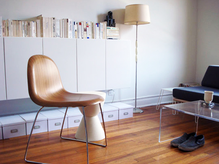
I’ve always imagined I would eventually use this idea to build a floating media credenza that would hide all the ugly TV components in a super minimal floating unit that’s both affordable to build and has oodles of hidden storage.

Anna of D16 deemed this type of installation the “fauxdenza”, a newly minted hybrid word describing the floating credenza/wall/storage piece that she built in her pied-à-terre.

Sarah from AT posted a step by step breakdown of how to install one of these bad boys.

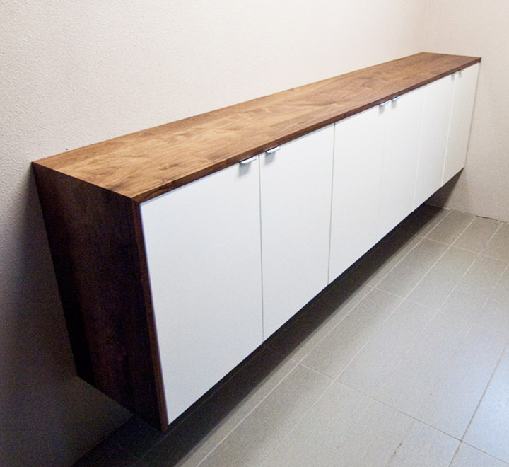
Matt of Wood&Faulk applied it to his kitchen remodel with the addition of a beautiful custom wrapped walnut top.

The Zerbey’s, architectural overachievers and DIY champions, took the idea to the extreme and built a floating stair wall and transformed simple Ikea cabinets into a full on built-in buffet with all the custom bells and whistles.

So, this concept is obviously a time-tested, tried and true solution for stylish folks needing minimal + modern + affordable storage.

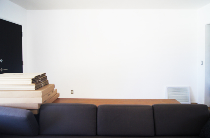
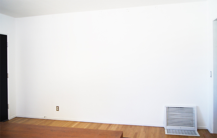
After the pipe shelving unit was removed, I’ve hunted around for a solution for this long awkward entry wall in the living room. The main issue with the pipe shelving was the lack of hidden storage, and frankly, I just kind of got exhausted looking at the clutter that was always on display.

The ten foot long open space dwarfs most furniture and I knew I didn’t want to use another tall, open shelving unit to replace the previous tall, open shelving that had driven me crazy. After months of resistance and fruitlessly searching to find the right piece, I recently gave into Ikea and bought the requisite components to build my very own simple fauxdenza.

Well, I’ve been working on it and like every other project in this place, have run into some issues. I had lofty ideas of using a live edge slab or creating a brass top, but the costs have been outrageous when it comes to something that needs to span ten feet in length. Eight feet? Not as much of an issue, but somehow those two extra feet have ended up killing all my hopes and dreams.

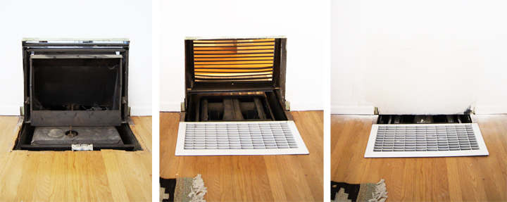
We removed the non-functioning weird heater thing and patched up the wall since that vent thing is an eyesore and is physically in the way. Unfortunately, all these boring prep details have turned into a bigger hassle than expected. I’ve been looking around for the right kind of top that’s interesting but still affordable and I still need to find a larger than normal floor vent (since we aren’t talented enough to patch the floor) as well as find a chunk of baseboard that matches the vintage baseboard installed throughout the house.

The metal thing is gone, the wall is patched, but all in all it’s still a hot mess.

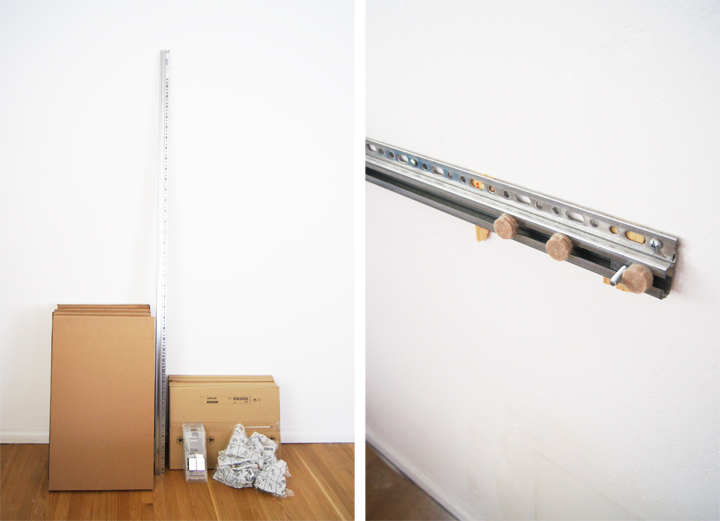
I bought four Ikea 30 x 18″ AKURUM fan cabinets with white APPLÅD doors and STRECKET handles. Pretty basic stuff that rounded out to cost a bit under $200.

Since the plaster walls are so wavy and uneven, the metal hanging rail had to be shimmed and fussed around with to create some semblance of flush evenness when the cabinets are hung.

Between annoying repairs and shimming, finding and customizing the top as well as trying to get the cabinets to hang without giant gaps, the project has been slow going. Hopefully soon, I’ll have it all up and finished and storing things.

Hopefully.

I have so many things that need to be stored.