Archive for the ‘living’ Category

ALT & CAMP

Tuesday, January 17th, 2012

Two things.

ALT SUMMIT is going down this week.

&

PHOTO / CAMP is coming.

???

It’s all crazytown around here.

Did you notice how I tried to casually slip this by?

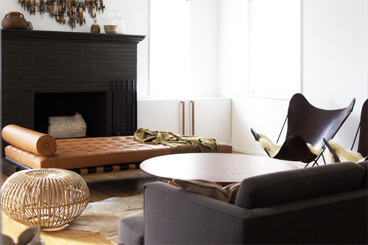
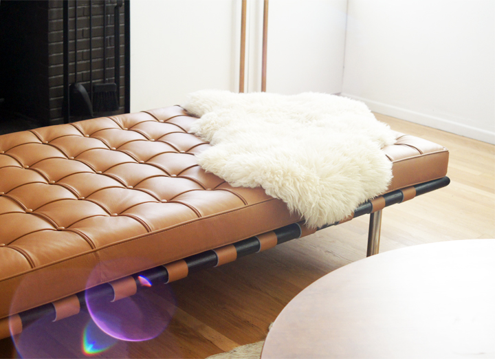
Hello, daybed.

This hunk of comfy recently arrived from Alex and I’ve been fiddling with the living room to accommodate it. Too bad I haven’t had time to make all the changes and or finish up the manic futzing that must be done. Hopefully soon, but just not quite yet.

*Try and ignore that badass brutalist wall sculpture, BTW.

And on another note.

Here’s a little preview announcement of something Laure and I have been working on that we’ve christened Photo / CAMP. The first workshop, FIELD GUIDE, shall go down on March 23 in Los Angeles. It will be incredible.

OK, so FIELD GUIDE is an introductory workshop that breaks down digital photo editing in a hands on, no BS way. Bring your photos, bring your computer and bring your questions – no matter what level of experience you bring to the table. We’ll walk you through the process of making any sad photo look amazing.

Full launch and more details to come.

Let’s take it slow and ease into things.

I thought to mention it before being all up in Alt. If folks are curious and also going to be there, I always enjoy a good nerding out on photo stuff.

Oh jeez, so I will shortly be heading out to Salt Lake to speak on the Interior Design Blogging panel with Emily Henderson, Jenny Komenda and Kirsten Grove. It should be a hoot? Yes! So, come and ask naughty questions.

Wait, are you guys going to Alt? This is my first time and I’m not sure what happens. Fight club, probably?

If so, please say hello or give me a high five or something. I’ll be the nervous one actively avoiding being in pictures while also avoiding wearing white whilst also saying wildly inappropriate things at all the most awkward moments.

HIGH FIVES.

FIREPLACE

Tuesday, September 13th, 2011

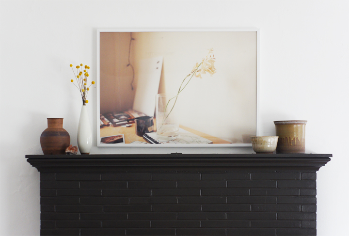
A little while back Laure and I went through her storage and pulled out a few portfolios filled with large scale photos she had taken during art school. We framed one great landscape for her bedroom and it looked so crazy amazing that she graciously let me borrow this softly colored desk shot so I could have a big ‘ol framed photo as well.

I hung it and looked at it and then texted her a picture of everything installed.

While it’s a great piece, we both agreed that it was being completely overpowered by the fireplace. Off to another spot with you!

The area above the fireplace has been an ongoing struggle, with many unsatisfactory incarnations including these – HEREHERE HERE.

The problem is scale.

Our ceilings are a standard 8′ tall, but the fireplace rides pretty high on the wall allowing for a mere 37″ of white space above the mantel. Two thin windows flank the fireplace on either side and their top moldings create a weird invisible horizontal line across the wall. When anything hangs near or above this strange visual trickery the ceiling begins to feel really low, while conversely, the art appears to be hung way too high.

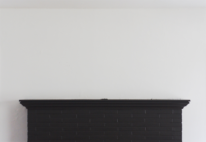
Then there’s that mantel.

Blech.

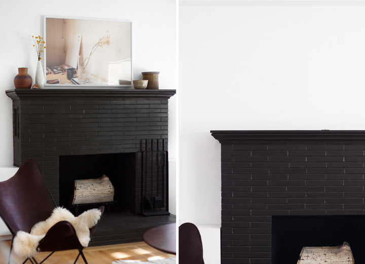
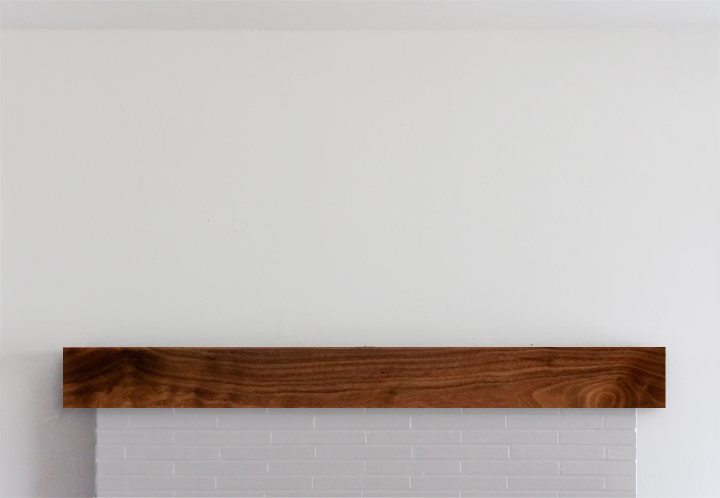
Overly fussy and completely under-scaled, this has been one of those “I’ll get to it projects” that never seemed to be gotten to. All I’ve ever imagined doing was installing a simple but chunkier wood mantel over the top of this thing. Something boxy, something easy to build, something budget friendly.

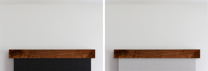
Excuse my terrible photoshopping, but a solution as simple as this uncomplicated wood box would be better scaled and suited for the fireplace mantle, easily constructed and pretty cheap materials-wise.

Screw it. Why not go all change crazy and paint the brick a lighter color like a soft gray/almost white. Or go slightly less nuttier and paint the thing a true black.

(I’m leaning lighter – if for no other reason than to shake things up)

Over the mantle art-wise is still an issue. I’ve hunted for the perfect long and lean piece to snuggle up into that strangely proportioned spot and have come up with ZERO things after almost four years of searching. Time to DIY.

Surprise surprise. I can’t afford a Stella or a Judd or any blue chippy art. I mean, I wish I could – that would be INCREDIBLE – but I can’t even find an affordable no-name modernist abstract painting or mid century fiber art wall hanging, let alone ANYTHING that’s both famous and super long and lean.

Making some fauxart has long been a noodle in my brain (and something I have done before). Why not. Faking it is fun.

I’ve been mocking up a few different (easily made) options – but SHOCKER – this long/thin composition isn’t widely popular with artists whose work I dig. Or really any artists. ‘Cause it’s weird.

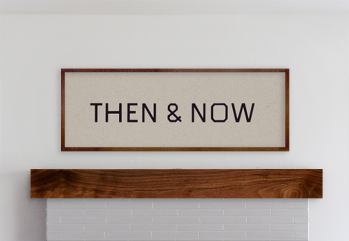
Firstly, a fake Ed Ruscha, well actually it’s from his art book THEN & NOW. I don’t know, it’s not a favorite – I just always liked that project and this typography. Plus this would be so easy to make.

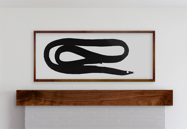
Next idea was a fake Matthew Brannon. I always liked his larger scale installations – like the Whitney limply coiled eel, a reoccurring motif in his work. It’s the right scale and I love an eel.

Otherwise, most of the artist’s work that I love looks awkward as hell squished into a format like this or is too labor intensive for my quick and dirty faker style. I though I could pretty easily pull-off something text based like a Weiner or a Holzer or a Shrigley or a Nauman or even a Baldessari – but nothing felt quite right (even though I love me some Weiner).

I’ll always remember this story a teacher once told me about going to another rather famous artists studio. He was admiring all the Jasper Johns and Warhols (or things equally blue chippy) and asked about the pieces. “Oh those? They’re all fakes – I just made them. Come on, I can’t afford that shit.”

Mantel first, forgery later, methinks.

FAUXDENZA

Friday, August 19th, 2011

BOOM.

It’s mother-effing fauxdenza* time.

We could flashback to the rough beginning of this particular fauxdenza via the power of HYPERLINKS or maybe just scroll down for a refresher.

OK. Let’s get our DIY on.

* Trademark via Anna at D16 & blatantly used here ad nauseum.
 

FAUXDENZA

Dimensions: 10′ long x 13-1/2″ deep x 33″ tall

Materials:

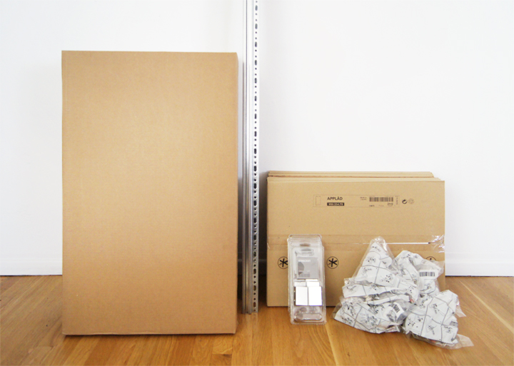
Ikea

8  –  Applad Doors (15 x 18″)
4  –  Akurum Wall Cabinets (30 x 18″)
8  –  Integral Hinge (2 pack)
2  –  Akurum Suspension Rail

Lumber

1  –  Wood  (14′ L x 15″W x 1″T) *I used Afrormosia

Tools:

Drill
Circular saw
Level
Tape Measure
Ratchet
Screws + appropriate anchors
Shims
Steel Wool
Fine Sandpaper
Danish Oil
Feed n’ Wax
Clean Rags
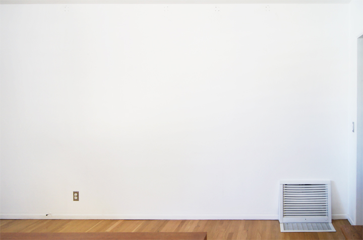
This poor, strange living room wall…

There was once a pipe shelf. Then I got bored with that. Then nothing for a bit. Then a floating storage credenza sounded good. Yup. Fauxdenza.

The whole fauxdenza thing boils down to just installing Ikea kitchen cabinets way, way too low. Since the tops of the wall cabinets aren’t meant to ever be seen and are all uglified, making some sort of aesthetically pleasing top becomes necessary. But first, installation.
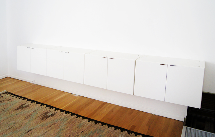
The Akurum suspension rail system is designed to levely hang Akurum wall cabinets very simply. Of course, to install the rail you have to choose appropriate wall fasteners for your walls. For our plaster walls, screws into studs plus heavy duty anchors worked perfectly.

I test mounted the cabinets to see what the plumb/level situation was going to be when confronted with our old plaster walls.

Obvious shocker. Old plaster walls are really uneven.
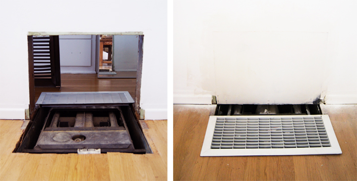
The walls are wonky, but the other installation hurdle was that creepy giant non-functioning heater thing. Not only did it ugly up  the place, it’s location blocked the centered installation of the loooonnng fauxdenza.

So we removed the internal bits, framed out the wall, patched and painted it up (although, finding matching molding and large floor grates are still an issue).
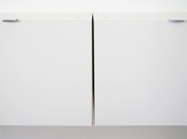
Old house + plaster walls = Gappity gap gap

The last cabinet had a pretty large gap since the plaster wall took a sudden curve.
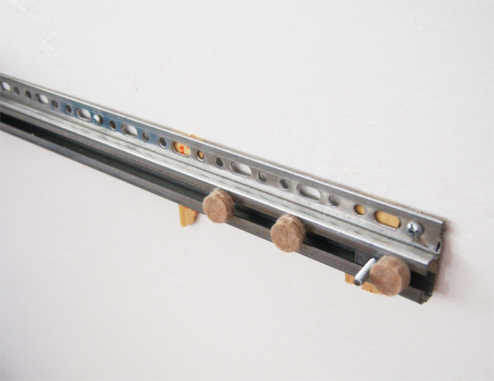
To correct the gap, first we shimmed the rail with some broken paint sticks from Home Depot, because that’s how we roll (unprofessionally). It was clear that the initial shim was nowhere near deep enough. We tested out how deep it had to be by sticking those little furniture foot pads onto the rail (unprofessionally).

Turns out, the last cabinet needed over an inch of the wackiest shimming you’ll never, ever see.
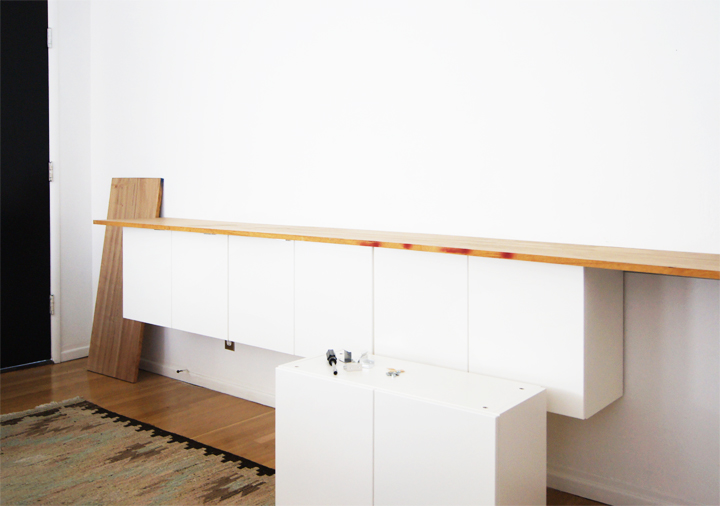
With the extreme shimming resolved and stuff hanging level, hiding the enormous new shim gap was the next quandary. The simple wood top I had planned on installing had to continue and wrap around the sides of the cabinets to disguise the monstrous shim gap.

For the newly expanded wood wrap, it felt best to find a better grade hardwood than I could grab at Home Depot.
With some brief googles I found Peterman Lumber, a local mill/lumber yard that specializes in domestic and exotic woods. They have wood wood, you know, wood you take seriously. Wood that won’t take crap from no one, no how.

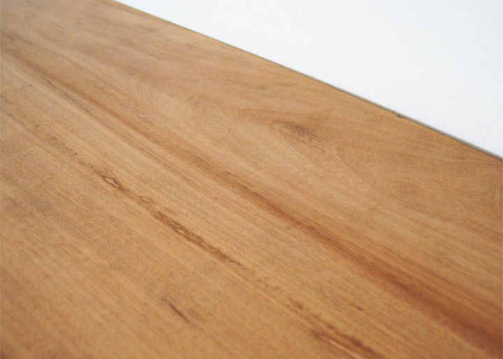
Tight budget in mind, I settled on a 14 foot long piece of Afrormosia, which is an excellent and – cough* cough* – cheaper teak substitute. Fauxteak.

At about 15 inches wide by an inch thick, the piece I picked ran about $100 and looked purtty.
We used a handheld circular saw to cut the wood down to size. No fancy woodworking, no miters. Just simple straight lines.

I traced along the front edge of the cabinet door onto the wood sitting on top of the cabinets and pressed flush against the wall. No brainer, no craziness. Cut on the traced line for a superb custom fit.
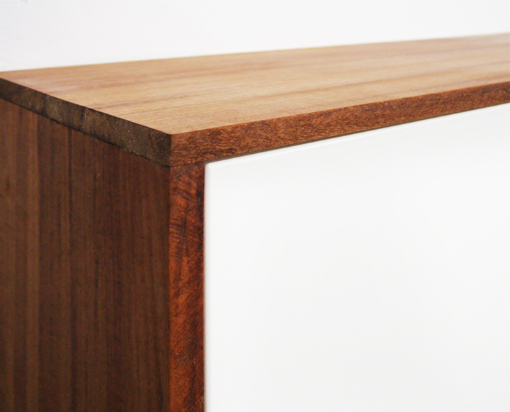
Each joint, as well as the edges, got a quick sanding to knock down any unevenness and smooth things out.

The rest of the wood got prepped with a once over sanding using super fine steel wool. Pretty much, I went with the same process that I use to restore vintage furniture to treat this new wood. Slap on a few coats of Danish oil and a few coats of Feed n’ Wax and…

Bam.

That untreated wood darkens up and looks incredible.
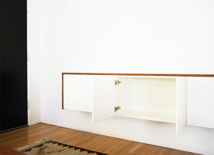
To attach the wood, I predrilled a few holes through the inside of the cabinet frames and screwed into the bottom of the wood to secure it; of course, do not go through it completely. It only takes a few strategic screws to set the wood solidly in place, all fancy looking.
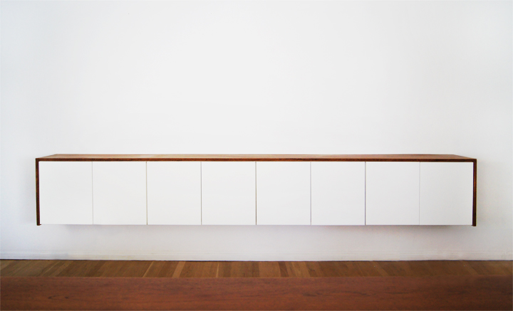
Initially, I had planned on using the Ikea Strecket handles and tested them out a bunch during the cabinet installation. Once the wood went on though, the handles suddenly looked way too fussy and got nixed.

Having no handles on the doors has been fine. The cabinets are high enough that I can comfortably grab the bottom door edge to open things up without any awkwardness.
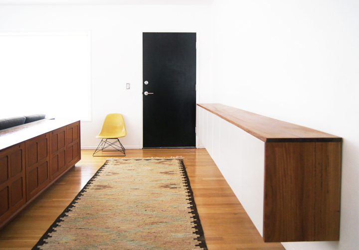
Done and done.

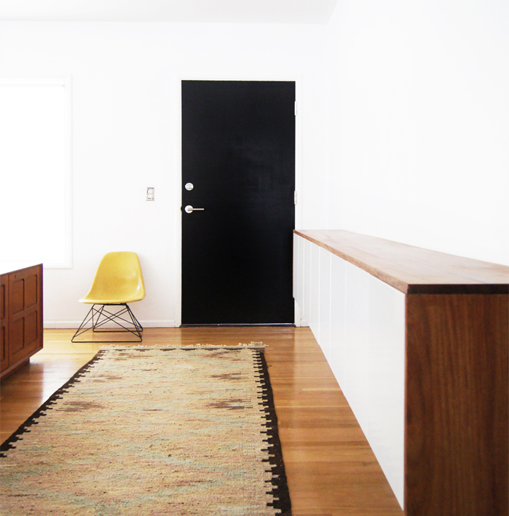
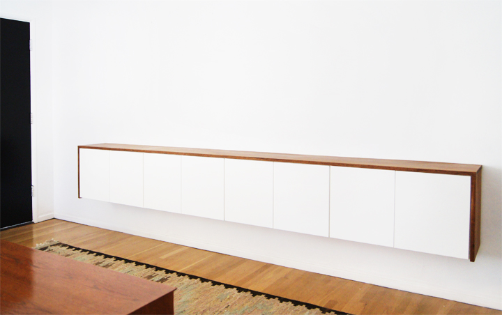
For about $300, some labor and some problem solving, we custom-built a ten foot long floating credenza that adds tons of storage while being perfectly scaled and custom fit on an awkwardly long and barren entryway wall.

Being both super customizable and easily constructed, the fauxdenza seems a clever DIY solution for a wide spectrum of storage conundrums. Plus it looks sexy doing it, which never hurts.