Albini Ottoman

September 10th, 2009

Oh no. I did. YES.

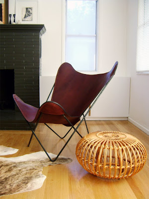
I was a bit of a naughty girl and decided to give myself a little present after a long hard tedious summer bereft of thrifty fun. The Franco Albini ottoman has been on my mind for a long time…I NEEDED one…a real one…desperately…

That stupid one click ebay bidding totally reeled me in. It is just so f*ing easy and addictive. Somehow I knew that this baby was destined to be mine, and in the end it was. For $102 – which was way over the budget I had in mind. Stupid internet.

Whatever, don’t judge me. Yes, this is not the thriftiest moment – but it is a deeply satisfying one. The ottoman is in amazing shape and BEAUTIFUL. Even all you rattan haters have to agree that this thing is rad.

Keep looking at it. Fall in love.
Winner!

September 10th, 2009

It’s gotta be that LEATHER y’all.

Medium Brown Leather reigns supreme. I knew it all along.

Maybe a more caramel colored sling was what I wanted originally, but these babies are going to patina nicely and they are soooo very well made.

Thank you Circa50. They are the loveliest.

Oh, and if you are ever in Manchester Center, Vermont be sure to visit the Circa50 store. Looks like it’s in a pretty wicked shopping area. (I didn’t know that Dansk had retail locations…awesome)

Anyone sick of seeing my living room yet? Too bad!

Name That Art

September 10th, 2009


I used to play this game called Name That Art. I would look through fancy pictures of fancier homes with my art savvy friends and try to name all the art installed on the walls and guess how much they paid. It can be very hard, but always pretty satisfying. I happened upon the above picture in my DESIGN! desktop folder that I always plop inspiring pics into and was shocked to see this John Currin painting so casually installed above the sofa.


John Currin
Rachel in Fur
2002 , Oil on canvas

(I swear, every single pair of sunglasses I buy are always inspired by this painting.)

I’m surprised that this painting didn’t end up in a better looking room. I mean, that painting is worth some DOLLARS. This room just seems a little underwhelming and uninspiring in terms of art placement and frankly totally WEIRD. What is up with the sad little framed drawing next to it that’s too thin and crooked to be symmetrical and then the installation of the big painting behind the green lamp? There is symmetry everywhere else in the room but the art installation. It’s just so awkward. Plus that saggy white sofa, off-white walls and molded plastic Eames knock-offs aren’t doing anyone any favors. It’s nice, but all in all a bit blllllaaahhhhh. Even the zebra rug looks like it just sort of gave up.

Maybe its not the real painting.

But we all know that little Mr. Marc Jacobs has the real deal.
Fucker.

I dare you to Name all that Art. Come on, this one is easy….