HERE & THERE

September 19th, 2011

Not that I’m one to get all frothy over Target collabos, but perhaps the Missoni for Target stuff turned out to be kind of a meh? It seemed to be a lot of plastic and polyester and poor construction, but the black and white stuff was the best? Fo’ sho.

Giant shocker, Hemet isn’t a bustling hub of fashionistas and design fans. I know?! How is that possible with such a large retirement population and two super WalMarts? So, when I stopped by Target at a leisurely 2pm on launch day to pick up food for the dogs and garbage bags, ’cause shizz be glamorous around here, I took a gander at the Missoni pieces.

Pretty much ended up with a case of the underwhelmed mehs.

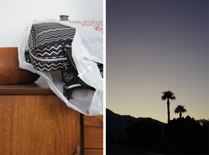
I did like this blanket thing – even though it was only sold online and sold out immediately – and did end up grabbing a few of the small black and white travel bags, since my luggage arsenal desperately needs actual bags to hold all the many fancy lady creams and powders I require.

The end.

Otherwise, on launch day the UPS guy wandered into the backyard to drop off a vintage Minolta Maxxum 35-70mm macro lens I recently won on the ebay for $30. Such a crazy day! TWO things happening? How do I keep it all together? Really. It’s a miracle.

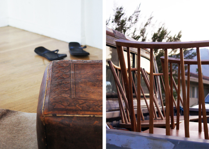
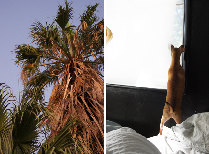
So, these are some meh pics wrought from quickly testing the new lens out. I think I’m feeling a bit of an underwhelmed meh over this lens as well.

My middle name is meh.

I don’t feel so meh about a couple recent Craigslist acquisitions. In fact, I’m feeling pretty YEAH.

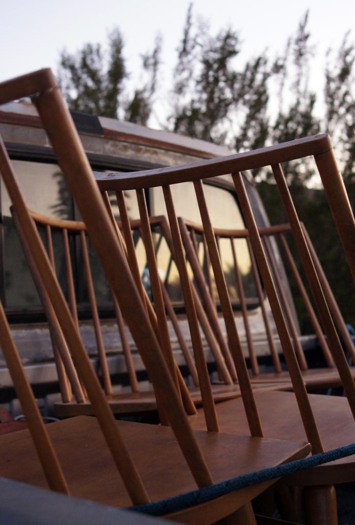
Headed out to Palm Springs in the late afternoon to pick up a few vintage bits off the ‘ol CL and took advantage of the twilight lighting to push this new/old lens through a few more hoops.

And yup. Still meh.

But did I hear someone say Russel Wright for Conant Ball dining set? Mmmm-hmmmm. Grrrrrrl.

From the few pics shot around our dusty as all neglect house, I found that the macro function wasn’t thrilling me. Also, the low light capabilities at F4 weren’t fulfilling all those wild fantasies and unreasonable expectations I had built up inside my heart. Over this $30 lens? That would change my life? Madness.

It’s a fine lens – not mind blowing – but maybe I need to put this thing through it’s paces. Or maybe I’ll keep buying more and more and more vintage lenses until that deep black hole inside of me is filled up with glittering glass.

I bet the CL guy – who I got the Wright dining set from – didn’t think I was a creepy insane person when I pulled out the giant SLR and wandered around the street to shoot pictures of the darkening sky…you know…instead of pulling out of his driveway and going home.

Because it’s never terrifying when a stranger from CL wanders around in front of your house with a big camera snapping a bunch of pictures after that always awkward transaction had supposedly ended.

No one would be freaked out by that. Come on.

Oh. I’m a creep.

Great.
CACTI

September 15th, 2011

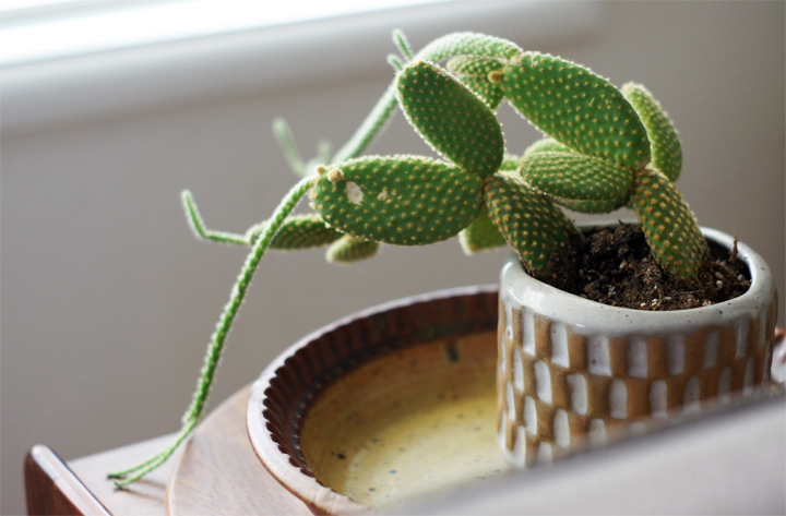
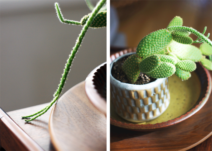
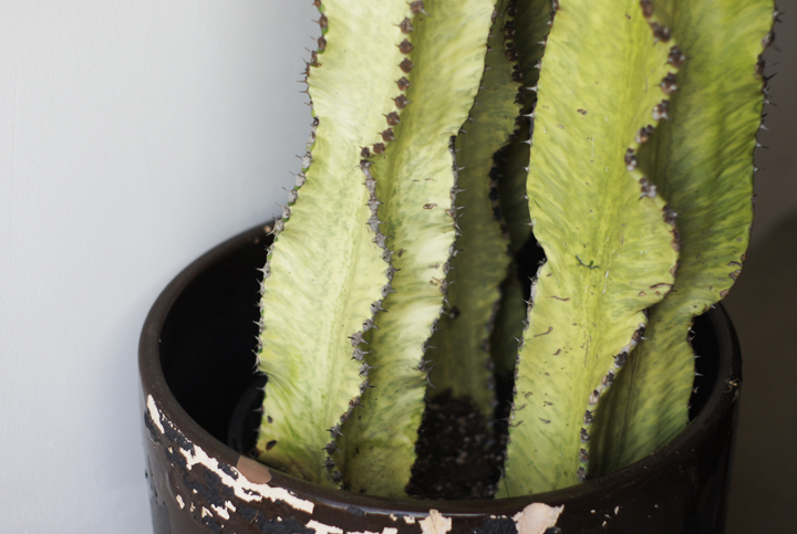
My cacti are all screwed up.

I hate plants.

How is it possible to constantly kill every living thing that comes into this house? Finally got a fiddle leaf fig tree – immediately dead. My terrariums? Mostly dead. My sansevieria? Dead. You see – everything living is dead.

Well, except for these two.

They’re OK.

But seriously, screw you cacti. Please stop suddenly drooping and turning brown and being all temperamental.

What’s wrong with you? Depressed? Thirsty? Bored? You got fungus? I neglected you like the instructions said to. We live in the damn desert – this is your home! YOU COME FROM HERE. You should be loving this.

I give up on cacti and plants and greenery in general (even though I’ve always dreamt that the house would be filled up with sculptural plants). They just keep committing suicide…or I’m murdering them. It’s a 50/50 chance.

DAMMIT.

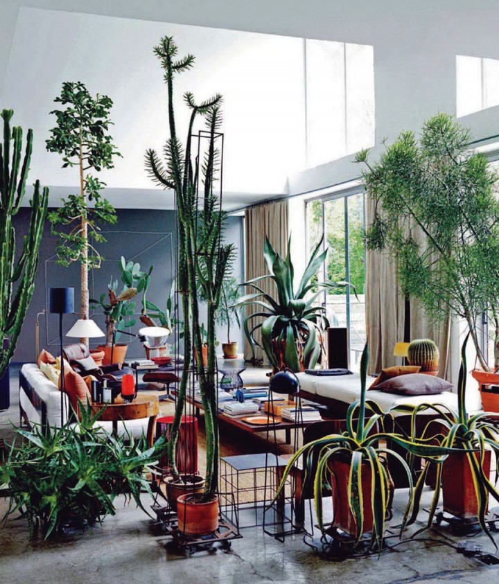
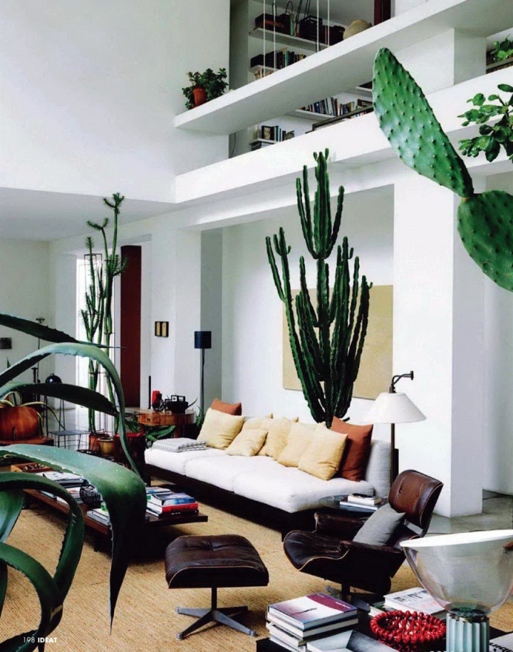
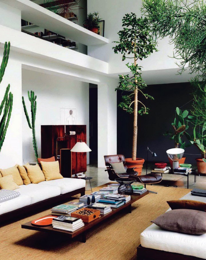
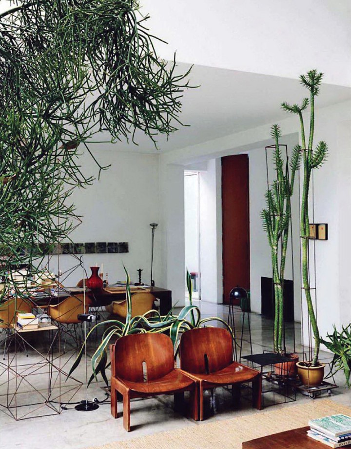
In my plant fantasy, I imagine my cacti reaching the sort of grand heights and mythic health that Maurizio Zucchi’s have. This is ‘effing plant pornography. These pictures are mocking me and my stupid plant failure. Also, that entire interior? You know, pretty much PERFECTION on every single level. Dammit.

(you’ve probably seen these images from Ideat Magazine-June 2011 via iiiinspired).

Mocking me.

Bastards.

FIREPLACE

September 13th, 2011

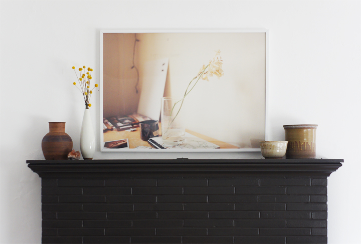
A little while back Laure and I went through her storage and pulled out a few portfolios filled with large scale photos she had taken during art school. We framed one great landscape for her bedroom and it looked so crazy amazing that she graciously let me borrow this softly colored desk shot so I could have a big ‘ol framed photo as well.

I hung it and looked at it and then texted her a picture of everything installed.

While it’s a great piece, we both agreed that it was being completely overpowered by the fireplace. Off to another spot with you!

The area above the fireplace has been an ongoing struggle, with many unsatisfactory incarnations including these – HEREHERE HERE.

The problem is scale.

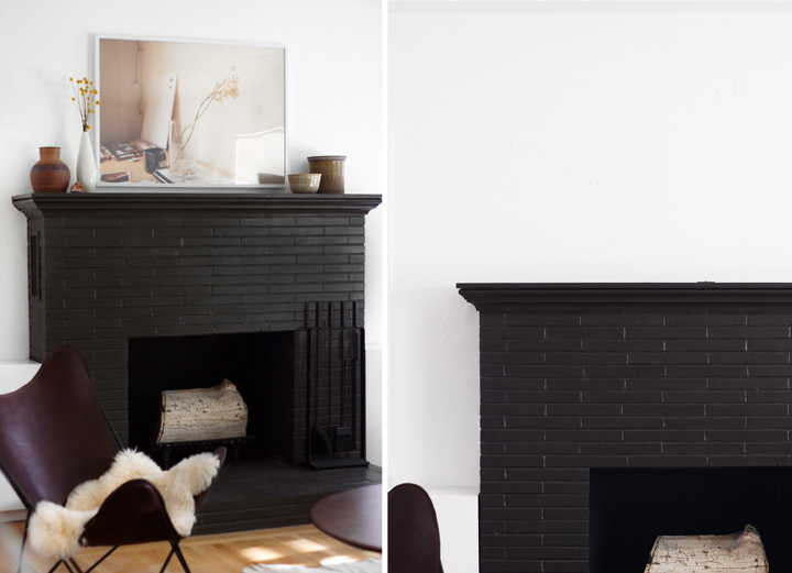
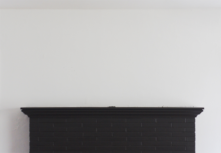
Our ceilings are a standard 8′ tall, but the fireplace rides pretty high on the wall allowing for a mere 37″ of white space above the mantel. Two thin windows flank the fireplace on either side and their top moldings create a weird invisible horizontal line across the wall. When anything hangs near or above this strange visual trickery the ceiling begins to feel really low, while conversely, the art appears to be hung way too high.

Then there’s that mantel.

Blech.

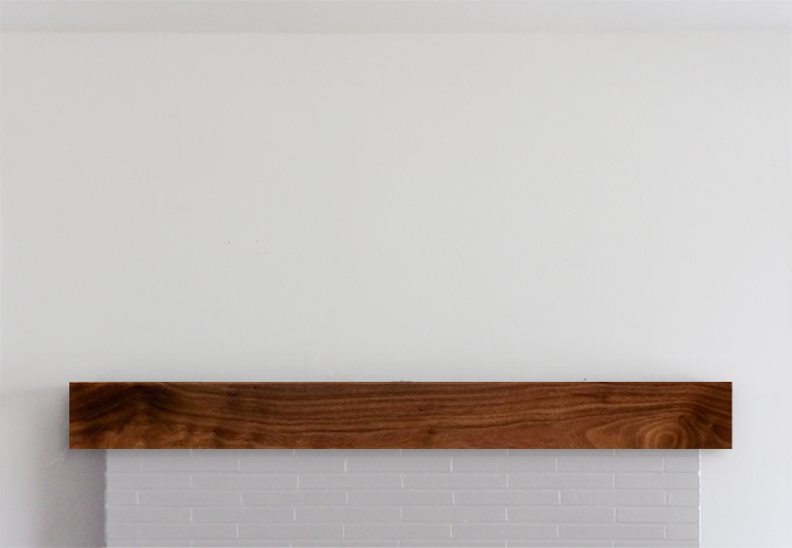
Overly fussy and completely under-scaled, this has been one of those “I’ll get to it projects” that never seemed to be gotten to. All I’ve ever imagined doing was installing a simple but chunkier wood mantel over the top of this thing. Something boxy, something easy to build, something budget friendly.

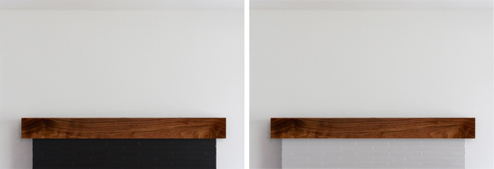
Excuse my terrible photoshopping, but a solution as simple as this uncomplicated wood box would be better scaled and suited for the fireplace mantle, easily constructed and pretty cheap materials-wise.

Screw it. Why not go all change crazy and paint the brick a lighter color like a soft gray/almost white. Or go slightly less nuttier and paint the thing a true black.

(I’m leaning lighter – if for no other reason than to shake things up)

Over the mantle art-wise is still an issue. I’ve hunted for the perfect long and lean piece to snuggle up into that strangely proportioned spot and have come up with ZERO things after almost four years of searching. Time to DIY.

Surprise surprise. I can’t afford a Stella or a Judd or any blue chippy art. I mean, I wish I could – that would be INCREDIBLE – but I can’t even find an affordable no-name modernist abstract painting or mid century fiber art wall hanging, let alone ANYTHING that’s both famous and super long and lean.

Making some fauxart has long been a noodle in my brain (and something I have done before). Why not. Faking it is fun.

I’ve been mocking up a few different (easily made) options – but SHOCKER – this long/thin composition isn’t widely popular with artists whose work I dig. Or really any artists. ‘Cause it’s weird.

Firstly, a fake Ed Ruscha, well actually it’s from his art book THEN & NOW. I don’t know, it’s not a favorite – I just always liked that project and this typography. Plus this would be so easy to make.

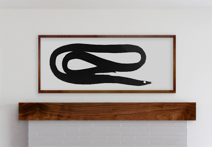
Next idea was a fake Matthew Brannon. I always liked his larger scale installations – like the Whitney limply coiled eel, a reoccurring motif in his work. It’s the right scale and I love an eel.

Otherwise, most of the artist’s work that I love looks awkward as hell squished into a format like this or is too labor intensive for my quick and dirty faker style. I though I could pretty easily pull-off something text based like a Weiner or a Holzer or a Shrigley or a Nauman or even a Baldessari – but nothing felt quite right (even though I love me some Weiner).

I’ll always remember this story a teacher once told me about going to another rather famous artists studio. He was admiring all the Jasper Johns and Warhols (or things equally blue chippy) and asked about the pieces. “Oh those? They’re all fakes – I just made them. Come on, I can’t afford that shit.”

Mantel first, forgery later, methinks.