POTENCE STYLE DIY LAMP

June 2nd, 2011

The Potence lamp by Jean Prouvé is one of those elegantly minimalist lighting solutions that appears easier to construct than it actually is. Well, for me at least. I tried and failed, MISERABLY, to build an affordable DIY version for our bedroom and eventually gave up hope. Then? This email popped up brimming with pictures of a homemade version of the Potence that blew me away. Logan of ONEFORTYTHREE had written a comment long, long ago when I first posted about trying to build one of these thangs –

“Logan on February 1, 2011: I like the lamps but you’ve inspired me to try and make that wall lamp. It looks cool but too expensive to consider buying. If I can, YOU can! cause I’m a self-taught DIY’er too.”

Then? He totally f*cking did it. Like a DIY champion. Also, nope – turns out I can’t.

BOOM.

Did I mention that I kind of slobbered all over his emailed pictures and was like ohhh, ahhhh, woooow, you are a master fabricator, you are amazing, it turned out so great, mine failed so miserably…wink wink, nudge nudge.

So, Logan had been building a few of these tester lamps for friends and family while figuring out kinks and streamlining the fabrication process. I somehow ended up being lucky enough to get my hands on not one but TWO of the prototype versions. By unashamed groveling, perhaps?

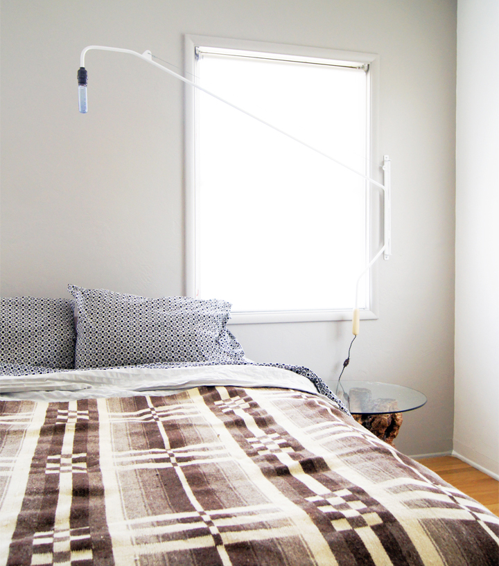
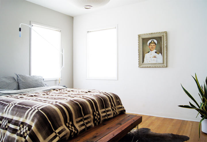
One white version for the bedroom – which can swivel and swing to illuminate whichever area your heart desires.

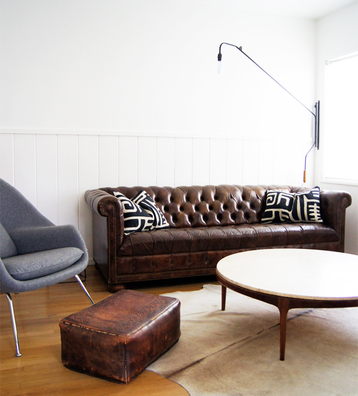
And one black version for the den. Both areas we tend to relax, enjoy a good book or perhaps a long game of Words With Friends.

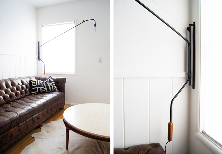
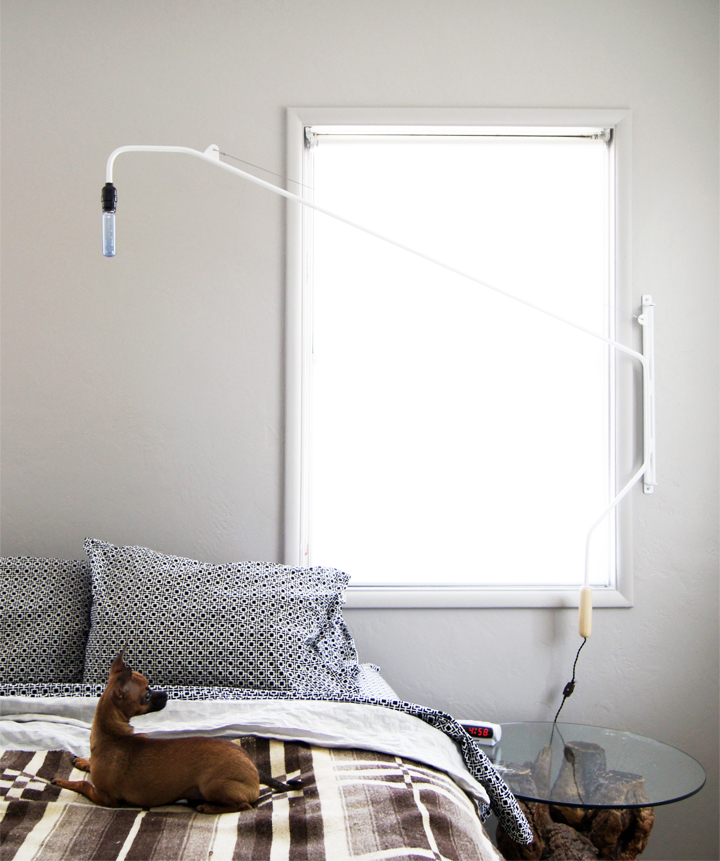
See? It swivels! You use the little wooden handle to move the lamp into position.

I love the detail of the braided cloth cord and handy little on/off switch positioned a little ways down the wiring. Logan worked it out on the little details to keep the lamp sleekly minimal but with areas of warm texture.

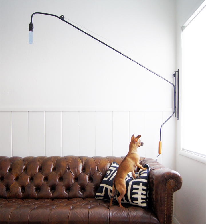
Chihuahua for scale.

My lamps are about six feet long and are perfect and I love them. Loved them so much and was so impressed by their handmade completely from scratch construction that I may have been a little forceful about Logan making a few available for sale. Maybe because I want to put them in all the homes I’m working on? Maybe out of complete selflessness? Weld! Weld till your fingers bleed!

Be sure to check out ONEFORTYTHREE for the DIY how to as well as even more of Logan’s great DIY projects and home renovation. A limited run of these lamps will be available in his newly minted ETSY STORE. Check them out and be on the lookout for additional handmade items to be added in the near future (wink wink, nudge nudge Logan).

*Also, homeboy just got engaged to his lovely, talented and hilarious lady. Congrats! Roxy was rocking some Vegas style bling at the big sale for realz.
REMIX

May 31st, 2011

Slowly the house is getting put back together and rearranged to reflect the much less hoarded out state we had been living in for the past few months. I can’t even show pictures, it was just too horrifying. You will just have to imagine stacked piles of furniture and odd bric-a-brac overwhelmingly overflowing through the entire living and dining room.

It was so bad that we had to create a single hoarder style path to the front door. So, so incredibly bad that delivery people gave us funny looks when the front door wouldn’t open all the way and kept asking if we were in the process of moving.

Now we are blissfully decluttered and I’ve been rearranging all the leftovers into some sort of coherent floor plan as well as getting excited about acquiring a few new pieces.

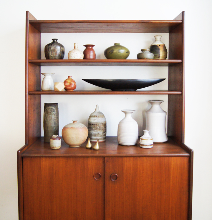
During the big sale, I deaccessioned a large part of my studio pottery collection. While there is still a ton of ceramics sprinkled here and there, it feels good to be able to go a little more minimal in vignette town. Now to somehow resist the urge to scoop up peoples old high school ceramic projects…

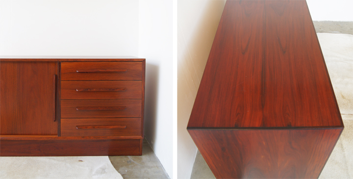
Here’s a peak at a recent Craigslist acquisition. It’s a Danish rosewood credenza which is currently being repurposed as a media unit in the den.

We still need to mount the TV on the wall, but this thing is so much better than the dresser we were using before. This puppy hides away all the cables and ugly boxes and frees up so much visual and physical space that my heart is all aflutter. I can’t wait to have everything fully installed and looking banging…but I just do the furniture thing. I’m leaving it up to Jeremy to figure out the boring electronic stuff.

SHOP

May 26th, 2011

Hold on. Whoa. I know. Wait. Just. Stick with it.

Before you say anything, I honestly hope you’ll feel deep within your innermost sticky parts my honest regret radiating out of the interweb. I’d planned to have something more entertaining to slap up on the ‘ol blog, but apparently failed monumentally. Trust that I fully realize things have been INCREDIBLY furniture heavy around here lately.

Maybe it might be prudent to address this whole ebay shop thing. Maybe I’ll put that off for a bit…let’s do that later…

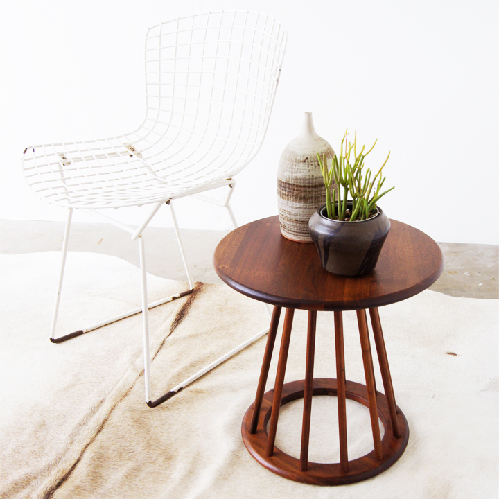
Hows about we look at this mid century spindle table. It’s trying so hard to be like a Warren Platner, so very very hard. Just give it up table, it’s not going to happen. You are already spindly and wooden and can hold stuff like a champ.

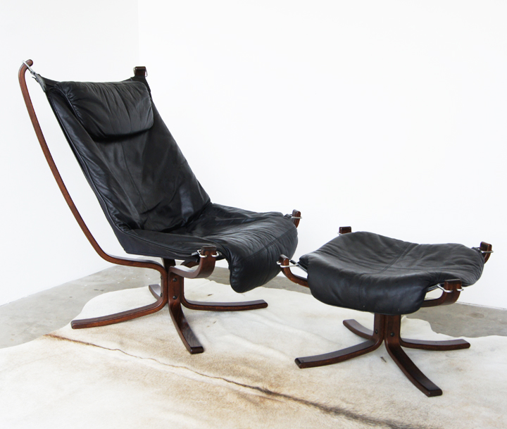
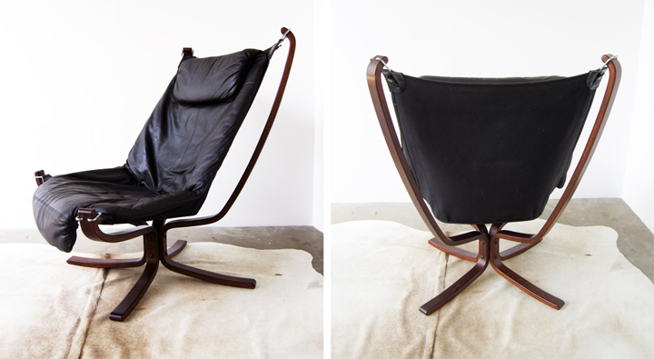
This one is for the fellas! It’s a super sexy leather and rosewood Falcon chair + ottoman designed by Sigurd Ressel for Vatne Møbler, Norway.

If our Chesterfield sofa wasn’t all brown town and all leather, then this hot thing would be our television lounging chair. Turns out that all that dark leather and dark wood piled into a single room feels way more bachelor than my admittedly masculine taste can handle.

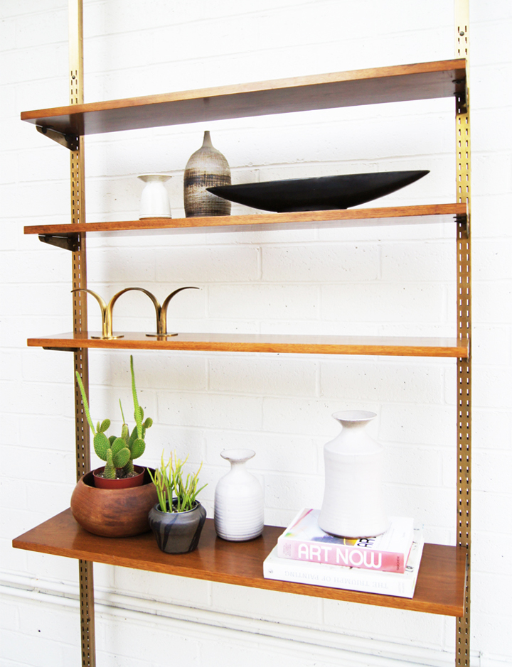
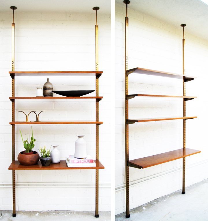
Hey! This vintage adjustable tension shelving unit / room divider has long been apart of the ever evolving den. With all the switching and change going down in there it’s time for this baby to move on to a better place.

Apparently that better place was not my little photo area. The roof was about a foot too low to install this puppy in the designated photo zone – so the rear exterior brick wall with all it’s awesomely random pipes and slanted cement slab ended up being a stand in. We try and keep it classy. With water softener pipes.

These should be up in the BRICKHOUSE MODERN radically hardcore shop around 7pm-ish, depending of course on how my software wants to behave.

Ugh. Time for the the shop talk? Blech.

I’m assuming we are all intelligent and reasonable people. Most of the time at least? Right? I feel silly pointing out something this simple, but…

This little renovation (or maybe design blog? home blog?) is going to be really, really boring and pointless if there are no funds for projects or a house.

Kate recently dealt with a similar issue and bloggers can attest to this, but it blows getting rude emails and disparaging comments regarding a project you’re psyched and invested in doing. It also blows attempting to not take it totally personally (you know, those totally impersonal attacks on a personal blog about personal choices).

What doesn’t blow is all the researching, traveling to find pieces, spending hours laboring to restore them, troubleshooting the day to day complications, styling, photographing, editing, answering questions, arranging shipping and so forth that this venture requires. After years documenting furniture zooming in and out of the house and selling in every imaginable venue, it seems obvious I’d be very into doing this particular type of thang.

The online shop wasn’t intended to be quick or temporary but was labored over and approached as a serious endeavor. It’s also an additional way to help with the living in and fixing up of a modest brick house in an unbearably dull and low income retirement community. So yes, *so* living the high life constantly. Glamorous crazy parties at Applebee’s every night of the week!

Ok, maybe soon I can write some entertaining or informative posts that aren’t about furniture? Yes!