SALE PREVIEW

May 11th, 2011

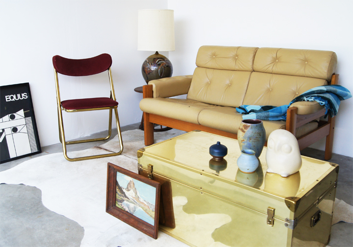
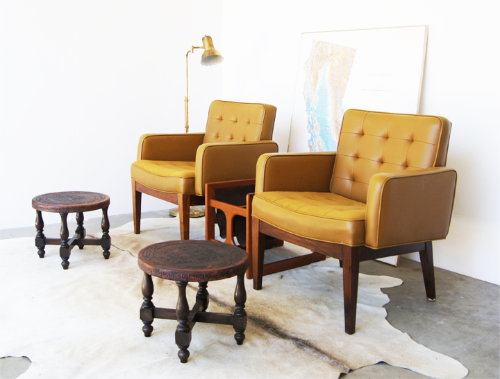
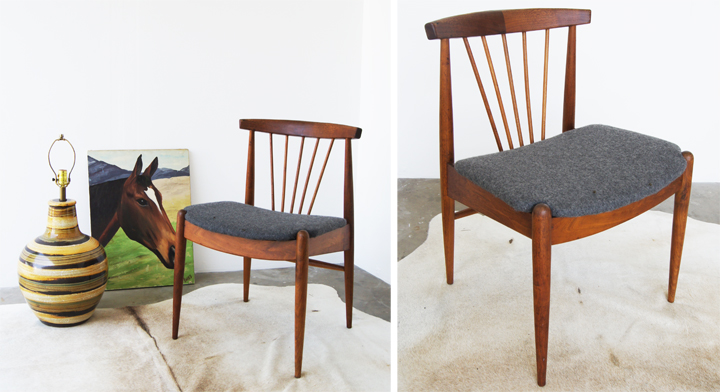
I tried to rustle up a few of the “easy to access” pieces that weren’t piled under an insane mountain of stuff in the garage (or were way too heavy for my measly lady arms to pull out) to give this sneaky peeky of the BIG SALE this Sunday. Of course this is just the tiniest little wee selection previewed – there are OODLES and OODLES of more stuff. TRUST, both small and large pieces will combine into so much vintage goodness that your head will explode.

I haven’t even shown you what Summer’s bringing – add to your imagination another whole giant load of tasty stuff.

Style and item wise it’s going to be all over the board. Just lump 1950 – 1970 together and shake that all up with everything you would need to decorate up your home. Furniture, accessories, lighting, weird creepy art, way too many ceramics…we’ve got it all and are loading up the convoy to bring it.

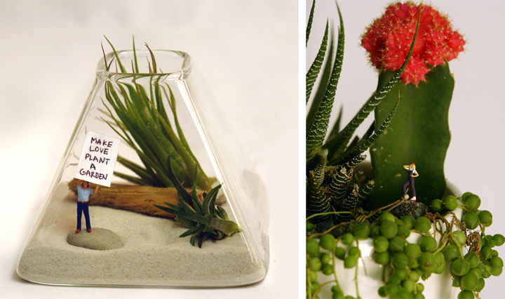
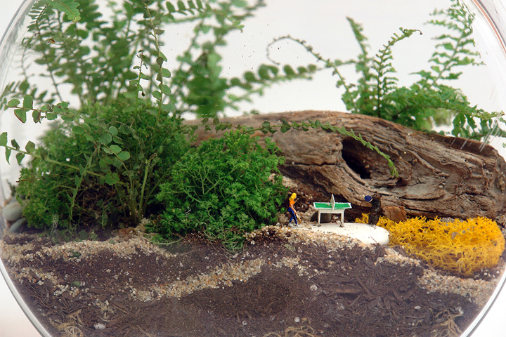
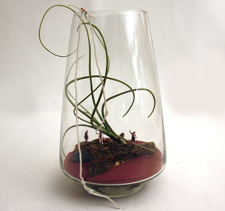
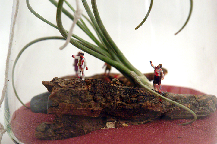
In addition to all the vintage, Bianca will be busting out some of her gorgeous terrariums from her shop Terri Planty. Be sure to look closely, there are miniature zombies and hikers, roller skaters and bears playing ping pong in those suckers.

It’s all going down THIS SUNDAY!

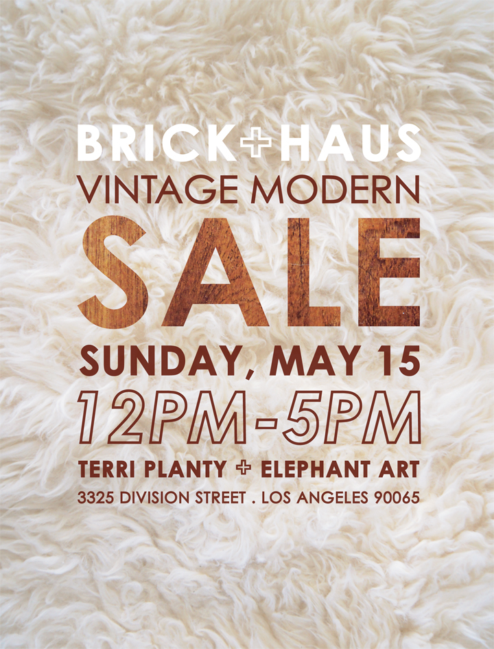
BRICKHOUSE + MODERNHAUS + TERRI PLANTY
Vintage Modern Sale
Sunday, May 15th
12 – 5pm
Hosted by Elephant Art Space
3325 Division Street, Los Angeles, CA 90065
(I swear it’s not at a dentists office, even though the map says so)

In terms of pricing, pricing will be commensurate with flea market pricing – we have lots of affordable stuff and some larger ticket items. There are project pieces that need a little work and pieces that are in pristine condition. You know the drill, homies.

In terms of payment, we will be accepting cash, paypal & credit cards. Ooohhh fancy town.

I’m so ‘effing nervous, my social anxiety is kicking in to the extreme – but I do really hope to see you there! Fun times? Drinks? Shopping? Yes?
WALL HANGING

May 9th, 2011

Since I love to stay hip and timely with the larger culture, I just finished watching the entirety of Twin Peaks. (Admittedly about twenty years late on that phenom, but hey, Netflix was really insistent that I’d enjoy it – and I did! But no Netflix, I don’t want to watch Tyler Perry’s Madea Goes to Jail or 151 episodes of Wings no matter how many times you insist.)

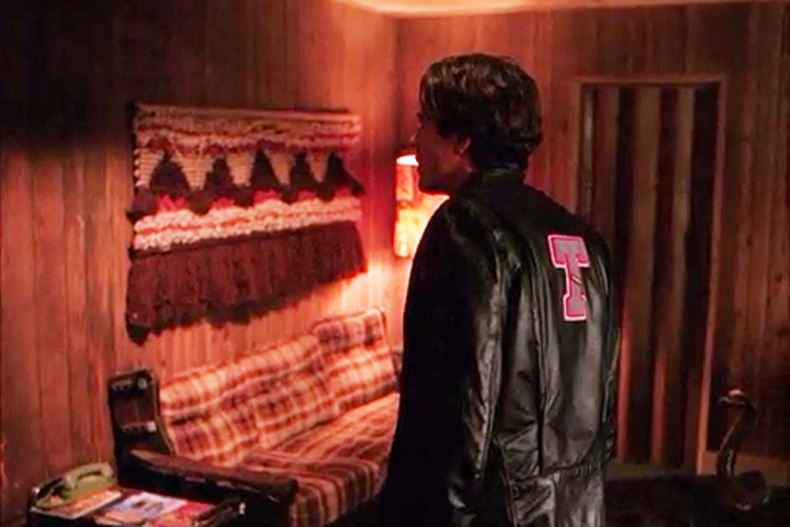
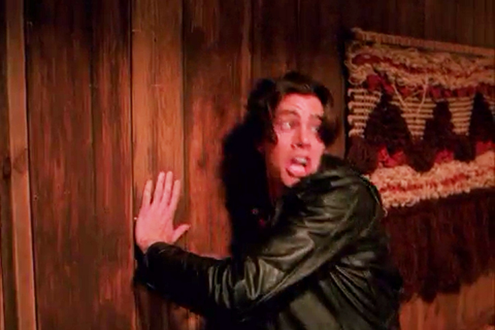
While watching Twin Peaks I totally became enamored of the unfussy small town interiors with that smidgen of surreal doom David Lynch pulls off so well. It’s all in the details, like the diner wallpaper and the log lady’s log and the crazy hotel and this wacky 1970’s chunky wall hanging pictured above.

Don’t be scared Bobby – just look at that cool fiber art thing. It’s great!

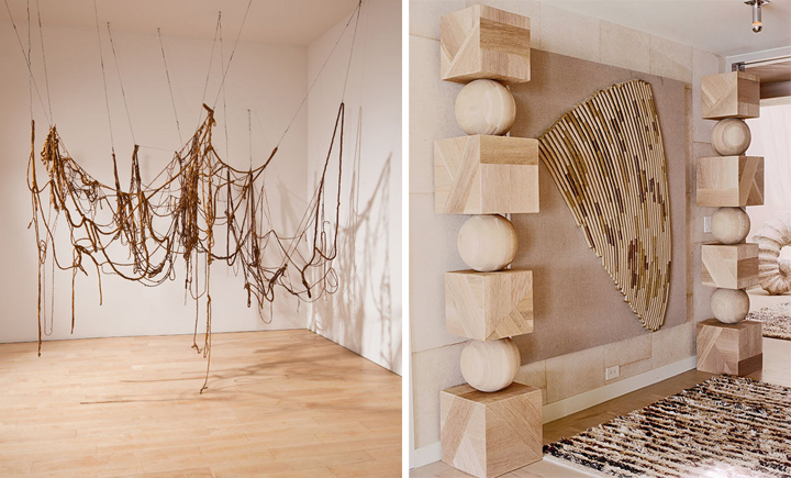
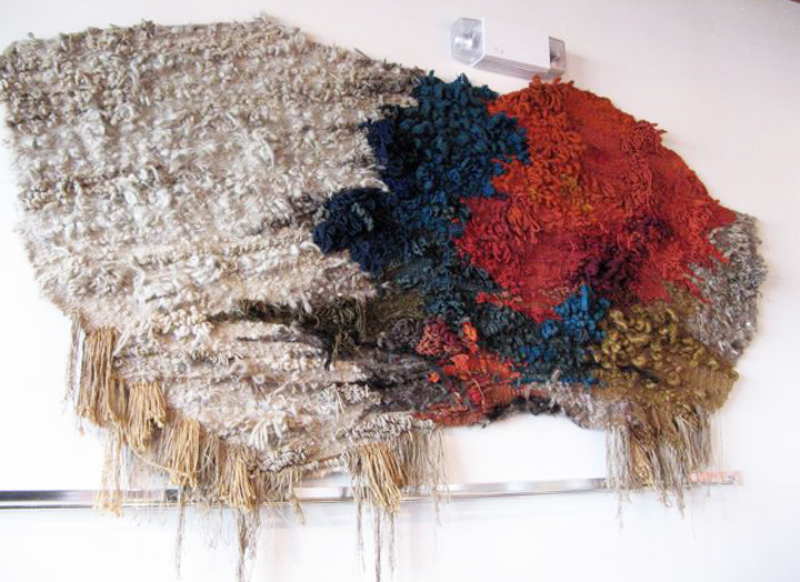
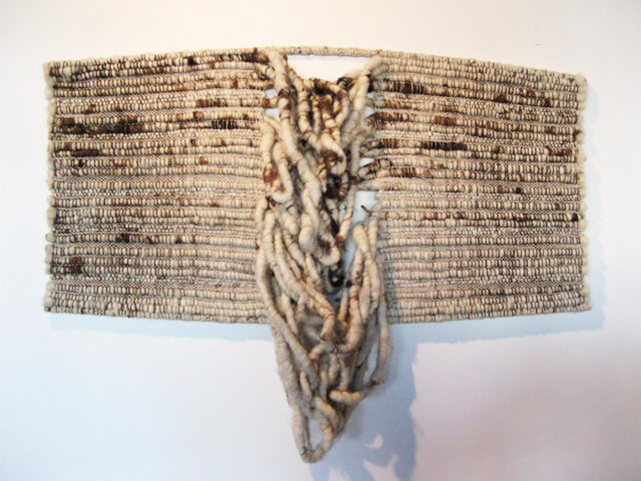
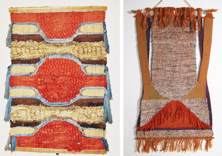
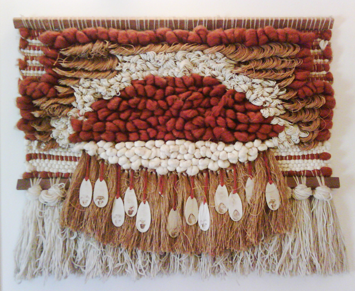
Inspired by this little fiber piece of Twin Peaks, I’ve been hunting around for images of 1960’s and 70’s abstract woven wall hangings in residential settings. Instead, I keep bumping into more extreme hotel and art installation versions. In particular, The Parker in Palm Springs has a plethora of giant tapestries and weird wall hangings throughout the hotel. Looking through their collection makes me sort of desperate to find one for above the fireplace or in the den or maybe for the living room wall where the pipe shelves used to be.

Officially, I’ve been obsessed with these things for some time but haven’t found that “perfect” one. I’ve scoured thrift stores, estate sales, ebay, flea markets, Craigslist and have come up blank. Possibly it’s that whole “if you’re looking for it, its not around” conundrum which equals frustrating bizzness.

Eva Hesse brings it all arty style while The Wearstler does it up super fancy with some Shelia Hicks.

Trust. This particular stuff ain’t cheap or skulking around the local Salvation Army.

Speaking of Shelia. Taking it to the next level.

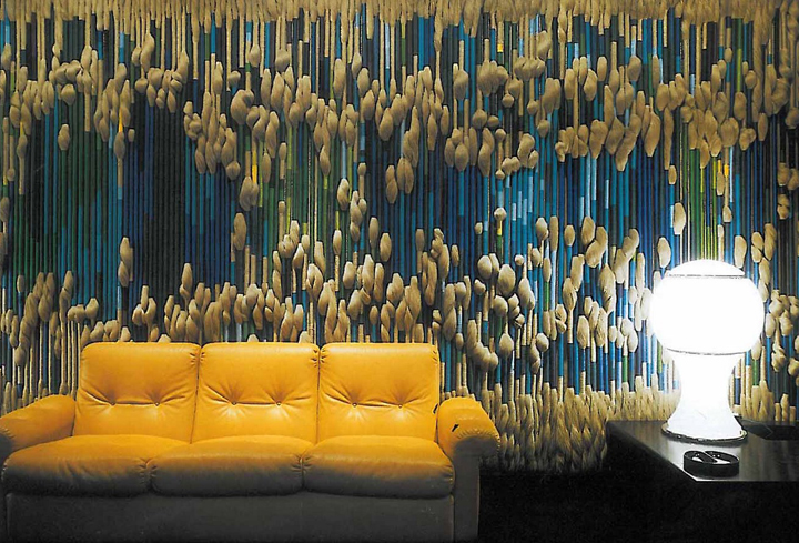
Oh yeah. This type of piece is more my speed. Oh wait – Studio 111 sold it to The Ace Hotel. Poopers. If you visit The Ace be sure to check it out in all it’s glory near the entrance to Kings Highway. This sucker is massive and amazing and deserves a second look over.

Also. Rock wall. Yup. Thinking ’bout it.

LOVE AND LOVE.

Sold and sold. Boo.

This baby was just on ebay and this Patricia Smith wall hanging can be yours at Object USA. Both are very cool, but I’m really looking for something way more chunky and way more horizontal.

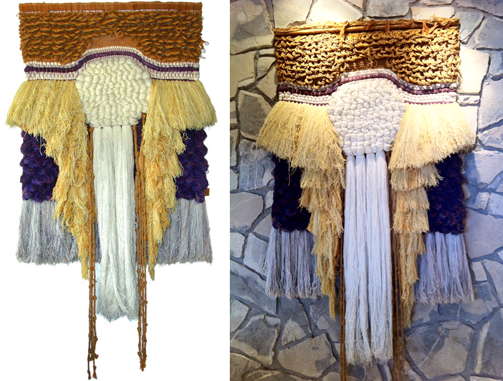
Yummers. This is the kind of perfect piece that I’ve been jonesing after. I like the color palette and the chunky texture – my only complaint is that I wish it was a little wider.

Also, totally not for sale. Crap.

Maybe I need to stop really aggressively looking and then one of these things will magically surface. I know they tend to be a whole lot of look, but there is something kind of charming and unusual about these weirdo wall hangings that I super enjoy. Kind of like Twin Peaks.

ROPE WALL

May 5th, 2011

I’ve been helping out Shelly Leer – aka ModHomeEc – with the design of her brand new upholstery workshop in Indianapolis. Shelly is a fantastic upholster and hosts classes to teach folks the ins and outs of fixing up and reupholstering their old forlorn stuff (a skill I can really appreciate).

With this open warehouse space, one big design issue Shelly needed help with was figuring out how to layout and define areas for various work and private “zones”. She needed areas for tools, areas for storage, an area for a personal office, a waiting area, an area to teach and work with students and so on and so forth. Functionally, this one big room had to be used for many many purposes and still be open, accessible and of course look awesome.

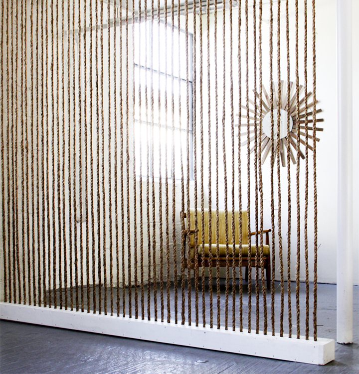
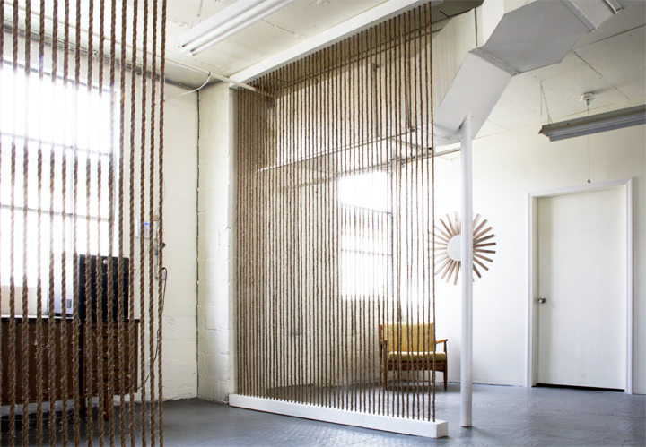
Since cost is always an issue (and this space is a rental), it wasn’t prudent to dump a bunch of cash into building traditional solid walls that would split up the space and make it feel smaller and darker. My solution was to build these vertical jute rope division walls that allowed for defined “zones” but still retained light and visibility throughout the entire space. A plus when using this type of jute rope is the added benefit of bringing in a chunky / graphic / warm texture to an otherwise cold and hard industrial room.

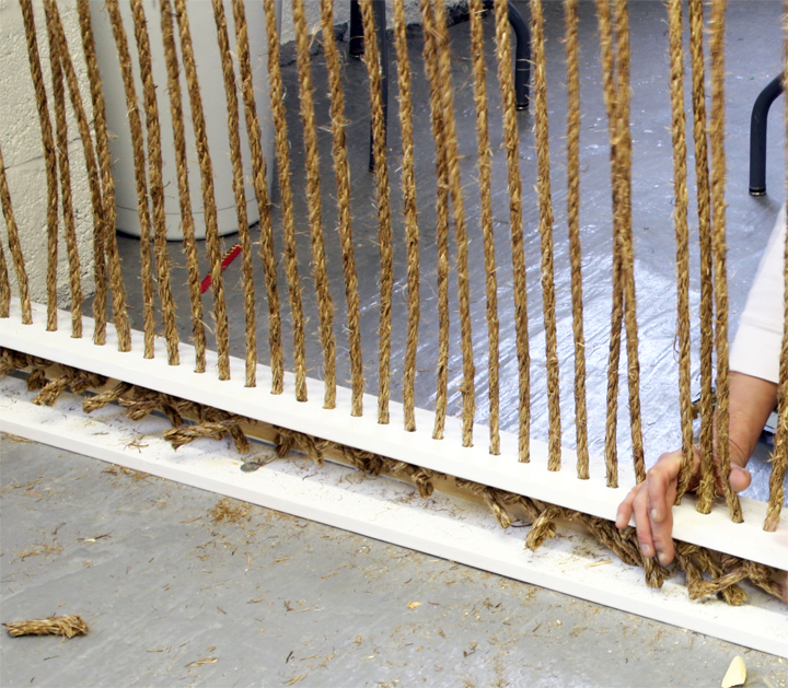
The construction process is pretty simple. Wood boxes were custom built with evenly spaced rope sized holes drilled through the top and bottom. Precut sections of rope were strung through the top and tied off at the bottom, allowing for the interior knot to hold the rope in place and taut. Just screw close the open side of the box and all those ugly knots are hidden away.

With this design the overall costs are kept pretty low for such a big impact. Rope is cheap, especially when bought in bulk, and wood boxes are very low cost to build. The true cost is going to be labor and time – it’s just a tedious and super repetitive process.

Come on. Hotness.

I think the outcome is pretty spectacular. Not that I’m bias or anything.

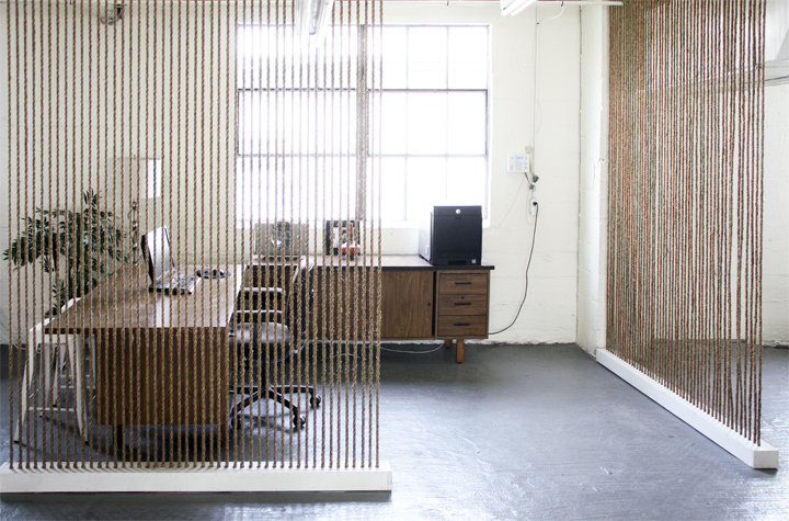
This roped off area is actually Shelly’s office!

I’m completely thrilled with how these rope walls came together and so happy I didn’t have to lift a finger and do any of the actual labor. There is another wall in the works that I’m pretty excited to see completed as well as other awesome ideas that came from designing Shelly’s new workspace to be affordable, functional and downright ‘effing stylish.