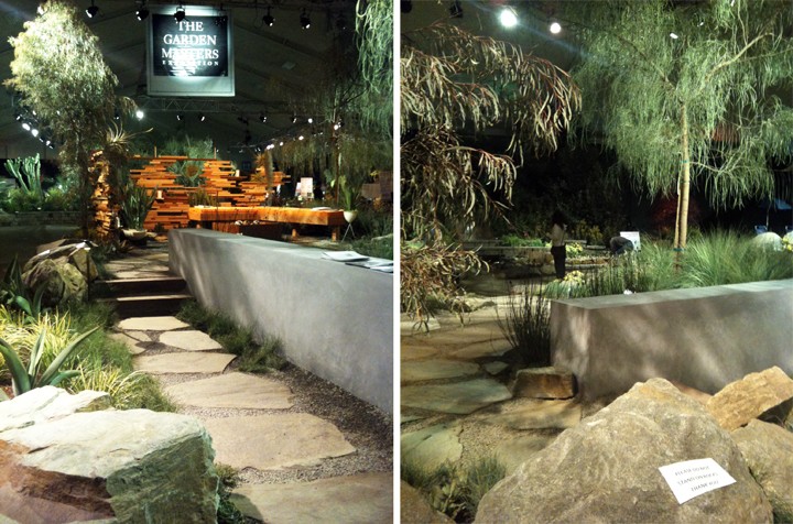
I headed out to San Diego to check out Ryan’s entry in the Garden Masters Exposition at the San Diego Spring Home & Garden Show.
Well..
I got all my fancy camera equipment together to take some killer photos and then…forgot my battery. Because I am dumb. And a loser. And a terrible blogger. Please please please excuse the crappy iPhone pictures. I was in a bit of a pickle and it was the only camera I had that actually worked.
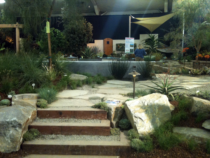
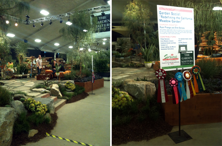
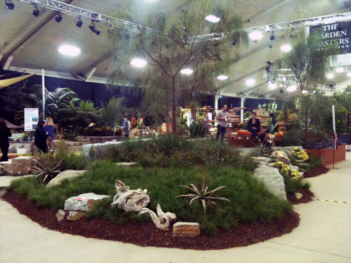
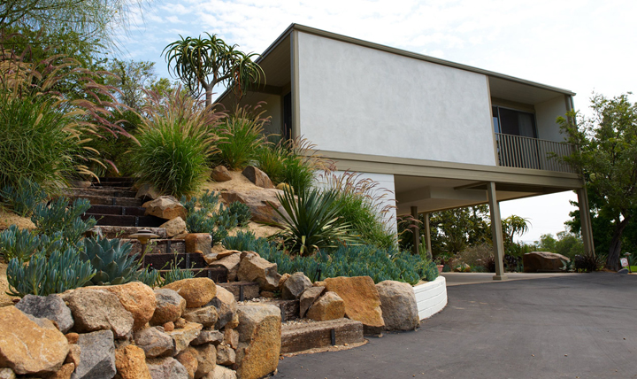
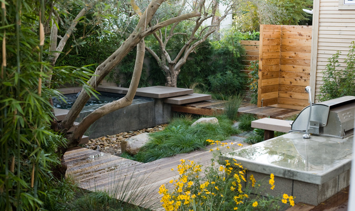
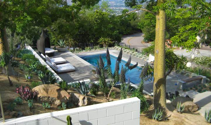
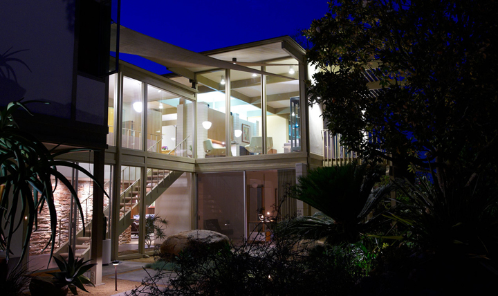
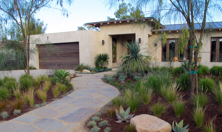
Ryan’s entry was super modern but still very lush. I dug the plant selection and easy breezy walk through set up. I wish I had somewhere to put these gravel and wood steps…so simple!
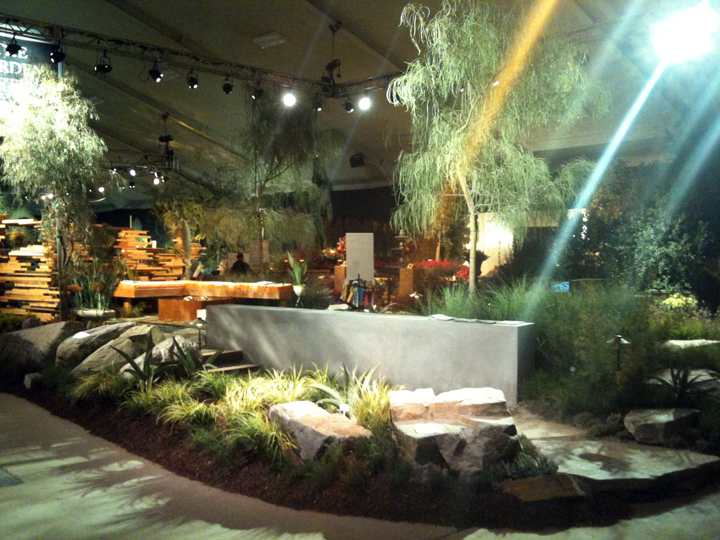
The lighting throughout the event was very “theatrical”. It was like a garden bordello in there.
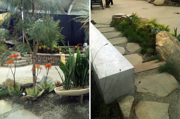
Gotta love a hard troweled stucco wall that looks like concrete, though. I would also like to find a place for one of those babies somewhere. Maybe a ten foot tall one to block out the crazy cat guys house…
Look who won all the fanciest ribbons! Ryan really took home more prizes than anyone else…and you will see why in just a moment…
We showed up at the very end of the event and they finally turned off the bordello lights and turned on some basic overheads. Thank you regular lights, now I can see the plants.
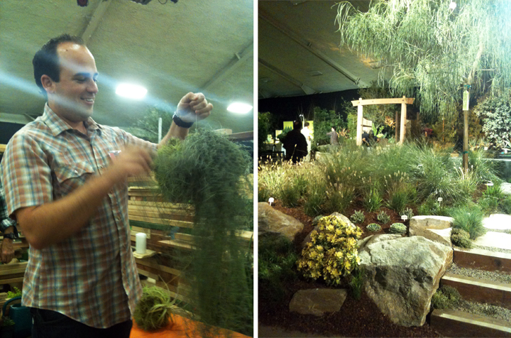
Ryan loved handling these big bushy balls. Just saying.
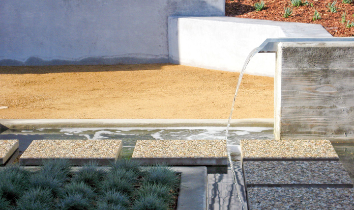
Overall, I thought he did a great job. It was a good mixture of organic and geometric planting with an interesting water feature and great little fire pit area. Totally that comfy SoCal modern backyard deal that is so nice to hang out in and totally water friendly. Definately my fav design of the show.
+++++++++
Now folks, onto the other entries that caught my eye (if by caught I mean made them bleed).
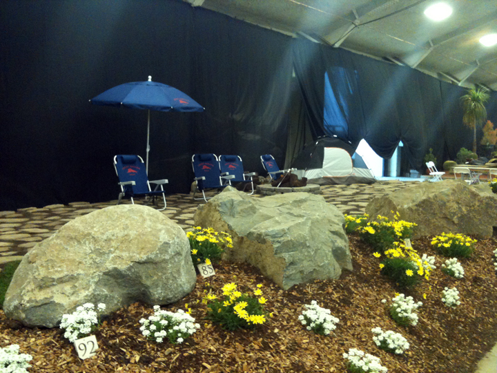
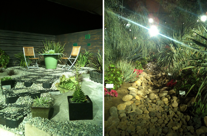
This pissed me off. Little stupid flowers (only two kinds total) and Tommy Bahama folding chairs? It was like a big F.U. to viewers and the other designers. Totally ridiculous.
Let me count the ugly.
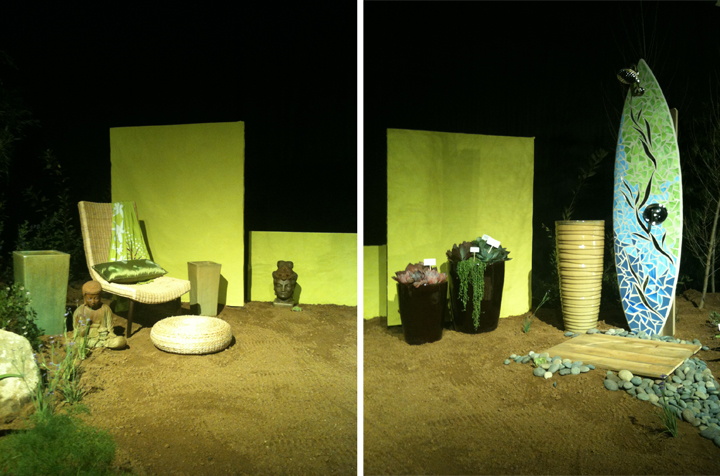
- Neon green random panels? Check.
- Mosaic surfboard shower? Check.
- Creepy voyeur wicker chair? Check.
- Random empty planters? Check.
- Random eastern statues? Check.
- DRY RIVERBED? Check.
(Dry riverbeds may be one of my bigger pet peeves.)
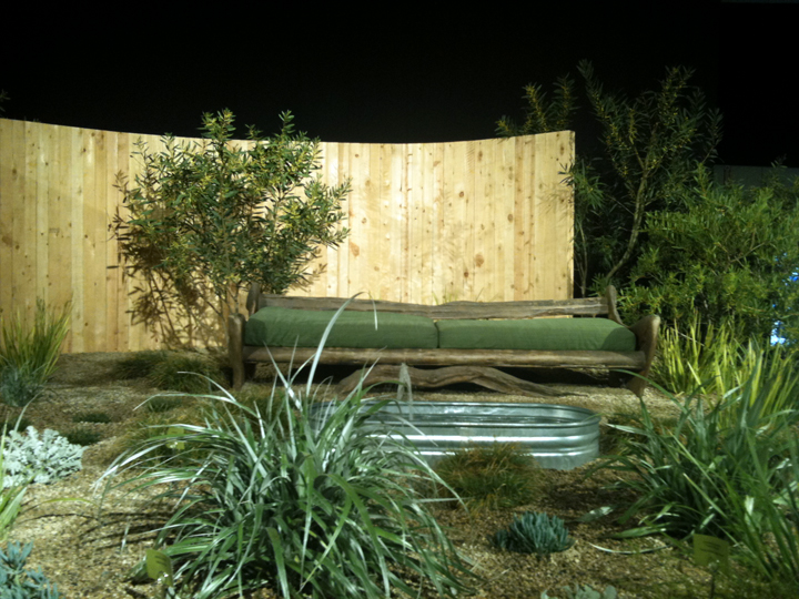
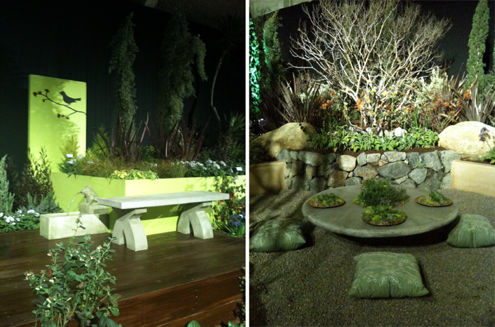
I liked this bench thing and the galvanized tank fountain, but overall it was a little random and strange with the plantings and layout and totally all green all the time.
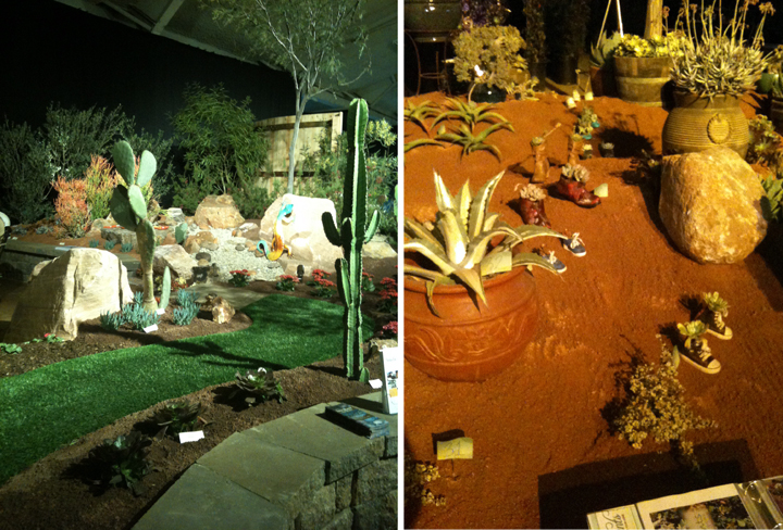
AstroTurf. ‘Nuff said.
Baby sneakers with plants in them walking through the landscape? GAG. GAG. GAG.
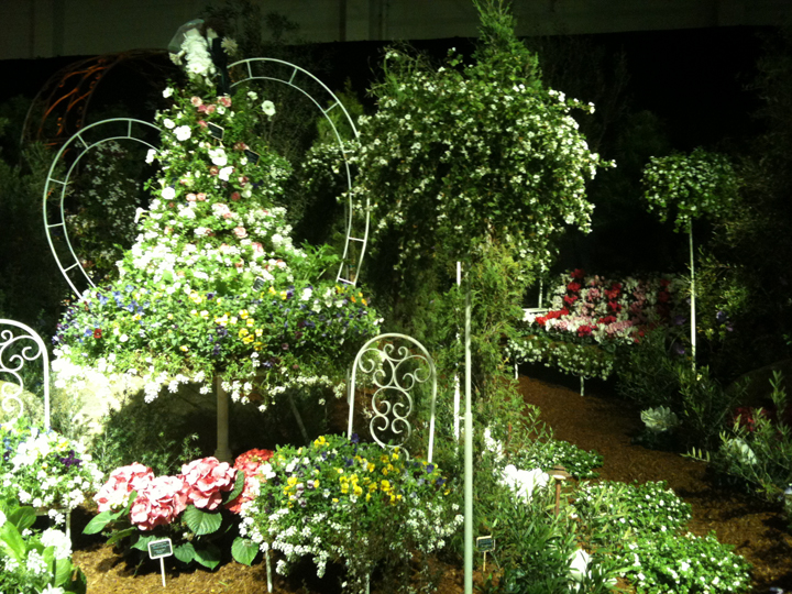
Oh yeah, this was a horror show. Curly white wrought iron with a wedding themed “bush” (check out the “whimsical” bride and groom on top) and a poofy flower bench. Please gouge out my eyes.
When in doubt, put a bird on it. Or a spitting frog fountain. For fucks sake.
Also, how many people want to sit on a pillow in a bunch of pea gravel? All I can think of is gravel in my pants.
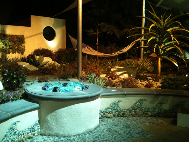
This was almost OK until you saw the wave mosaic masonry work and the creepy balls of glass fire pit.
Ah, sharp and horrible slicing cheese grater squares to step on to get to the most depressing sitting area ever. The fence looked like it was smeared with poo.
Oh awesome, another huge dry riverbed. The most pointless thing in all of landscaping.
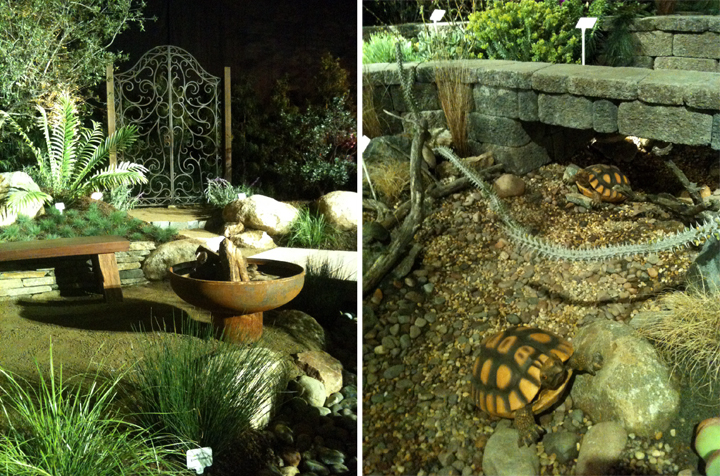
Check out that cool fire pit! Too bad there is a total disconnect with that fanciful wrought iron gate. What happened? Design seizure?
Oh perfect. Plastic fucking turtles on a dry riverbed.
+++++++++
Ok, now I may be a little grumpy (or a lot grumpy) but I drove an hour and a half to check this show out and my camera had no battery and it started raining and I’ve been really sick – so I’m grumpy. Shut up. It happens.
I appreciate all the hard work that goes into an event like this, but honestly, it seemed like a lot of folks were just completely phoning it in. Seeing as these landscapes were intended to be professional examples created in the hopes that they will win awards and entice new clients, some of the choices were just weird. I’m pretty sure someones dream landscape wouldn’t consist of folding Tommy Bahama chairs, or maybe people really do love plastic turtles and wave mosaics. Who knows. I’m being a grumpy snob.
