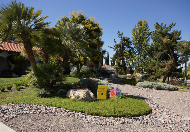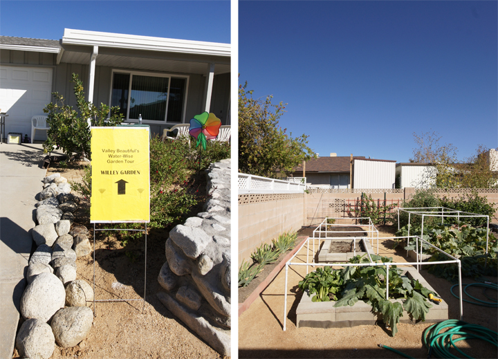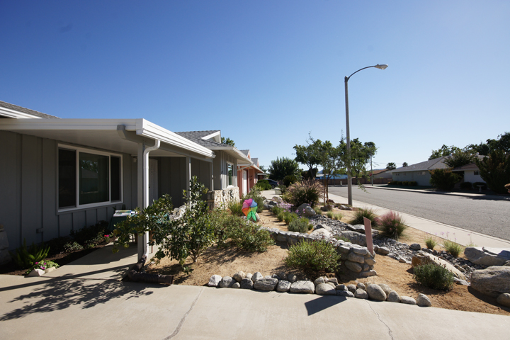
If there is a rainbow flower pinwheel and a welcome sign with tiny unreadable type, you must be in for a treat. A Hemet style treat.
Where to begin…
Saturday was incredibly hot and dry and I thought to myself, “Self, why don’t we go check out the local Water Wise Garden Tour and talk to some folks about xeriscaping. That sounds like a sexy good time!” In hindsight, that was probably a pretty crappy idea (and not sexy in the least).

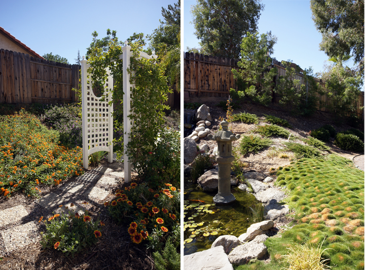
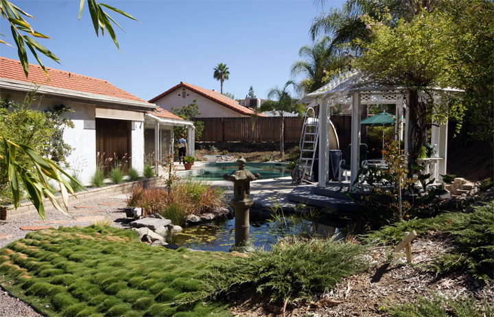
The Garden Tour began with a professional landscaper’s “Asian” inspired home. If I hear Asian Inspired one more time, I swear, flames, flames on the side of my face. I digress. So, there was a koi pond and a path to nowhere, and a gazebo, and a pool that had seen better days, and bamboo to keep it Asian, and little statues, and a slide and fish. I did like the mounding grass…

I feel that Tim Gunn would assess like this: there was a whole lot of look happening here.
Overall it made me pretty uncomfortable and felt sort of schizophrenic in terms of design.

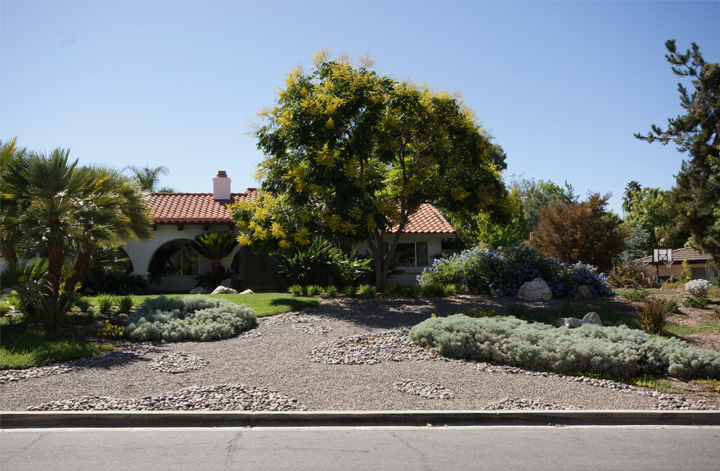
Here is the front yard with a weird huge rock-scape thing. If I was in an artist’s studio, I would possibly say that their work looked over-worked, felt forced and was a bit stiff. I do like the icy green bushy ground cover though…

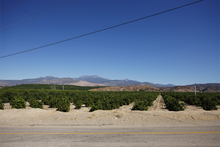
Through the orchards and over the hills, to rural Hemet I go.

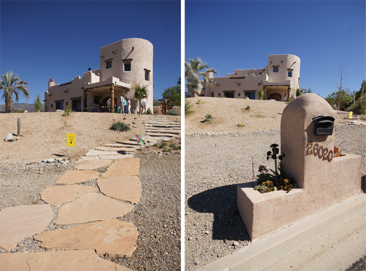
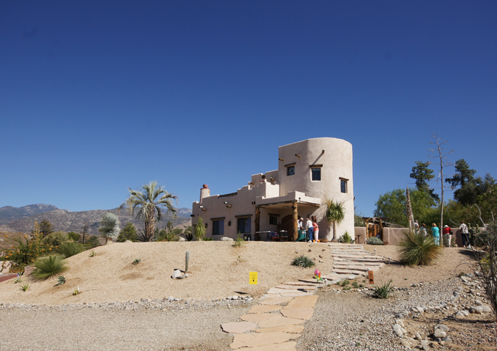
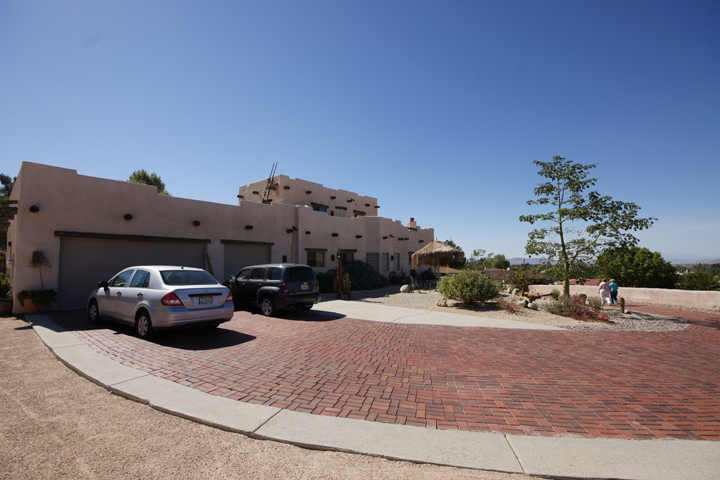
Next stop on the tour was…ummm…an “imposing yet welcoming Santa Fe-style home (with) charming decorative objects”.
Uh oh.
If the penis style mailbox was any sort of clue, I was certainly in for a treat.

Imposing and welcoming!

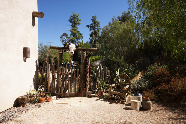
Charming decorative skull!

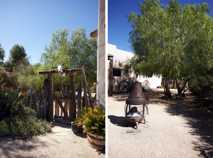
Wagon wheels? Pot belly stove? Boy howdy. The ADT sign doesn’t feel as charming though. I think they need a more rustic version.

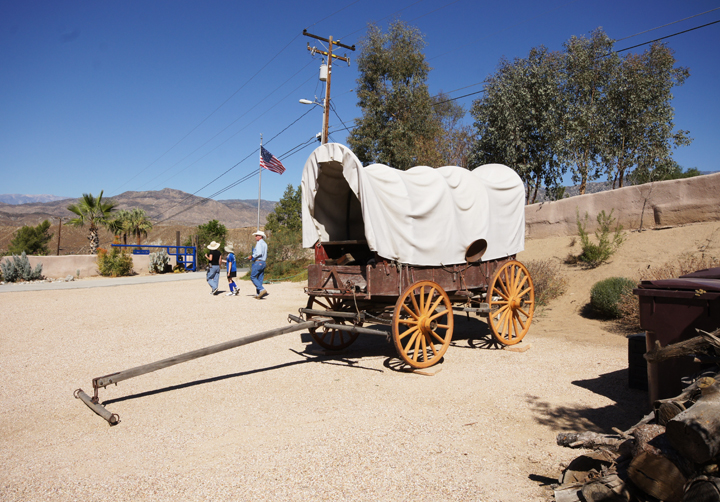
Don’t fret. They have the required covered wagon and American flag.

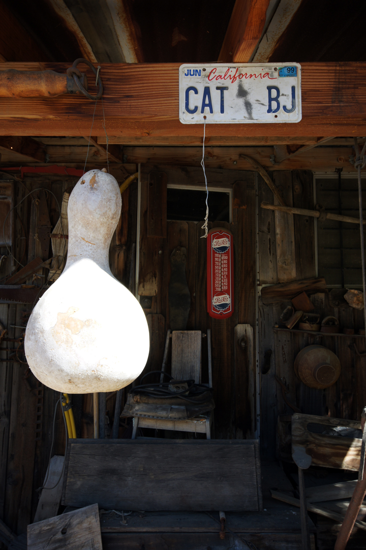
They also have a CAT BJ license plate. A prominently displayed CAT BJ license plate. Why? I’m guessing for the charm.

Majestic and inspiring.
I’m thinking Tim Gunn would say that it’s verging on costume and maybe getting a little “themed”. Otherwise, make it work CAT BJ. Nice variety of cacti and succulents…

Number three.
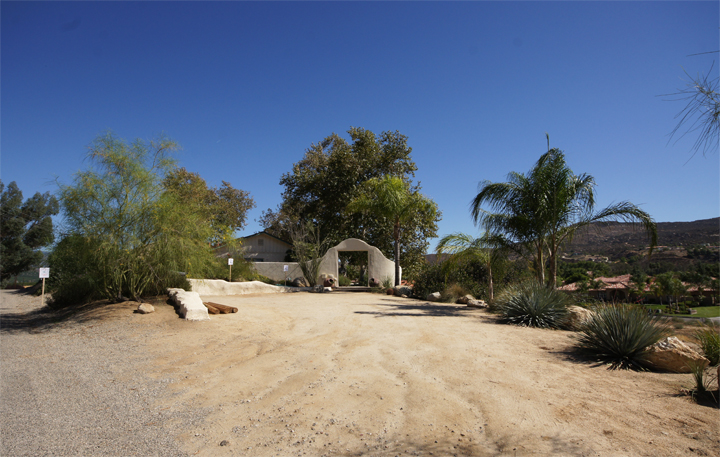
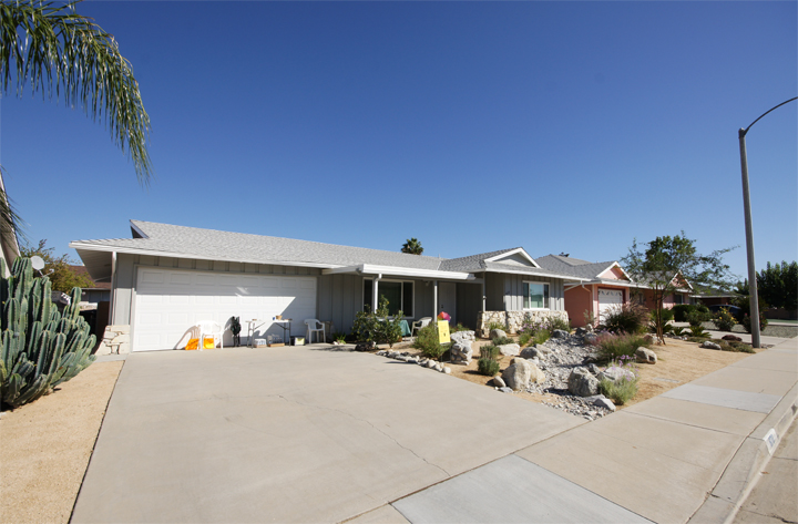
By this point I was losing hope. Another professional landscapers home, oh great. But the driveway wasn’t terrible. Nice Palo Verde and Agave with some Ocotillo. The adobe walls are a bit much, but hey, lets take a look.

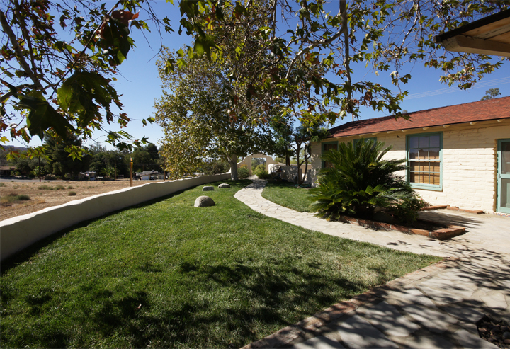
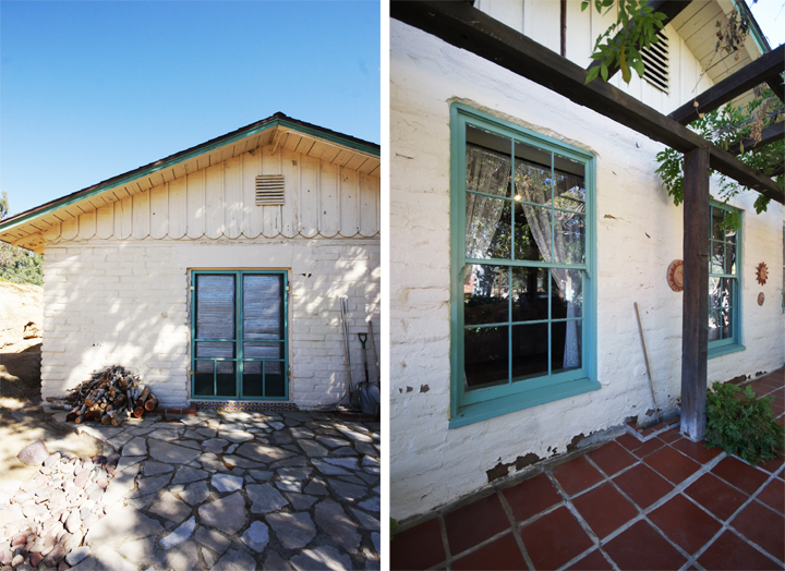
OK, the landscaping isn’t that interesting and I’m not sure how a whole bunch of lawn is water wise, but look at that brick and those windows. Certainly the first interesting house I’ve seen.

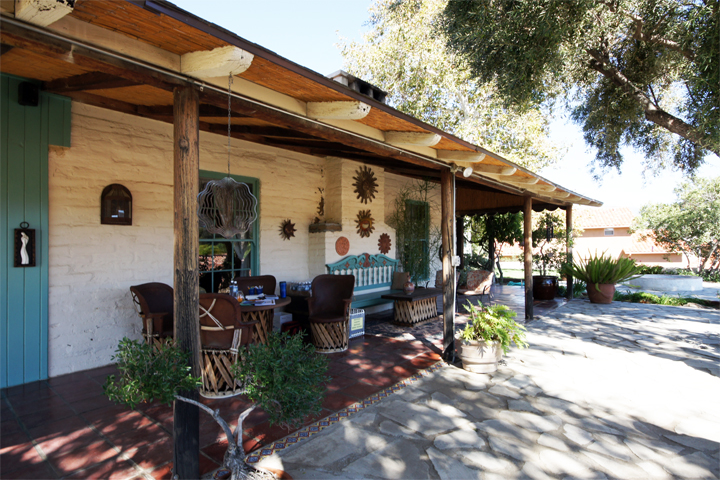
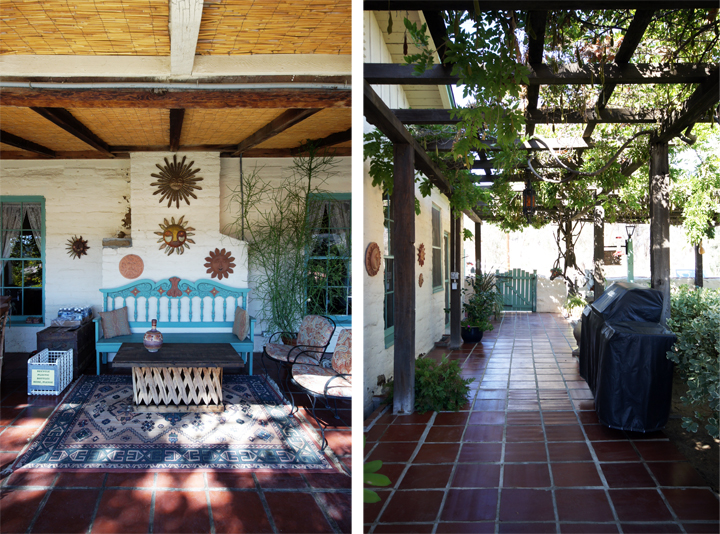
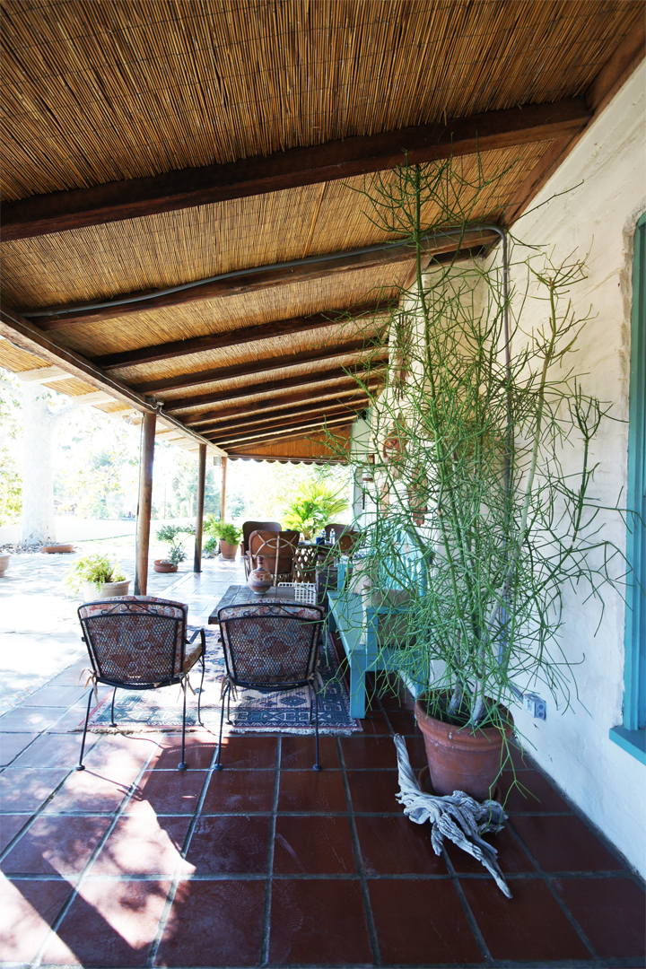
This was the first landscape that was actually comfortable to walk around in. A number of mature Sycamore trees and Wisteria gave ample shade to help reduce the temperature. I kind of loved the architecture of the place – the textured crumbly brick and the big windows and doors, even that crazy terracotta tile patio. This style home is usually not my cup of tea, but it was the first home in Hemet in a long time that I could actually see myself fixing up and enjoying.
I spoke to some of the guides and they said it was the original farmers house that overlooked a huge grapefruit orchard spread below in the valley. I guess it’s one of the earlier homes built in Hemet (when there was still a lot of farms).
The orchard is long gone, but some of the original architectural details remain. The decorative choices (like all those suns) are a little Santa Fe cheese-ball, but I think with a quick edit and some small adjustments it could be an incredible cottage type rustic rambler.

While I was there I just sort of wanted to sit and hang out. The exterior was actually really welcoming instead that sort of forced faux-welcoming overwrought thing that can happen.

I like the flagstone and the oversize windows. This place had a lot of charm and so much potential.

This pencil cactus was as old as I am. I’m kind of in love with pencil cactus right now.

Last one. I knew it might be a mess when I saw the words “small” and “mobile home” in the tour literature.
It did not disappoint, or it did disappoint. I don’t know, pick one.

I wish they could have picked a better marker than those stupid pinwheels. Look at all that space on your sign, USE BIGGER TYPE and less clip art. I am driving by with your crappy map and I can barely see your poorly designed signs (these were also the street signs leading the way and impossible to see).
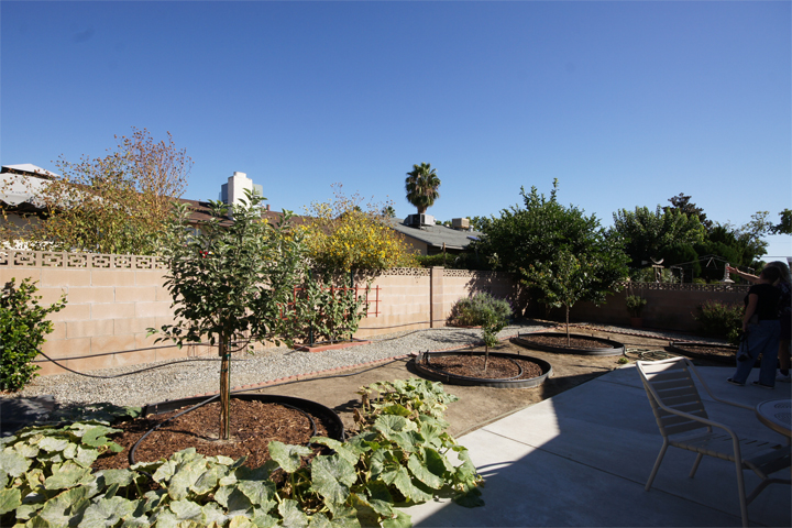
I walked in the back yard and saw sad dusty plants with hoses thrown everywhere, PVC piping over empty cinder block beds and then just sort of died on the inside. People are coming for a tour! Put away your hoses.

Why did I drive over here.

Ah yes. A dry riverbed.
I am not into the dry riverbed landscape motif. I just don’t get it, it always looks silly to me. You are in an urban environment crowded by other homes, not nestled next to a forest or open landscape with an actual creek. Your fake riverbed does not fool me, it goes nowhere and does nothing. It is weird and forced and awkward.
OK.
I’m done crapping on my town and neighbors very noble attempts to showcase water wise landscaping solutions to inspire folks to tear up their lawns and use drought tolerant desert friendly plants. I think its a great idea, I just think the execution was lacking. I’m acutely aware that I’m a snob and a jerk, but I really wanted to be inspired and learn about some new plants or at least check out some innovative ideas while spending a large chunk of my Saturday in the searing heat. The whole tour just wasn’t very visitor oriented. I usually walked around lost and the volunteers ran out of all the plant lists and paperwork so no one knew anything or could answer questions. I applaud people for trying to beautify their homes and inspire others since so many exteriors in this town are in such terrible shape (including my own landscaping – trust me – I know), but come on, all of these were “professional” landscapers homes. Really?? I feel pretty underwhelmed…
I did get one good thing out of it, besides the thrill of real estate voyeurism. Whenever I need to turn that frown upside down, I’ll just remember the elegance of CAT BJ.
