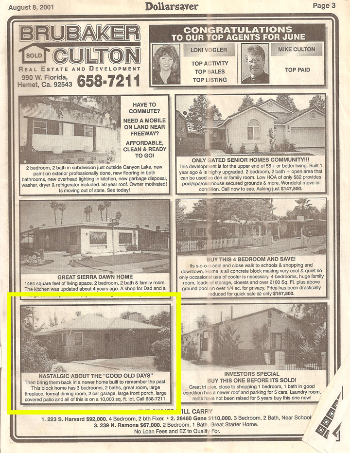
Eric and Katie are in the process of fixing up an adorable little brick house and wanted to get some input on how to address the exterior. After a recent need to replace the front door, they decided on ordering something a bit more modern from Crestview Doors outfitted with minimal stainless door hardware. We all have experienced that moment of change – you upgrade one thing and all of a sudden everything starts to look a little shabby in comparison.
They are on a budget and able to parcel out small projects over time, thereby not taking on too much expense all at once. I wanted to give them an overview of possible changes they can do over time and create smaller projects they can tackle themselves.
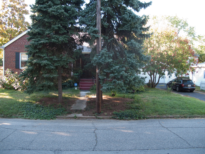
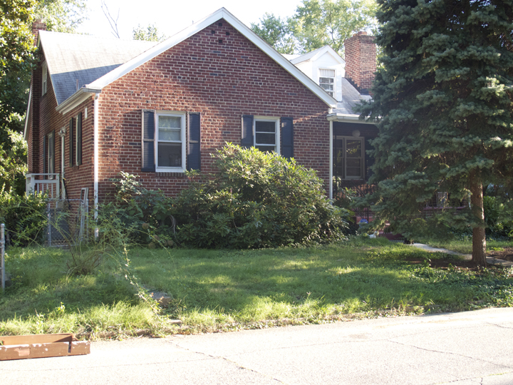
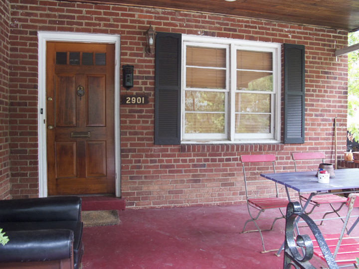
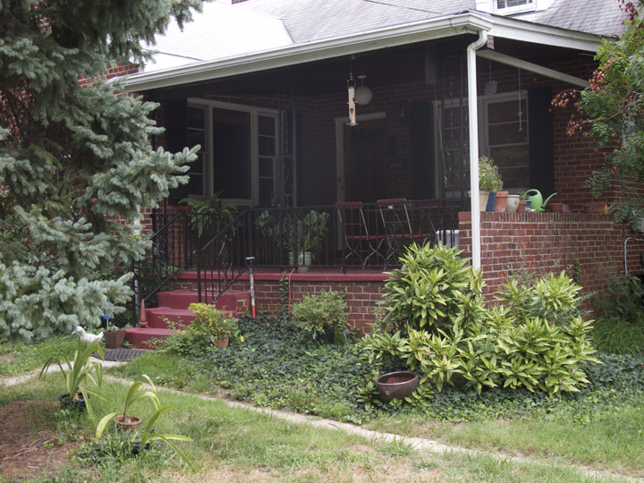
Lets take a gander at a few images Eric sent of what they are working with.

Those are some giant trees! And a really unfortunately placed utility pole. They’ve been doing some checking and it appears that the pole is more of a support and not a full-on useful utility pole. They are working with the city in hopes of having it removed or relocated since it’s the only one in the neighborhood in such an an inconvenient spot.

Both landscaping and hardscape need to be addressed. They really enjoy grasses, shrubs and non-flowering plants with a bit of a Japanese garden vibe. Something clean, modern and layered – not too fussy, but a tad organic.
Also of note, they are not going to paint the brick but will take down the shutters and restore the fascia and window trim with a new coat of paint.


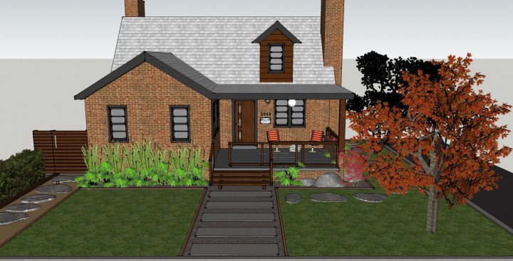
The main area they would like addressed is the front entrance and porch. They want it modernized and made a little more functional. The big trick was designing a way to keep their dogs secured on the porch and stalemate their tendency to run off chasing after little free roaming furry creatures.
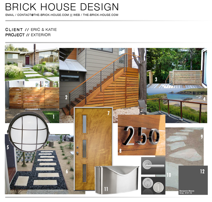
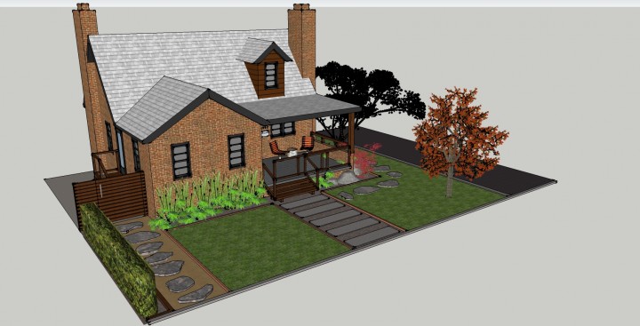
So, cute little house with plenty of opportunity to snazzy it up. Here are some of my ideas (on the “Design Board” – please don’t make me say mood) to enhance what they are working with while staying budget friendly.

EXTERIOR OPTIONS //
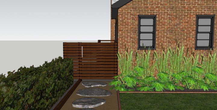
1 | Horizontal slat gate for the side yard entrance
2 | Horizontal slat staircase/storage area
3 | Sliding patio gate on casters (to keep the dogs in)
4 | Cable railing system
5 | Large round aluminum bulkhead exterior sconce
6 | 18” x 24” concrete pavers (two side by side) or custom poured concrete steps
7 | Crestview “Langston” front door
8 | Nuetra house numbers / Weston address numbers / Home Depot modern house numbers
9 | Flagstone pathway
10 | Stainless Steel door hardware
11 | Postino wall-mount mailbox
12 | Benjamin Moore Gray 2121-10 (for trim)

First, they were not loving the white trim, so it has to go and be replaced with a much darker shade of charcoaly gray. I gave them a few options and they liked Benjamin Moore’s “Gray” which is easy enough to remember. I think that by removing the shutters and going with a moodier (and more grounded) dark trim, the brick feels sophisticated and modernized.
The other large paint issue was the dormer on the roof. The wood siding has some damage and the paint is in rough shape and it either needs to be replaced or restored. The original unpainted beadboard ceiling on the porch looks amazing and I wanted to pull that detail up to the dormer. The white siding would be replaced with a good clear cedar stained to match the rest of the wood details.

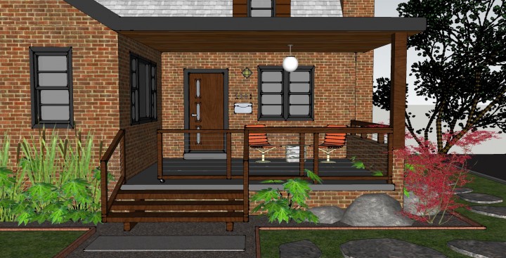
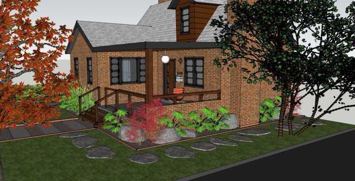
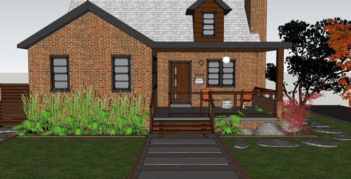
One solution to fancy up the porch was to remove the current wrought iron railing and crumbling cement steps. The steps would be replaced by a wider and simplified wooden stair and the railings would be reconfigured to include wooden supports with a simple cable railing system. You can buy all the necessary parts for cable railings at the local Home Depot and DIY or go for a sleeker look with readily available cable railing systems.
The big custom feature to keep the dogs at bay is a rolling gate that closes access to the stairs. A similar idea / design can be seen at John & Juli’s cottage.

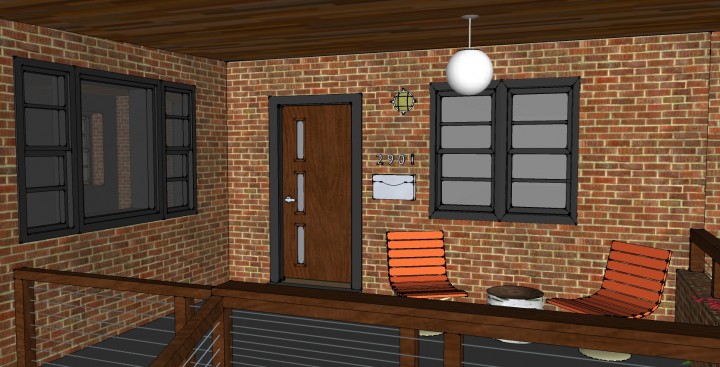
For the entrance, everything needs a good coat of BM “Gray” including the porch cement. Ditching the maroon and going monochromatic is a surefire way to make the disparate architecture cohesive. The Crestview door will be complemented with a minimal door lever as well as a new wall-mounted mail box, new address numbers and an additional bulkhead porch light. I love the round ball lamp they have already and by throwing down a pair of fun patio chairs they are set for lounging on the porch, keeping an eye on the neighborhood.

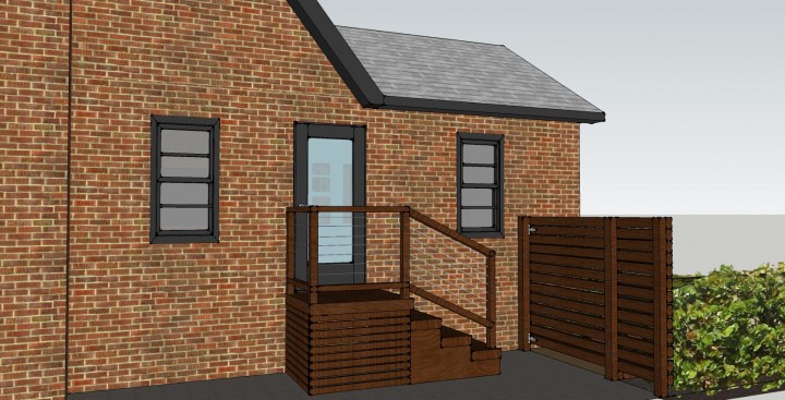
For the side entrance the stairs would mimic the design from the front entrance with the addition of a little slat enclosure under the platform. The back side would be hinged and would create an area for storage under the stairs for tools or charcoal or whatever your heart desires.

The beat up chain-link gate would be replaced with a simple slat gate with an aluminum pull. A flagstone walkway edged with either hot rolled steel or composite edging, would have a base of decomposed granite to make it easier to roll those garbage cans out to the street.

Since they both typically arrive home and park by the garage, they wanted a little meandering path to get from the driveway to the front entrance. An organic path of flagstones set into the grass would give them a quick and dry footing to the front door.


The wider walkway from the street would be inset with pea gravel and have either custom concrete poured in horizontal slabs or go the more cost effective route of combing 18″ x 24″ concrete pavers to create the series of horizontal steps.
There is my rundown of solutions for all those vexing design decisions and conundrums Eric & Katie were running up against. They are working with a landscape architect who is going to hash out all the planting details and figure out the best choices for their climate. I want to just throw Papyrus everywhere, and Horse Tail Reeds and Japanese Maples, which must be the most go-to contemporary landscape plants ever.
Thanks guys! Can’t wait to see how it comes together.
__________________________________________________________________________________________________
If you have a space, big or small, and need design consultation please email me at contact@the-brick-house.com to discuss solutions for all your decor dilemmas. Depending on your budget and the scope of your project, a quote for services ranging from 3-D rendering, mood boarding, product sourcing, or actual physical shopping can be arranged.
