Archive for the ‘decorating’ Category

GRAY DUVET

Sunday, April 14th, 2019

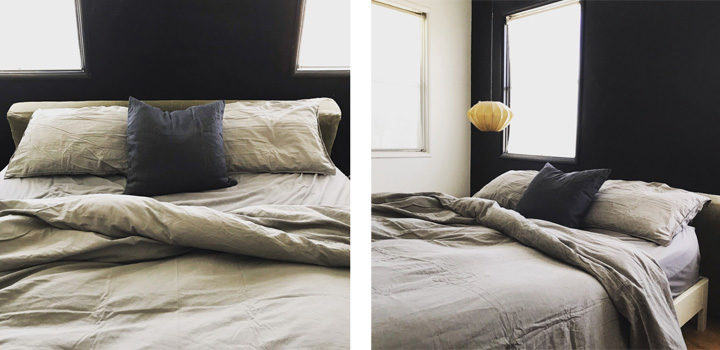
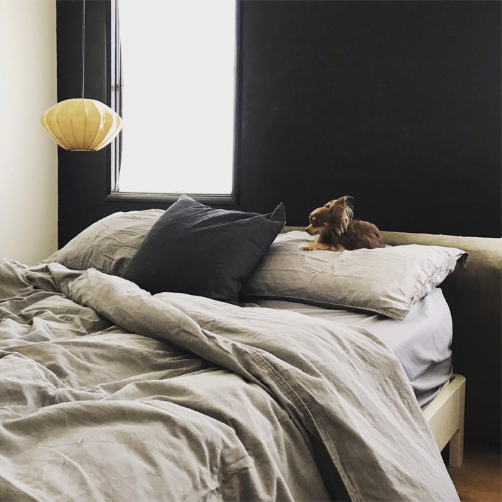
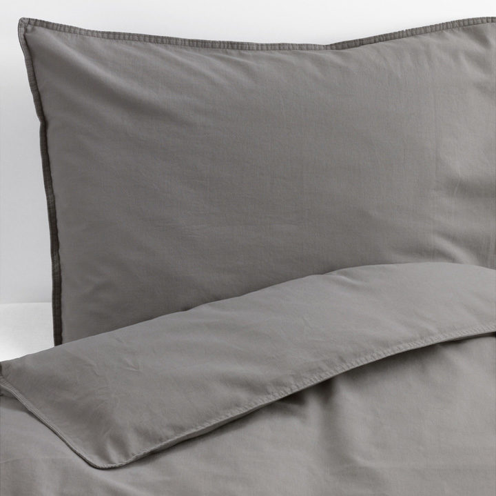
I’m always on the hunt for a good gray duvet and had been using a discontinued gray linen one from MUJI for a good long while. But the need is always strong and when I saw the IKEA ÄNGSLILJA I was intrigued but cautious.

I wanted to check it out in person before ordering it online and made the trek to Ikea and was pleasantly surprised. I liked it a ton more in real life than the Ikea promo photos and grabbed myself the queen duvet.

I’ve had it for some time now and can say its impressed me for Ikea textiles and the price is pretty great for the quality. I do hate the crappy plastic snaps on the bottom and would have preferred a zipper, but I do like the material and the sewn edge detail. So, all in all if you’re on the hunt for an affordable gray duvet, this IKEA ÄNGSLILJA ain’t a bad option.

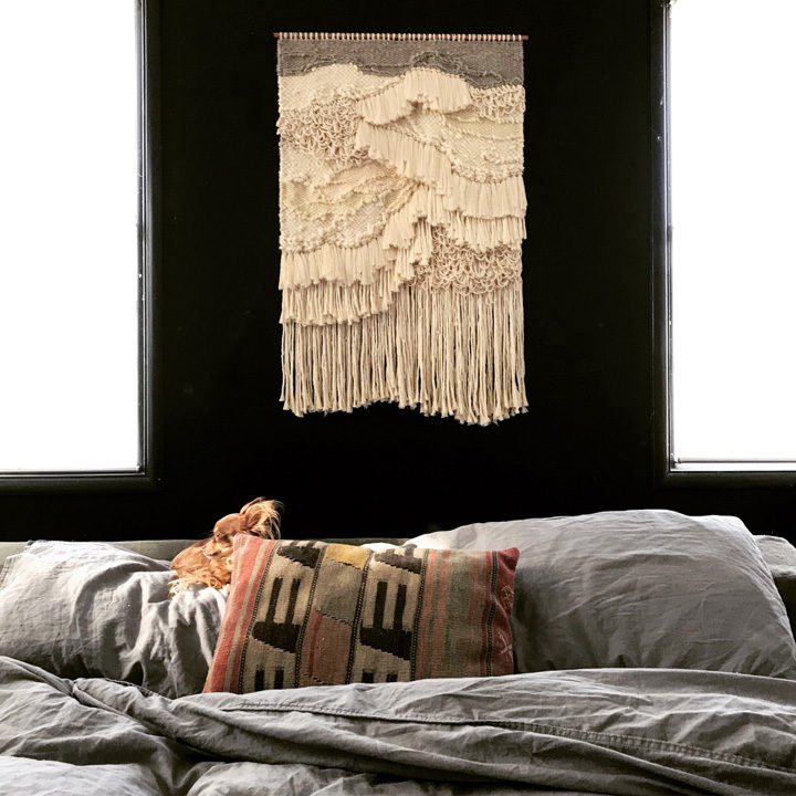
*It’s also Bea approved.

DESIGNING | NEW NURSERY PROJECT

Monday, June 17th, 2013

The Animal Print Shop by Sharon Montrose

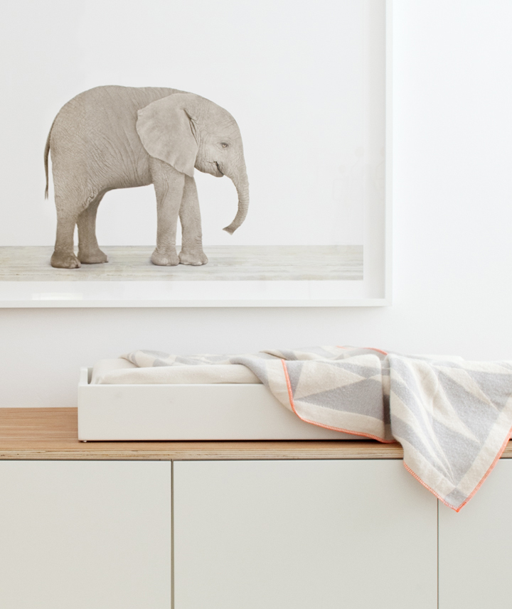
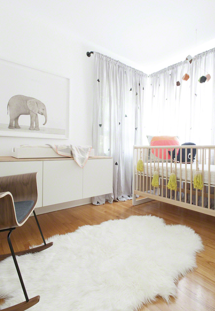
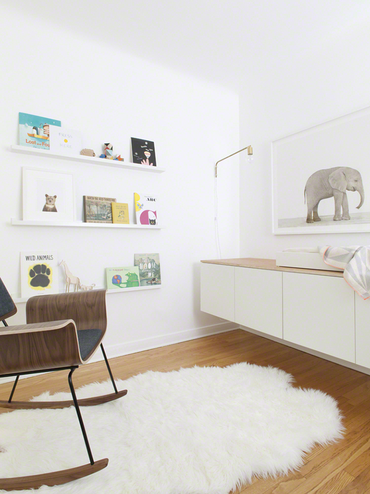
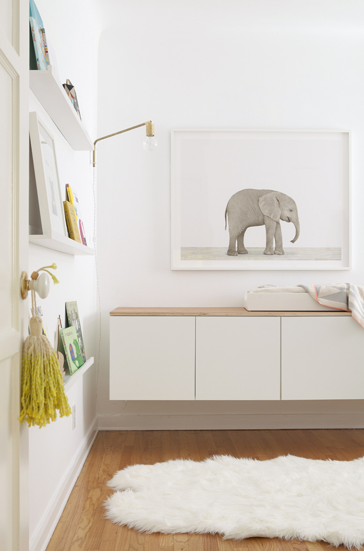
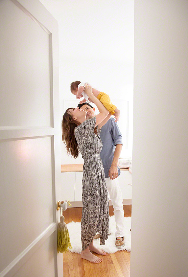
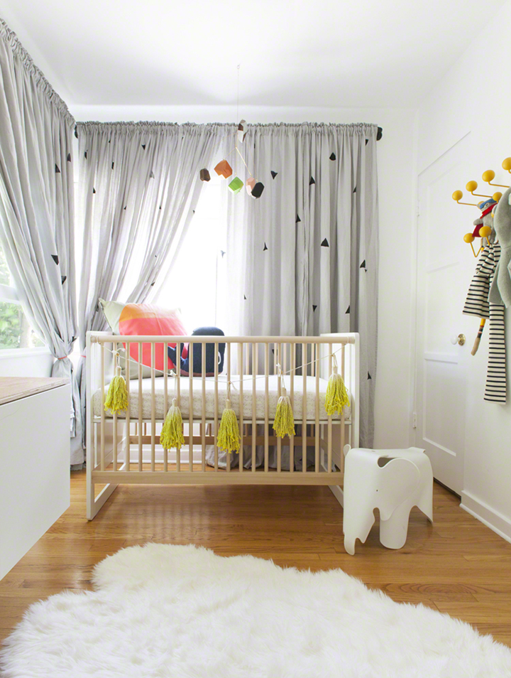
I recently got to team back up with The Animal Print Shop to design a bright and cozy nursery for photographers Max and Margaux Wanger and their adorably spunky new baby boy Dash. This marks the second addition to The Animal Print Nursery Project (previous nursery is right over here) and was inspired by this equally spunky and newly released Baby Elephant print as well as the Wanger’s modern style and charming vintage Los Angeles home.
The Animal Print Shop by Sharon Montrose

The Animal Print Shop by Sharon Montrose

The Animal Print Shop by Sharon Montrose

The Animal Print Shop by Sharon Montrose

The Animal Print Shop by Sharon Montrose

The Animal Print Shop by Sharon Montrose

The Animal Print Shop by Sharon Montrose

I bet a pretty cool baby kicks it here.

Design-wise, this wee little room had a bit of a quirky layout that was super tight on space but packed full of great vintage architectural details. I wanted the nurseries layout to be functional for the family and baby Dash’s day to day baby needs, but also adaptable enough to eventually smoothly transition as Dash gets older and his needs change. Big basics like the changing table / floating dresser, beautiful rocker and wall shelving are minimally modern enough to remain looking stylishly age appropriate for years to come but are currently a perfect and functional backdrop for the rest of the rooms cheeky and unexpectedly colorful accessories that any baby, that enjoys style and bright unique handmade things, thoroughly adores.

Speaking of.

Perhaps you’d like to know what’s what and where to get some of the pieces seen here in this nursery for your own stylish baby? Well, lucky duck, look below for sources on the pieces I picked up to design out Dash’s stylish digs:

sources_baby_elephant_nursery_theanimalprintshop_024

SOURCES

1. Crib and Changing Tray: Ouef
2.Chartreuse Tassel Garland: The Minimalist
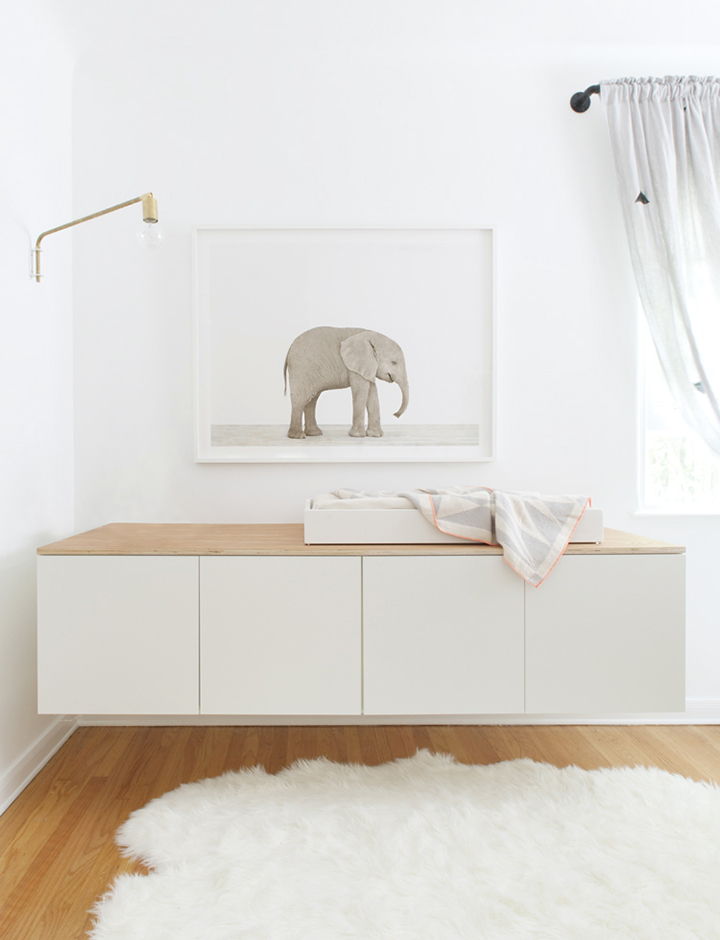
3. Baby Elephant Art (available in 5 sizes–here in 30″x40″): The Animal Print Shop
4. Neon Edge Blanket: The Minimalist 
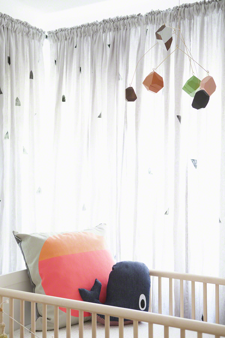
5. Circle Pillow: The Minimalist
6. Brass Swing Arm Lamp: OneFortyThree
7. Whale Pillow: Ferm Living
8. Rocking Chair: OneFortyThree
9. Floating Storage: See Fauxdenza DIY here (we used 24″ depth)
10. Sheets: Little Auggie
11. Curtains (hand stamped with black triangle pattern): Ikea 
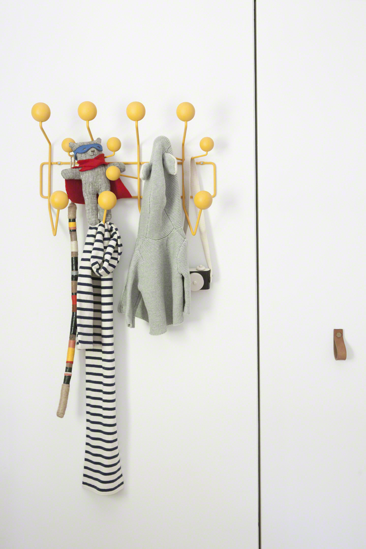
12. Eames hang-it-all with a yellow paint update.

*Other accessories include a custom made wood facet mobile by OneFortyThree, leather and brass cabinet pulls from CAMP, Ikea picture ledges, white MODIKIN eames elephant and faux sheepskin rug via ebay.
The Animal Print Shop by Sharon Montrose

BABY ELEPHANT, yo.

Extra thanks abound to Max and Margaux for trusting me with the design of someplace special for such an important little guy, The MinimalistOeufOneFortyThree for their incredible product contributions and endless support, but especially to Sharon Montrose and The Animal Print Shop for always making magic happen.
RENOVATE IT (INTERNATIONAL EDITION)

Wednesday, June 5th, 2013

LCM_ja_Eames copy

Hey there. What. Up.

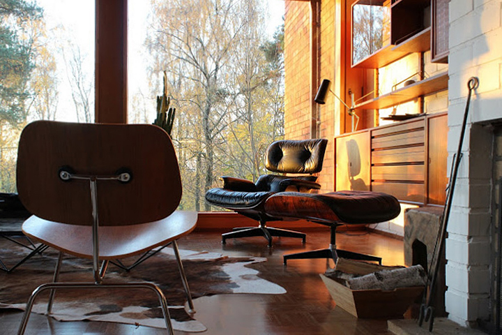
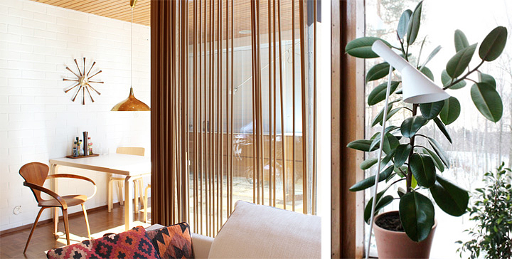
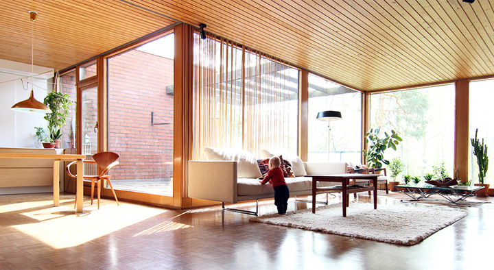
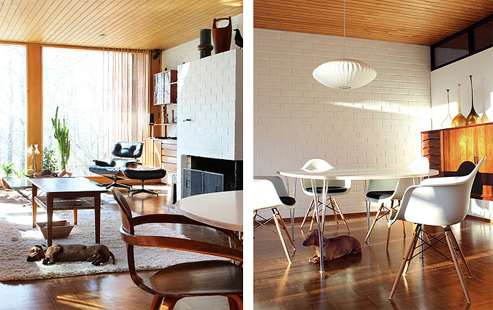
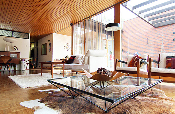
Short story? Things got busy and the house and blog suffered some major neglect. Hiatuses happen or whatever. Now slowly I’m reintegrating into interwebbing and thought a nice way to kick off and refresh some of my old time renovation vigor and determination was to show off a smattering of this incredible renovation project & blog happening in Finland.

10_Atrium

13_Atrium

bht1

Urho_3

12_Atrium copy

05_Atrium

photo-4 copy

bht3

I mean.

Quit it now with all your modernist architecture and good things.

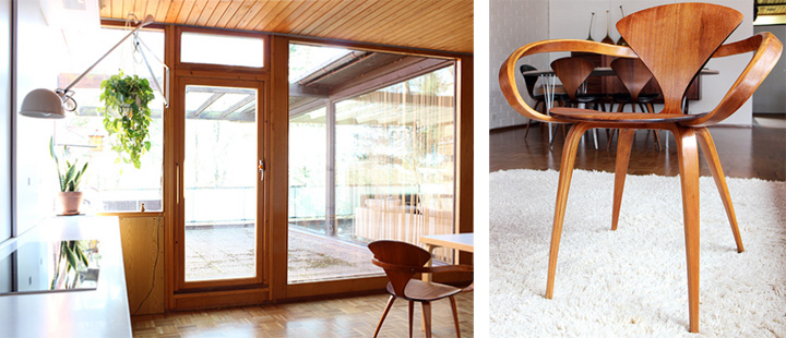
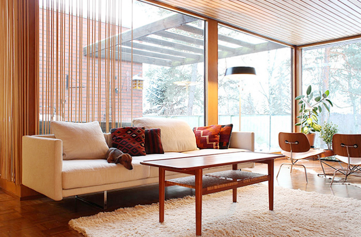
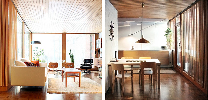
Anyways, a few weeks back I received a super sweet and undeservedly flattering email from longtime Brick House reader Pekka Kumpula (Finnish industrial designer/modernism fan/vintage collector) and his partner Minna (plus their adorable dachshund and baby girl) that included a few teaser images of their 1960’s modernist home renovation project and a link to Olive Green Window, their blog that chronicles it all. The blog also has a few great vintage restoration tips and tutorials along with all sorts of modernist furniture eye candy. So obviously go check it out to see more of this sassy home and then quickly mark their blog as one of your new go-to favorite things.

Oh, and all the Cherner. Come to me.