Archive for the ‘decorating’ Category

NATIONAL PAINTING WEEK

Thursday, April 18th, 2013

DSC02781

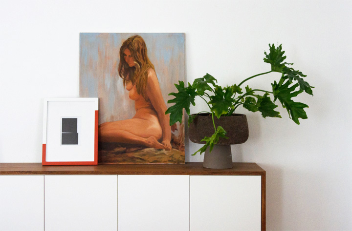
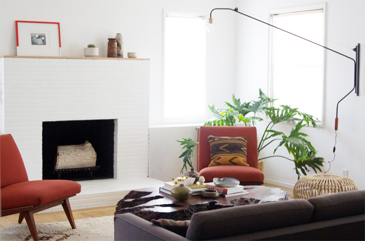
Hey now. Look at that updated living room.

As mentioned earlier I’ve been working on a painting project with Sherwin-Williams for National Painting Week. Most of the time my taste and the house leans towards a pretty predictably neutral (aka browntown), so when it came time to add a bit of orange to the mix I wanted it to be BOLDLY orange and therefore decided on Sherwin Williams ‘Raucous Orange‘.
DSC03057

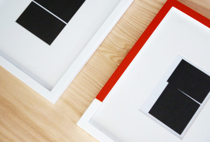
DIY ART  |   MINIMALIST PAINTED FRAME

Art ain’t easy, but hey, at least this project is.

Materials

– Basic White Frame  >  these are from Target, but Ikea and many others have similar options.

– Paint  >  as mentioned this is Sherwin Williams ‘Raucous Orange

– Art  >  I used a couple black & white minimalism inspired pieces I printed out at home.

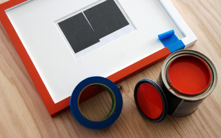
– Sponge Brush / Fine Paint Brush

– Painters Tape
DSC03076

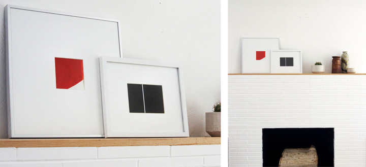
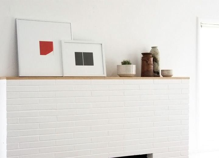
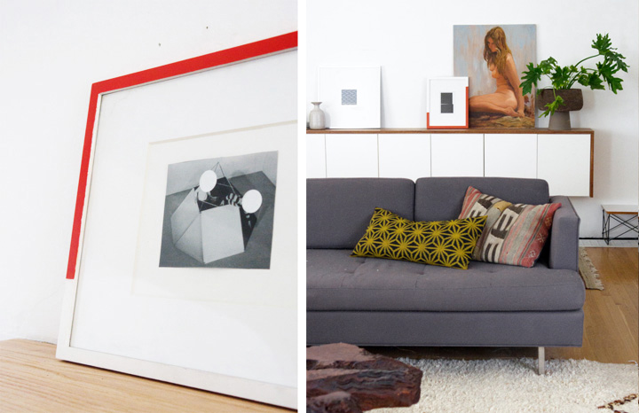
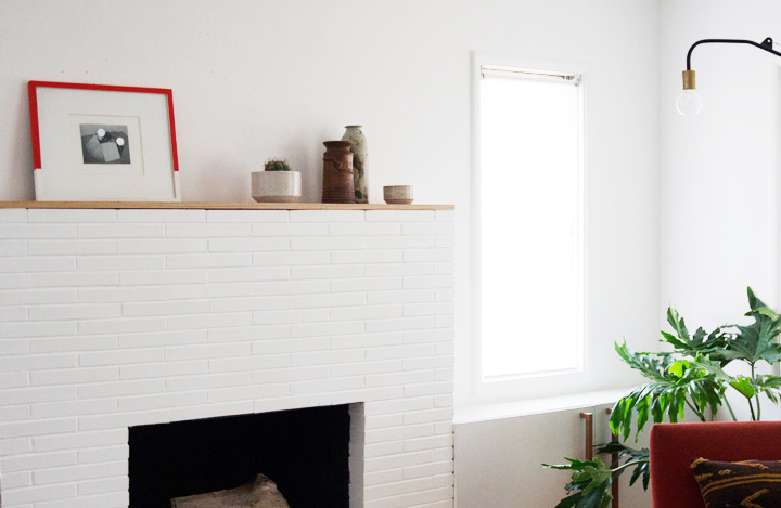
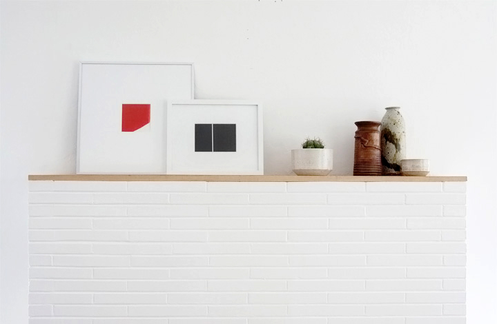
On the mantel is a larger framed piece painted symmetrically about 3/4 of the way around while the smaller framed piece leaned on the fauxdenza is painted asymmetrically for an unexpected hit of color.
DSC03023

How To

– Decide where the painted detail begins and ends on the frame.

– Wrap a piece of painters tape straightly and evenly around the front and side of the frame.

– Use a sponge brush / fine paint brush to apply paint evenly on the front and side of the frame.

– Do a few coats for even coverage.

– Remove the tape and call it a day.
DSC03078

brick house

Hey now. A bit of graphic color makes a difference.

I’ve been messing around with a bunch of DIY art type projects and it’s been difficult to get something going that doesn’t look too ‘DIY’ or actually adds to a space in a positive way. The addition of some unexpected color and an unusual composition painted onto the frame turned out to be a nice twist to an old idea and keeps things modern amongst all the vintage. Minimal and bold, easy and budget friendly art for anyone who – like me – is also stuck in browntown. Color it up!

Check out some more orange themed paint action over at Design Crush and look out for some red/pink projects tomorrow on  Vintage Revivals & Style By Emily Henderson. Paint it up!

*This post sponsored by Sherwin-Williams. All photos and words are my own, yo.
DIY ART & MANTLE-ING

Tuesday, March 26th, 2013

DSC02747-2

DSC02749

I’ve been trying to figure out a number of creative (aka ‘frugal’) art + framing solutions for a few design projects that have kept things busy busy around here. The whole art thing still remains an ongoing frustration at this house and tends to be a difficult finishing detail to get right at most all design projects. Problem is, poorly installed or wrongly scaled crappy art will ruin a great space almost immediately. Right? Like In the same way how good art can make a blah space seem incredible.

FACT. Art isn’t easy. Framing can be costly. Budgets like to be tight. Details are something something.

As an attempt to work around the art + framing is kind of hard + expensive issue, I’ve been experimenting with a number of DIY art ideas and affordable ways to create large scale pieces that must (and most importantly) avoid looking super DIY or like total crap.

So, an impossible goal pretty much.

DSC02754

A recent project left me with a stack of scrap paper tests I’d printed out as well as some small frames that, like a hero, I have bravely reused and slapped together into something that is sort of like art. Now these two minimalists framed things are living large in the newly updated and simplified mantel vignette. Bold moves considering these are just some Target frames stuffed with scrap paper I pulled out of the garbage.

So, yes, this is some framed garbage displayed on my mantel. Stylishly.

I’m a fan maybe.

Well, at least this project was easy and cheap and pleases my eyes. Budget art success.

I mean, it’s not like I wouldn’t prefer to hang a bunch of Donald Judd works on paper instead of this DIY solution. I’d also prefer to have the big baller style art collector money required to make that happen. I don’t so that won’t happen. But for now? My kind of funds can make more DIY garbage art happen. Or I can go nuts and splurge and get working on something LARGE SCALE. Bigger is better.

Till then. I guess.

ANIMAL PRINT SHOP NURSERY + GIVEAWAY

Thursday, October 25th, 2012

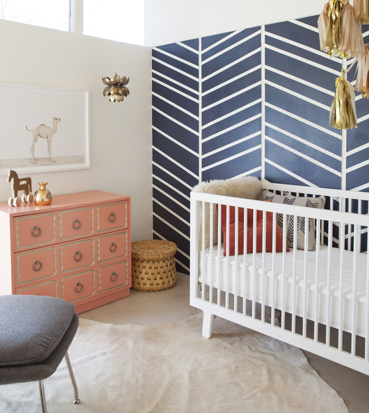
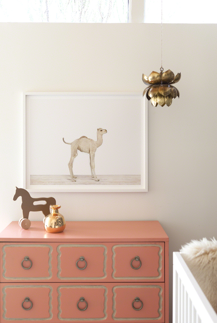
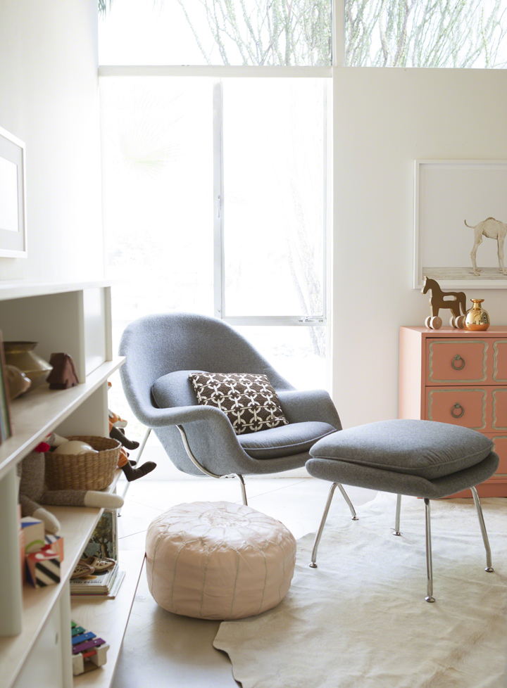
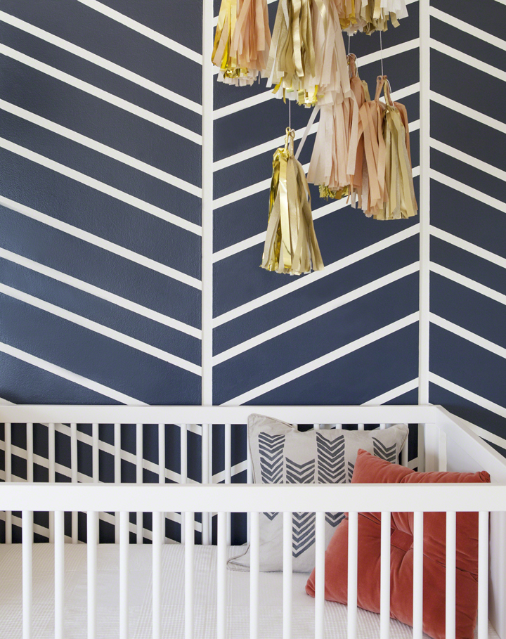
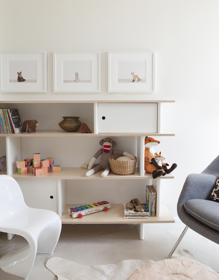
I recently had a great time designing a couple nurseries for The Animal Print Shop Nursery Project, which were all photographed by the awesome Laure Joliet. This first space was deemed the Fun Lux room, you know, for that baby who loves a little bit of bling and glam without sacrificing comfort. Babies enjoy comfort, or so I hear.

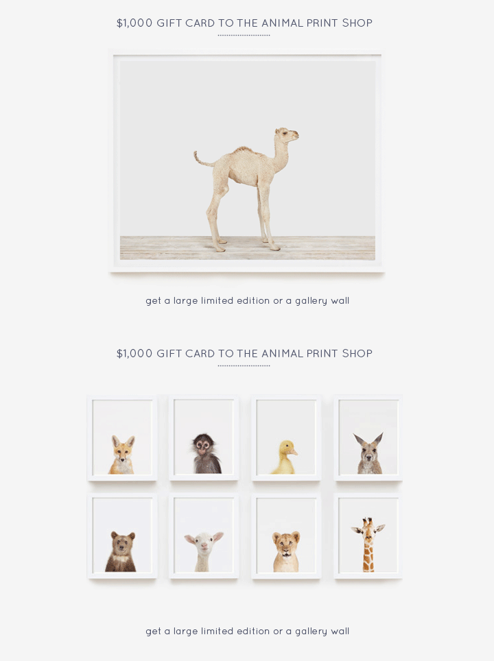
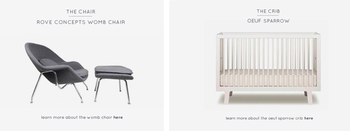
Anyways, the exciting news is that The Animal Print Shop is launching this first nursery with a big giveaway to help one lucky winner create a stylish room for their new kiddo. But what can you win, you say? These three items featured in my nursery design:

BOOM.

$1,000 Gift Card to The Animal Print Shop

Rove Concepts Womb Chair

Oeuf Sparrow Crib

Those are some nice things, yo! And I know, because I picked them out for the room. So, if you need a bit of help pulling together a pretty space for your new little wee one on the way, make sure to click over and ENTER THE GIVEAWAY HERE!

Thanks everyone.